Content marketing is, in my opinion, the most valuable investment that a company can make to grow its web presence, capture mindshare and boost conversions. There are countless tips out there on how to engage your audience(s) and make your content SEO-optimized, but far fewer speaking to the design aspects of web content. Here are some best practices that will make the frame of your content (your website), more aesthetically pleasing and easy to read. After all, what is the point of content marketing if your audience doesn’t want to read/share your work?
I. Let the content breathe
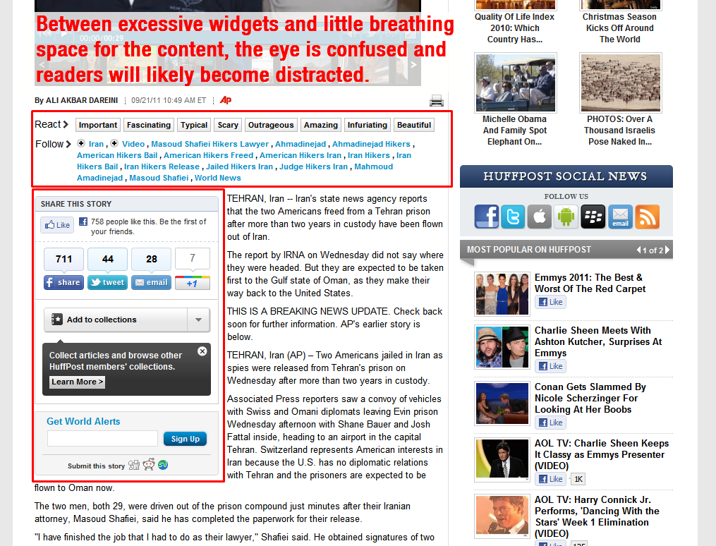
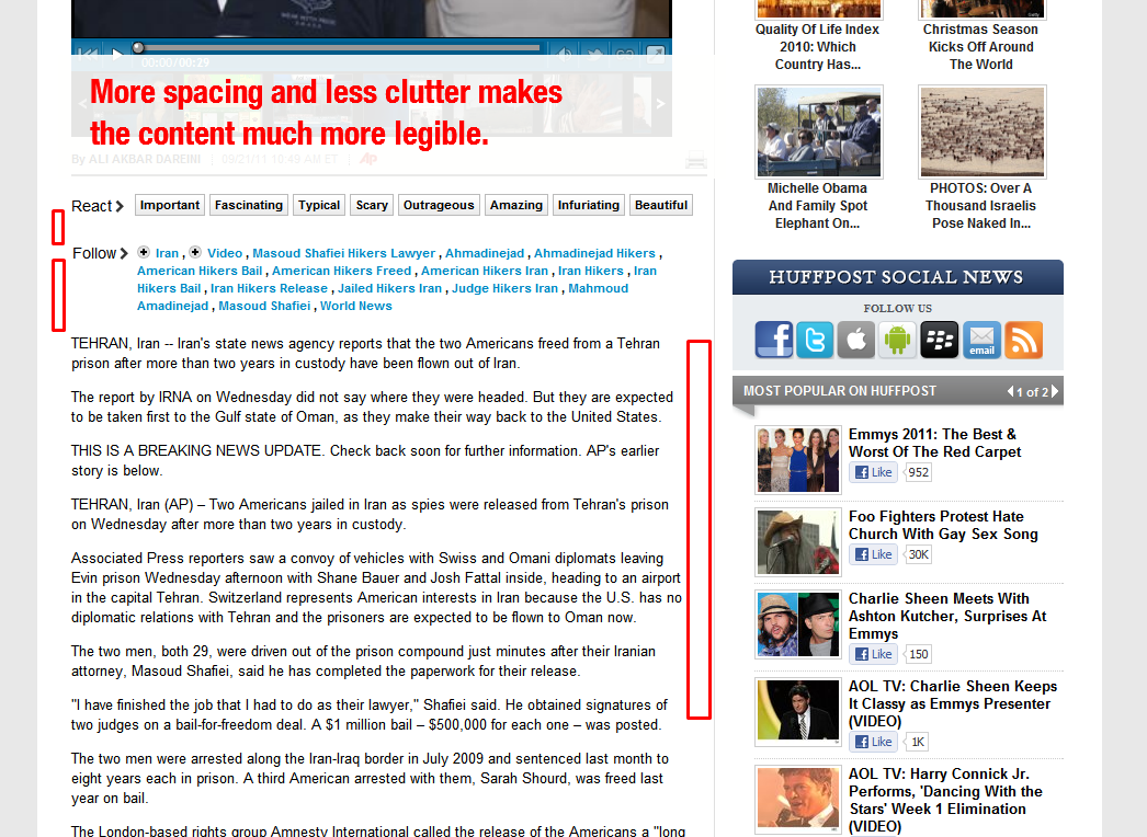
I think the most common design crime surrounding content is poor whitespace layout and overly narrow pages. I’m sure you’ve been to more than a few sites guilty of this; you can barely read the paragraphs and keep getting distracted by the myriad of display ads, widgets and other junk squished in with the content.
(Click an image to view its full size.)
The Huffington Post is guilty of both issues. Not only is its content squeezed into a relatively narrow space, there are no less than three widgets packed in (not even on a sidebar) and the columns on the website have a tiny gutter which causes the eye to incessantly bounce back and forth between the news stories and feeds/widgets on the right side. The result is a distracting and disruptive experience for readers.
Plus, Brafton has reported that cluttered sites with hard-to-find content may be guilty of “myopic SEO” – search engine optimization strategies that attempt to overly cram on-page SEO with the algorithm in mind. SMX experts shared insight that these were the type of web pages penalized in the Panda updates. What’s good for site visitors is also good for SEO.
II. Mute surrounding site elements
Just as a lack of spacing and clutter can distract users, so does excessive use of color and contrast directly around your content. Using a muted (pale or subtle) palette for adjacent web elements accomplishes two critical objectives:
- Emphasis on the two most important site areas: content and calls-to-action or CTAs (conversion links)
- A hierarchy of information for your audience to process.
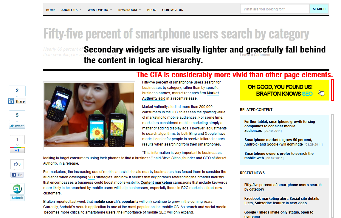
Just as grids and tables can arrange information for you to read and comprehend, color and contrast can do the same thing. Brighter, more vivid color immediately highlights components of a web page as important in our subsconcious, while softer colors cause the elements to slightly recede and take lesser priority. This theory applied to CTAs means that a viewer will immediately lock on to a CTA as important and be much more likely to read and click on the object.
(Click the image to view its full size.)
You can see this in action on Brafton.com. Our content has a neutral, white backdrop and the only vivid object nearby is our CTA leading to a product landing page. The eye recognizes this instantly and processes it before moving on to the content. The secondary widgets (Related Content, Recent News, etc.) are in muted colors, such as our soft blue and pale gray, to subtly define their existence but keep focus on more vital content areas.
III. Optimize for different browser sizes
Let’s face it, the once and done approach simply does not work for today’s internet; tablets, smartphones and laptops of varying screen sizes require a more sophisticated strategy when it comes to designing our content’s “shell.” Depending on how your website was built, there may be ready-made modules or plugins available to make mobile optimization easy. For instance, Brafton.com (a WordPress-run site) utilizes the WPTouch plugin to reflow our news and blog content for mobile visitors.
If you’d prefer to let an outside agency craft and update your mobile website, Mobify seems to be a slick solution. Before everything else though, you should pull up your favorite web analytics tool and make sure your audience utilizes mobile browsing enough to justify the implementation cost.
Updates translate into search (and sales) success
The long and short of the above best practices is that simply producing quality content isn’t enough to maximize the value of your marketing efforts. In order to get the most of your time and spend, attention must be paid to the human experience of your content, namely usability. To give a little context to these recommendations, we implemented each of them on our own site (relaunched in January 2011) and have seen our traffic double and conversion rates increase dramatically as a result.
Have you made any website changes to better present your content?


