

As marketers, we all love written content – it’s a fantastic way to effectively connect with consumers, provide them with valuable information and keep delighting them once they are customers.
But sometimes, audiences want something more than articles and blogs. This is where custom infographics come into play. After all, 65 percent of the population are considered to be visual learners, according to the University of Alabama at Birmingham. This information can be shown as images with various data points in infographics, or it can also be a brand’s overall message in the design elements it uses.
But simply putting together some photos, flashy colors and other elements that pop won’t do anything. Sure, it’ll make a graphic stand out, but it won’t give the reader the details they are looking for. They’ll just skim right over it.
But when designed effectively, with the right images, colors and text, custom infographics and brand images convey a strong and consistent message to viewers while also providing valuable information.
So how can you make sure your graphic design marketing plan will succeed? How can you ensure you are including the right elements into your custom graphic designs that will keep your prospects wanting more?
Consider following some of the methods from these four examples we’ve put together and that we think excelled in 2016. These brands focused on creating graphics elements that center on consistency, simplicity and storytelling.
1. Xceleration stays simple
Xceleration, a provider of employee reward and incentive programs, created this infographic to appeal directly to its target audience: millennials. The brand kept the design uncomplicated but modern.
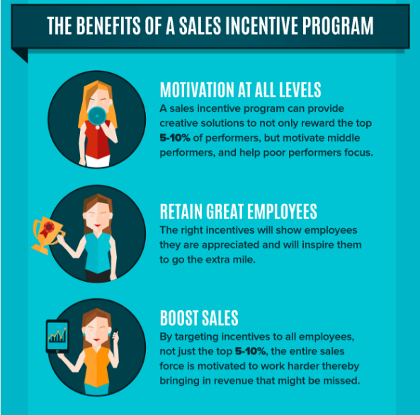
Brafton’s Senior Graphic Designer Jenna Campbell said that it’s clear that Xceleration took the time to understand the audience it was going after, and then used that data to design a graphic that speaks specifically to them.
“Xceleration’s illustrations are simple, modern and attractive to a more millennial group of employees,” she said. “There is not much need for complicated design because the information is exactly for that kind of person: smart, inquisitive and fast learners.”
Xceleration knows the audience it wants to reach, and the brand makes sure to incorporate elements into its graphics that speak directly to those viewers, ensuring they walk away with valuable information and not just glean over it.
2. Uinta Brewing tells a story with its products
Successful graphics don’t have to always include text or data points to convey a message. And Uinta Brewing is an excellent example of this.
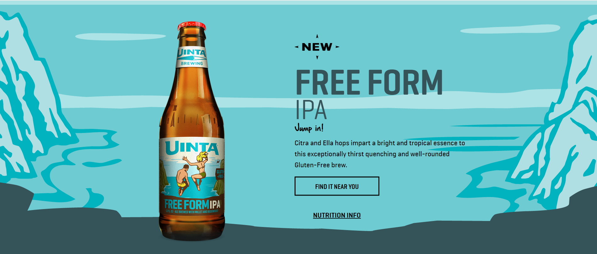
The craft beer producer uses custom-designed labels for each of its beers, but it maintains a consistency throughout each illustration. Even though each beer is different, the brand message stays the same so consumers know they are enjoying a Uinta beverage.
With its Free Form IPA, the brand utilizes several graphic elements to tell customers about the drink, as Jenna pointed out. This particular beer is known for being on the more mellow side of the India pale ale family, and so it includes components that convey that message.
“The illustration for the bottle is carefree and symbolizes freedom and adventure, which is exactly how this beer can be described,” she said. “The colors are muted, cooler tones that give off a more relaxed vibe. This is a great example where the label embodies the beer inside.”
3. Starbucks makes it personal
Starbucks may be the largest coffee shop chain around, but the reason it makes this list is because despite its presence in countries all over the world, the brand maintains a personal touch in all of its designs. This approach allows each customer to feel connected and special to the brand, rather than another patron with the same cup of coffee as everyone else.
Brafton Graphic Designer Ali Eagle pointed out this year’s holiday-themed cups as a great example of Starbucks’ focus on personal design. There are 13 cups, each one featuring a different hand-drawn image from a customer. This style, coupled with the company’s online illustrated custom infographics and in-store chalkboards listing seasonal specials, is what helps it connect with individual customers in a unique way.
But the coffee brand takes it a step further in terms of personalization with its #RedCupArt campaign. On December 17, Starbucks offered customers blank red cups and encouraged them to doodle on them, and then show off their creations on social media.
“Starbucks’ illustrations encourage customer interaction with the company as well as their loyalty, and the personal touches make the company feel more like a small coffee shop than a global chain,” Ali stated.
4. Spirit Airlines finds success with consistency
Some brands remain recognizable in their designs even when their name is not attached, and Spirit Airlines is on its way to becoming one of them.
Spirit has remained consistent in its brand message and design elements, which has helped the company maintain not only a familiar touch, but an approachable personality as well, Ali explained. The airline takes it a step further by including hand-drawn features in its logo and other graphics, which provide a more personalized tone to customers, making them feel like they are friends with the brand rather than just another passenger.
“Spirit specializes in low-budget travel, and its lack of “refinement” in its logo and visual elements (as well as the use of bold yellow) that appear on its collateral and planes says to the viewer that the airline is fun, relaxed and focused on getting its customers where they need to go,” Ali said.
No matter whether you’re building brand awareness for an airline, personalizing a large corporation, embracing a small business culture or targeting a key demographic through visuals, it’s not about throwing some images together to create a graphic element. Whether it’s presenting data in a custom infographic or creating a recognizable brand image, marketers need to hone in on telling a story, connecting with customers and providing them with valuable information in any and all design elements.