Google took to its Analytics blog on Wednesday to detail its latest release, Flow Visualization, which provides a graphical breakdown of website visitor activity on a company’s website.
While Google first announced it at the Web 2.0 Summit Wednesday morning, its blog entry provided the first major breakdown of the service for the public. The data is essentially the same Analytics has always featured. However, breaking down traffic paths in a flow diagram allows for an easier understanding of visitors’ progression through the website.
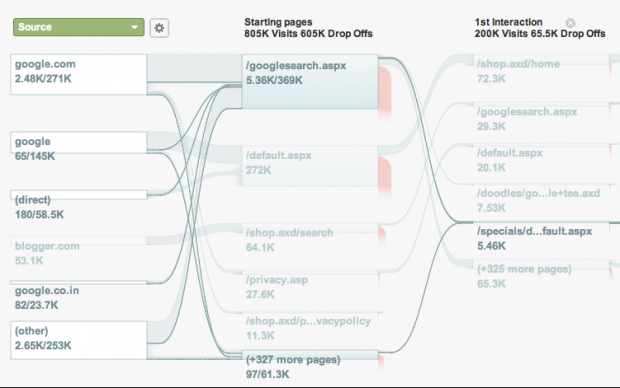
Starting with the source, which shows where the visitor landed on a page from, lines connect each stop made while a visitor browsed the website along with other pertinent information, including how long he or she remained on the website.
Moreover, the feature’s intelligence algorithm developed by Google tracks the common behavior on the website to provide a clear picture of the usual path a visitor takes before leaving the website altogether.
From this information, website administrators can adjust content marketing plans and calls to action according to the most common navigation paths and most successful pages to boost overall engagement. Marketers can also adjust their internal linking structures to try to point visitors to pages that aren’t getting as much visibility among visitors.
Google Analytics received another groundbreaking feature last month with the addition of Real-time Analytics. As Brafton reported, the tool provides data of web activity and traffic numbers to administrators down to the second. Like the addition of Flow Visualization, marketers can use this information to boost content marketing plans, especially when it comes to developing editorial calendars and publishing schedules.