
Notice anything new with Google Maps? When Google changes the design on one of its products, the marketing and design world takes notice. Not only is Google the standard-bearer in terms of rules of SEO, keywords, linking practices and all things web, but it is also exemplary in its design and style.
You can see Google’s design influence in the evolution of its logo: dropping the shadow, flattening, and going sans-serif over the course of a decade shows how its changes have aligned with, and inspired, modern design sensibilities. Now Google has updated its Maps design, and while the changes are subtle, there are marketing lessons to be learned.
The 5 Cs of UI updates: Cleanliness, contrast, color, consistency and change
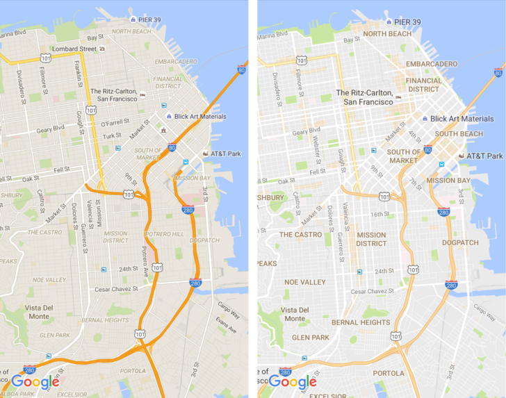
Google Maps slightly lowered the contrast and cleaned the field of view to allow for more detail, hierarchy of elements, and a quicker understanding for viewers. Each of Google’s updates to Maps hammers home the idea that content comes first, and that graphics – colors, shapes, contrast and arrangement – all serve to display content in as meaningful and digestible a way as possible.
Lesson 1: Keep it clean
What do the design philosophies of design industry leaders from Rams to Jobs and Ive to Eames have in common? They are responsible for designing extremely functional, but minimalist, products. Google’s designers removed as many unnecessary or intrusive objects as possible to guide your eye to what’s most important – areas of interest. They even introduced new, simpler fonts to lighten the visual stimuli on screen and make the app more usable.
The simpler the design of a tool, or piece of hardware, the easier it will be to use.
Lesson 2: Contrast helps users interact more efficiently
Google lowered the contrast for roads because we’re used to those by now. We don’t need a bright yellow, outlined strip to communicate that we’re looking at a highway route. Lowering the contrast on roads helps Google direct our attention to attractions, business, and other points of interest.
Too many high-contrast objects on screen strip the importance from any of them, but selectively keeping contrast high on certain elements brings the focus where it is needed.
Lesson 3: Consistency leads to better understanding
With the new update, Google Maps came even closer to officially codifying their Maps color scheme.
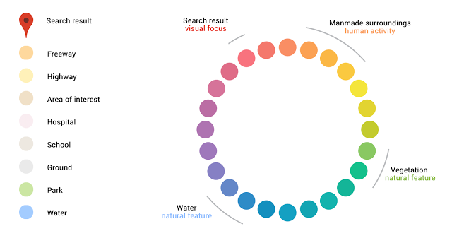
The more consistent you are with your colors in your design, the better and more intuitively your audience will be able to use your product or interact with your content.
Lesson 4: Color shows what’s most important
Colors suggest and create hierarchy. Google has rolled out “Areas of Interest,” which appear in orange throughout the map. Google likely designed the feature to encourage local businesses to optimize their content for search, and wants it to be front and center in this new Maps update.
Lesson 5: It’s OK to change!
All of the above are reasons why, when it’s time to update your design, you should. Areas of interest came from an algorithm we didn’t have when Maps was first released; now that Google is able to tell what spots are popular, it’s rolled out its update to show it. Similarly, now that we know what roads look like on digital maps now, we no longer need the outline of them to understand what they are; Google removed them to make way for other features.
Don’t be reluctant to change your design. Your graphics’ primary goal is to serve your content and product, so when your offerings evolve, so should your graphic design to best reflect and present them.