
We have a winner for the worst color in the world. The international market research agency GfK, tasked with creating an anti-smoking campaign for cigarette packaging, asked a pool of thousands of smokers what the least appealing color is. The consensus is that Pantone 448 C is the “ugliest” shade, and at first glance it’s certainly not pretty. Most respondents associated it with “death” and “tar,” and agreed that it is the perfect choice for dissuading people from purchasing tobacco.

However Brafton Graphic Designer Bradley Devereaux isn’t convinced that it’s inherently unappealing. “Some colors are more suited for certain marketing tactics,” he asserted as he started up Illustrator, ready to prove GfK and the world wrong. “You shouldn’t judge a color in isolation; every color has equal potential when it comes to graphic design, marketing and even art.”
The lesson for marketers in all this colorful talk? You don’t always have to follow best practices.
“Best practices are suggestions. Work on a case-by-case basis, and do what works for each project.” -Bradley Devereaux, Graphic Designer
Set yourself apart from the rest of the noise by doing the unexpected. By getting out of the habit of coloring inside the broadly accepted guidelines, and instead drawing a picture of what marketing looks like to you, your possibilities are endless.
Just because popular opinions indicate that you shouldn’t use a certain color or create content in a particular way, doesn’t mean you have to listen to them. In fact, Bradley took this revelation as a challenge, and made me a quick graphic that used the color in a positive light. I’m tempted to print it out and hang it on my office door.
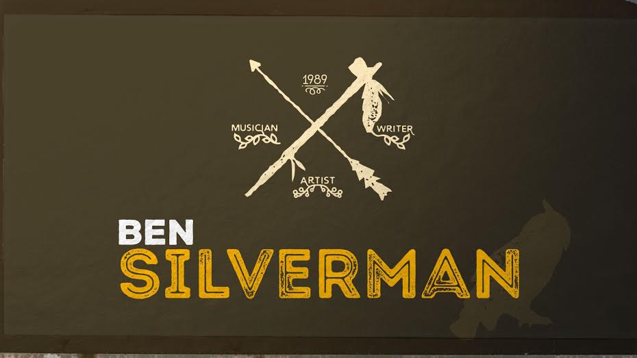
I’m not saying I’m planning on using this as my business card anytime soon, but the earth tones, textures and general resourcefulness of the image prove that good design trumps common opinion.
Bradley’s not the only one who feels this way about Pantone 448 C. In fact, you can find the color in da Vinci’s Mona Lisa, as well as in some of nature’s most beautiful plants and animals. Cosmopolitan’s recent list of 18 beautiful uses of the sludgy green-brown color shows its glamorous side in fashion, design, architecture and nature (and even outer space).
If our designer can make an impact with just one color, imagine what you could do with your strategy if you start to challenge other marketing standards.