
What if your Google Analytics data told you visitors hate landing on your article pages? If your bounce rate was 92 percent, would you write off content marketing as an ineffective strategy, or dig deeper to find out why it’s so high?
Without objective context for your data, you might tell yourself the wrong story about the numbers – and that can be costly. You don’t want to throw the baby out with the bath water … a lesson one client in the parenting industry and I recently discussed.
I saw something odd with the client’s news article pages – visitors who landed on news articles bounced immediately. That doesn’t bode well for a content marketing agency, does it? The client was happy with the quality of the content, but I wanted to know why our copy wasn’t keeping people on the page.
Based on the analytics data and my experience working with the site, I had suspicions. But I needed more answers to put the full story together and make some good suggestions, so I conducted a 5-second test to find out what users said was impacting their experience.
Here are the facts:
-
12 percent of traffic landed on the homepage*
-
5 percent of all traffic to the site was coming through a top Brafton-produced article (on a page that looks like the majority of articles on the site in terms of structure, length, content, etc.)
*For most clients, the homepage drives anywhere between 25-75 percent of all traffic. Ideally, we want a variety of landing pages (articles, product pages, concept pages, etc.) driving traffic. When they aren’t, it usually means something is wrong, like they’re not being indexed properly, they’re poorly structured or poorly written. So clearly the site had an even distribution of entry points and we needed to look further.
Initial conclusion: The content was certainly doing its job to get people there … but then what?
-
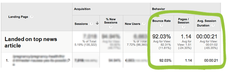
92 percent bounce rate meant visitors were leaving immediately
-
21 seconds on site was the average amount of time visitors spend on the content after landing on the page
Next conclusion: The visitors didn’t like what they saw when they got there, which makes it an issue of engagement or thought leadership … but is this a matter of copy or design?
-
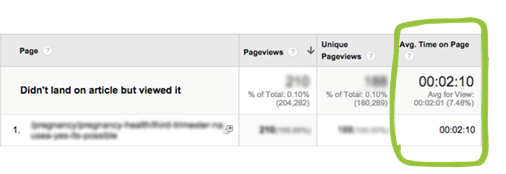
2 minutes was the average time people spend on an article when they landed on the homepage and THEN viewed an article
Conclusion: People will actually read the article, just as long as the article isn’t the first thing they see when they land on the site
Now, we needed to find out why visitors tolerate the page if it’s not the first page they see – especially if they see the homepage first? We could say, “Hey, it looks like your article page layouts suck – visitors think it’s a spam site before they have a chance to read the content,” but that’s just a theory. We’re in speculation land, when we need watertight data to make valuable conclusions.
Mystery shopping your competitors’ content
The next thing I did was take a step back and look at what some successful websites in the client’s space were doing. There were some easy observations I made right off the bat:
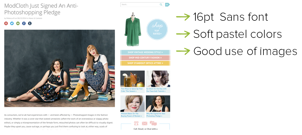
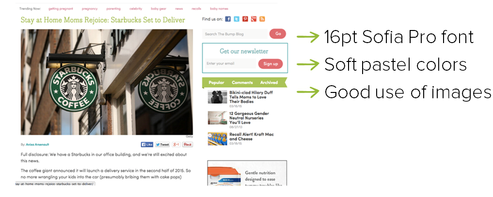
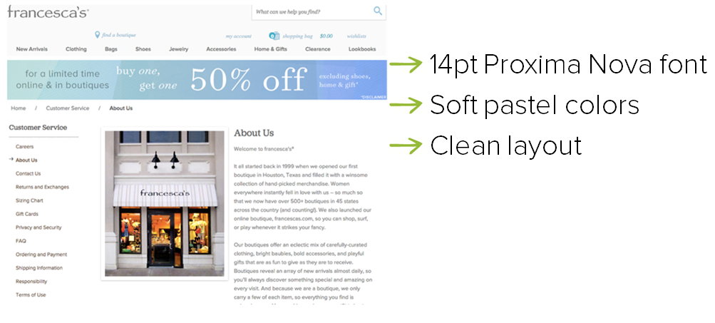
I started seeing a very clear theme here … All these sites format content in a very clean structure, use soft pastel colors and write in a neutral font.
So I took a look at our client’s site to see if anything stood out to us.
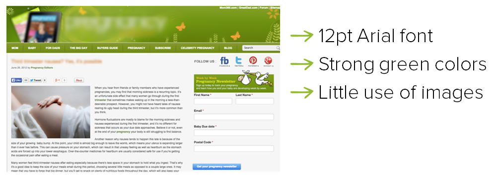
This is almost the opposite of everything we were seeing on other sites in the same industry. But before we go making a complete design overhaul, we have to remember this is just three examples. We need more data to make an informed decision, so we consulted the client’s audience.
Ask your target audience what they think
We utilized software called 5 Second Test to get qualitative feedback on this page and find out why people were leaving.
The concept is this: It only takes .05 seconds for you to make a snap judgment about a website. You may not realize this, but within five seconds you subconsciously make dozens of decisions about a page you encounter for the first time. You do this on autopilot so you can quickly breeze through information and move on with your day.
In our test, users were prompted with the message: “Imagine you are a new or expecting mother and you land on this page.” They were shown the same screenshot of the article for five seconds. Immediately after the five seconds were up, they were asked a series of custom questions. We sent this test to 25 new and pregnant mothers.
1. What was your first impression when you saw this page?
2. On a scale of 1-5 (5 being highest) how modern does this site look?
3. Does the site feel feminine?
4. What would you change about the site?
We compiled the data into different categories, and extracted direct quotes from the responses. The results are as follows:
What was your first impression of the site?
- “The green doesn’t feel mother-like…more like nature”
- “Too green”
- “Lots of green”
- “Long article”
- “Pretty, but had a lot of content.”
On a scale of 1-5 (5 being highest) how modern does this site look?
2.9 Average score (ouch)
Does the site feel feminine?
- “Eh, it’s pretty neutral gender-wise. That’s not a bad thing — pink and blue is overwhelming during pregnancy. But white would be better.”
- “Only because of the topic and the picture, the color green is neutral.”
- “Not too feminine. The colors were neutral.”
- “Kinda, because of stork and baby belly – but without pictures, I would say no – green isn’t very feminine”
- “Not the typical look of “feminine,” but it also does not seem manly”
What would you change about the site?
- “More visual design, less text.”
- “Too much noise, make it more streamlined.”
- “Simplify content on screen – a lot of text makes it hard to recognize key values.”
- “Make it look more current”
- “If you’re targeting mothers chances are they don’t have a lot of reading time. Bullet points. Deliver the info quickly”
- “Too flowery/green/nature.”
- “Change the color of the font for the articles title. Red doesn’t make me feel at ease.”
Conclusions from the 5-second test
Based on the results of the 5-second test, it’s clear the site’s look is probably having a serious impact on its performance. Feedback from the target audience tells us:
- The color palette is neutral and at times too aggressive.
- The page is content heavy and looks crowded
- The font size is too small
- The font type may be uninviting – Arial may be better suited for a B2B site
- We need to make better use of visuals
- We need to break up the content blocks with bullets, headers and media.
Forget surface-level data. Dig deeper to find actionable answers
To come to these detailed action points, we had to exhaust our tools of analysis. We looked at the raw data, created theories, evaluated the competitive landscape and gathered qualitative feedback from users in order to eliminate our personal bias.
We never would have known the colors and font size were having such an immediate impact on readers’ first impressions if we had stopped at the raw analytics data. All of this strategic work gave us an answer to the question: “Why do visitors hate landing on these article pages?” and offered real starting points for making the site more effective. (And that won’t mean cutting our written content!)