If you work in news or another content-centric pursuit, you’ve probably come across the common dilemma of our internet-engulfed times: making content accessible and beautiful for multiple devices (and multiple screen sizes.) This should be at the forefront of publishers’ minds as Brafton has reported that smartphone and tablet shipments are poised to overtake desktops in the near future.
While there are certainly some inherent challenges – both technological and in the design – with a little elbow grease and some thoughtful best practices, you can publish content both intelligently and effectively.
Don’t crowd your content.
This tip has two layers: Do not overclutter your page and, do break up your paragraphs for legibility. Although the allure of display ad revenue and trying to maximize website interactivity is tempting, if you want your content to shine, it must be given enough white space and contrast to stand on its own.
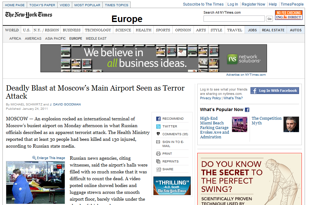 An example of overcrowded content: The New York Times website.
As you can see, The New York Times has immersed its news content with social bookmarking tools, pictures, and display ads galore. The most important part of the website, the news, has been lost due to the lack of contrast and prominence.
A good example of content-centric design: The Economist.
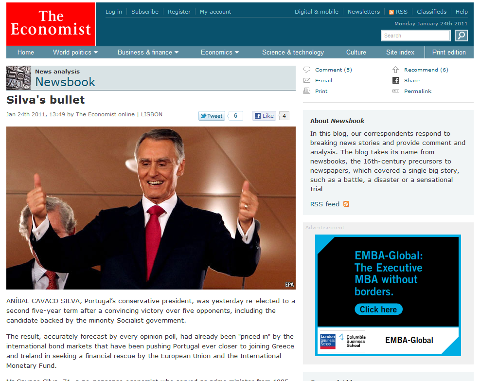 The Economist has one of the better news web designs of the bunch, having kept its content pure of inline obtrusions, with less distractions around it.
The second part of this key ingredient to make your content shine is breaking up your story into easily digestible chunks. In print, it is easy for your eyes to absorb larger blocks of text due to the use of serif fonts. However, most websites utilize sans-serif fonts, which actually make reading solid blocks of content more difficult than you would think.
Only link relevant and necessary items.
One sin some sites make is excessive linking within content. The first thing a reader thinks when they land on a page with too many links is “woah” – in a bad way. The contrast between several blue links (or whatever color yours are) and normal black text is extremely distracting. Worst case scenario: The reader might click off your site too soon and lose the value of your words. The effect of too many links is multiplied on a smaller screen – such as a smartphone – and may come off as obnoxious to your audience.
The unofficial best practice for linking within content is to use no more than one link per two paragraphs (three is better), unless you are citing a source or making a specific off-site example.
Use a mobile-optimized theme when possible.
 One downside of current mobile technology is the connection speeds usually aren’t anywhere near broadband bandwidth. This means taking steps to reduce the overall size of your webpage for a mobile visitor. If you use a content management system (CMS) such as WordPress, there are several mobile themes available such as WPtouch and Carrington Mobile; these plug-ins significantly trim down file size and run seamlessly alongside your existing theme for visitors on full-fledged computers.
For larger devices like the iPad, Galaxy Tab and HP Slate, most websites should render normally and legibly. If you are seeking a more tailored solution on WordPress, the makers of WPtouch have a tablet-optimized layout in their “Pro” version.
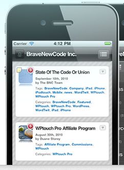
WPtouch emulates the iPhone interface for easy recognition and use among mobile visitors.
Ensuring that your content is ready for its mobile close-up could be key to catching clicks this year. Google is reportedly focusing on the mobile platform in 2011, and if your brand uses content to draw traffic from the search giant, maybe you should focus on appealing to on-the-go consumers, too.