Calls to action (CTAs) enable you to turn your content into currency. They help you build your business’s bottom line while also creating an experience for your users that guides them towards engaging with you brand.
Optimize your CTA graphics
Your challenge in engineering an effective call to action is grab your user’s attention as fast as possible, and keep them engaged long enough for them to act. Great graphic design is the first step in making your CTA as appealing as possible.
Placement
Don’t put your CTAs in unnatural spot. If they’re in an awkward or hard-to-find position on the page, your users might not see them.
→ Pro tip: Users naturally tend to look to the right and to the bottom of text boxes when seeking next steps.
Sizing
Not too small, not too large, just right. The button and image associated with the CTA should not detract from a user’s experience but they also should not go unnoticed. While this may seem like common sense many website still have off putting CTAs that just don’t match the overall theme.
→ Pro tip: When in doubt, use the golden ratio for sizing proportions.
Color
You may think the brighter the better to catch readers’ eyes, but this is not always the best answer. Too bright and flashy and you’ll look desperate and your users will have a negative experience. If the color is too harsh of a contrast and not complementary it will confuse the user and make them fear it’s an ad for another site.
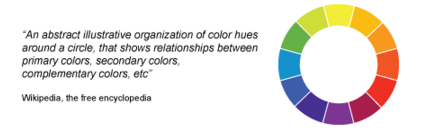
Ideally you’ll want to use colors that are directly across from one another to be complementary, such as orange and blue. Colors subconsciously affect our feelings about an experience. Red evokes a feeling of action or danger. Yellow evokes alertness and confidence. Green is calming and reminds us of nature. Blue is associated with authority. Black and white are associated with luxury.
→ Pro tip: Use a hue of red, green, orange/yellow for a button and avoid black, white and brown. Make sure the color selection is complementary with your current theme.
Layout
Bombarding your readers with too many buttons, options or offerings can be confusing and overwhelming. Your goal is lead your audience to actions – to sign up for an email list, download an asset, visit a site.
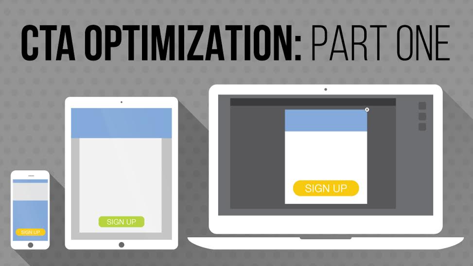
→ Pro tip: Check how your CTAs look on multiple devices and design for cross-device experiences.
You’ll need one or two very clear options that are easily identified as clickable links or buttons.
→ Pro tip: Ask someone who doesn’t know anything about your site to look at your CTAs. Ask them: What do they think the CTA means? and What do they expect to happen when they click?
Keep your text readable and bold (but not too huge!)
Less is more
Don’t get too wordy and pull out the old thesaurus to find fancy words – just use natural verbiage.
Text size
Your CTA’s text should be able to stand out from the rest of the website that it’s hosted on to show that it is worth a reader’s attention. Larger font sizes help draw eyes, while a smaller text size might lead users to mistake the CTA for body text.
While your goal is to grab attention with large, bold text, there is a limit to what readers will react to positively. Extra-large text can often subconsciously give users a negative impression of your brand, leaving many with feelings of anxiety and mistrust.
Design your CTA text size to be somewhere in between this:
and this.

Word choice
The most effective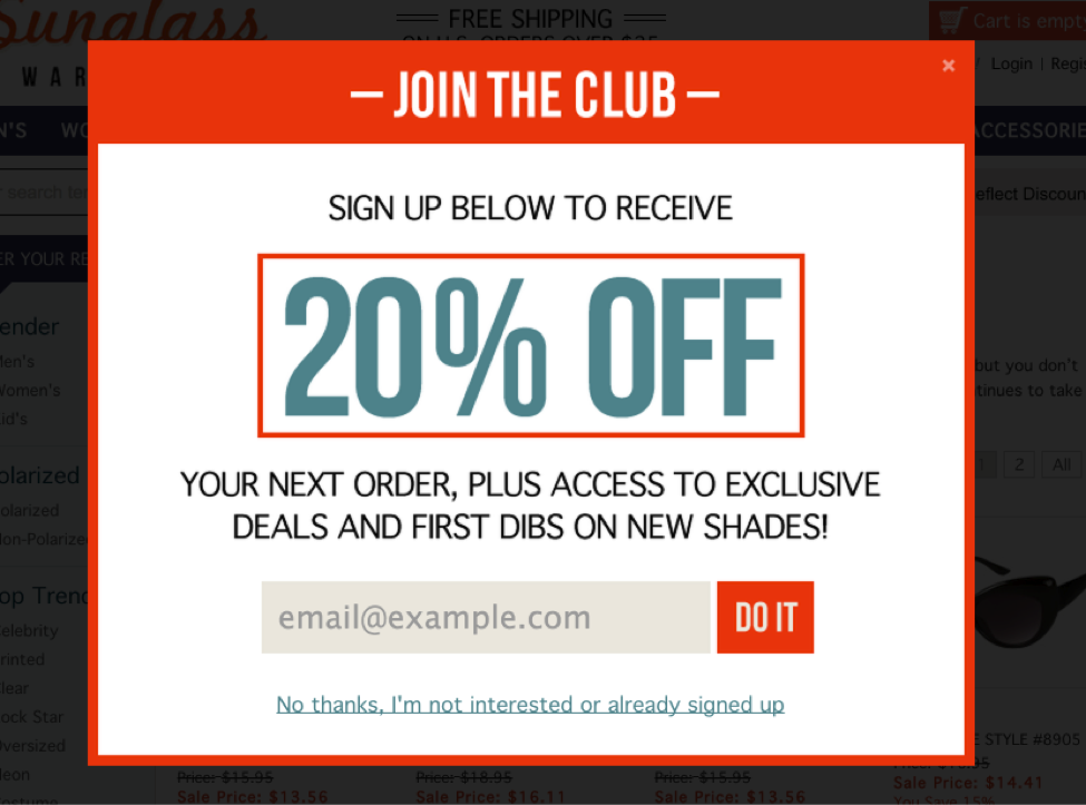 CTA text will be honest, friendly and descriptive.
Don’t cause click fear. Avoid the “next” button because it might imply there’s more work for the user. “Click here” and “submit” are also risky choices because they don’t give any valuable information for the user. Let them know what the button they’re clicking on does.
→ Pro tip: Keep your text specific – “watch the video,” “download eBook,” “Shop now” to let your users know exactly what they’re in for.
Fill Forms
 Ask for the bare minimum. The more you ask, the more strain you put on your users and the less likely they’ll complete the form.
The info that’s essential to capture in order of importance is: Email, First name, Company, phone number, last name, additional information.
→ Pro tip: If you can only capture one piece of information make sure you capture the email.
Terms and conditions apply
Remember your goal is “Action.” Every second that you stall your user, the likelihood they will complete their action decreases. Do you have extra, non-crucial checkboxes in a form-completion CTA? Does the form reset when they click submit without filling it out properly? These hurdles might slow your users down, and possibly lose them along the way. Every piece of your CTA design should be to push your user forward, and ultimately lead to them taking action.
Streamline your fill forms by stripping them of any complex or dynamic questions. You can save those for when your prospect is further down the funnel.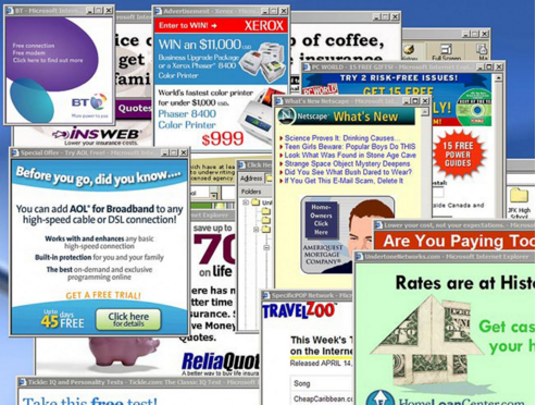
→ Pro tip: Design your fill form CTAs to only take a few seconds to complete by taking advantage of dropdowns and simple questions.
Pop-ups aren’t the enemy
Aggressive pop-ups are so 1990s
Many marketers shy away from using popups because of negative associations from the 1990s and 2000s, when pop-ups opened as separate windows, autoplayed sounds, flashed bright colors and were sometimes impossible to close.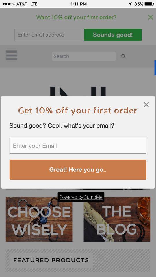
Today, pop-up CTAs are more user-friendly and are optimized for a positive user experience. They appear in the same window the user is in, gently offer relevant information and options, and can even use javascript movement-trackers to show up as a user begins navigating away from the page.
We recently tested the conversions from a stationary CTA at the top of the page versus a pop-up CTA on an e-commerce site. Both CTAs offered the exact same promotional deal – 10 percent off the first order. The result: The pop-up captured 120 percent more emails than the stationary CTA. Granted the text and button color are slightly different, but the pop-up showed more success because it captured the audience’s attention while the stationary bar was lost on the site.
- Now that you’ve learned the fundamental elements that go into a CTA look out for our next post on crafting the perfect image.