

We live in a visual world. Many of us developed a love for colors and imagery at a young age. Think about it: When given the chance to look through a vivid picture book as a child or steal your dad’s newspaper, you likely said no to the crossword and round of sudoku, right?
Today, adults get creative satisfaction from infographics.
What is an Infographic?
Infographics offer an invaluable opportunity to visualize important data and metrics to consumers. They can make those difficult-to-understand numbers more fluid, and the graphic design can add a layer of excitement to what would otherwise be considered boring content. Utilizing cool infographics can transform complex information into engaging visual information with minimal text, making it easier for viewers to grasp.
This visually appealing type of content is growing in popularity and shows no signs of stopping. According to the Content Marketing Institute, infographics ranked 9th overall (27%) as one of the best-performing content assets over the last 12 months.
So the next time you’re considering making an infographic…
The Value of Infographics
The infographic is a popular and irresistible type of content that makes data and statistics more interesting to look at and easier to digest. Aside from being a visually appealing opportunity to increase your brand awareness, it’s a great way to catch attention early on in the buying process. In fact, according to Demand Gen’s 2021 Content Preferences Survey Report, 55% of buyers believe that the infographic is one of the most reliable pieces of marketing content in the early stages of a purchasing journey.
But while all of the above stats show just how advantageous an infographic can be, you can’t just pull random data from the internet, paste it into a pretty design and call it a day. Understanding what makes a great infographic (and what the worst infographic of all time might look like) can better illustrate what will work for a brand and what could potentially make them sink.
Subscribe to
The Content Marketer
Get weekly insights, advice and opinions about all things digital marketing.
Thank you for subscribing to The Content Marketer!
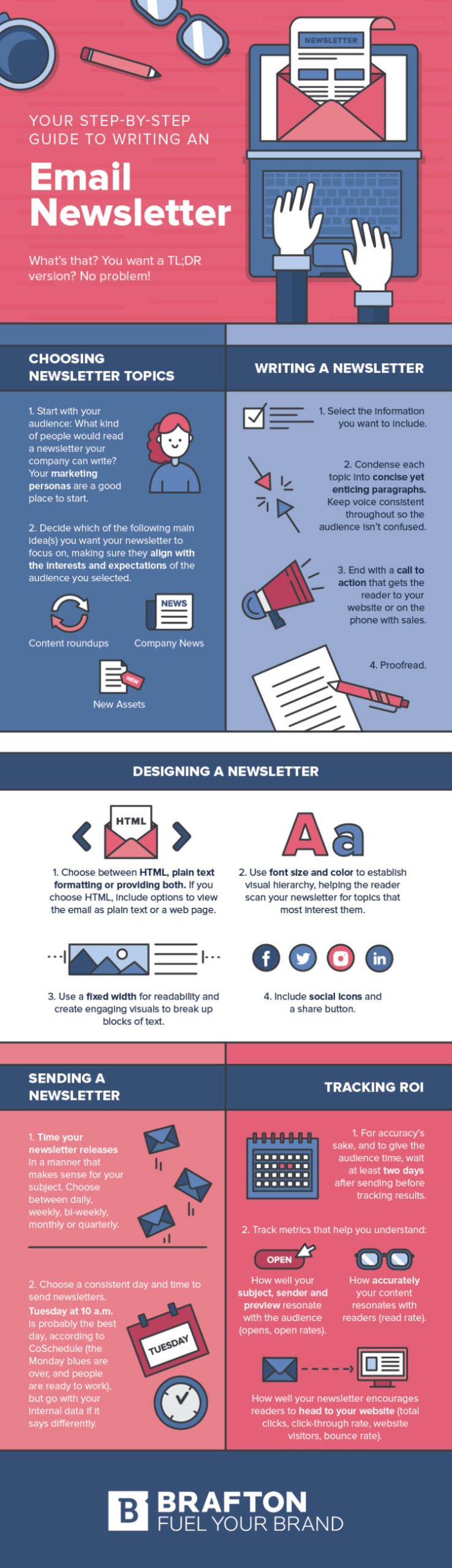
The Components of a Good Infographic
Opinions are all subjective, but there are certain factors that make for a decent and informative infographic. Not only should the visualization in the design be on point, but the type of content within the infographic should be attention-grabbing, educational and valuable.
An effective infographic should contain the following elements:
- Accurate information. This builds credibility for your brand and makes you a trustworthy source to your audience.
- Audience resonation. Your infographic should be well absorbed by your current readers but should also bring in new ones.
- Concise and clear data points. Be short, sweet and straight to the point. Make the information easy to digest by implementing data visualization design techniques such as bar charts and line charts to represent statistics.
- Design excellence. Your infographic should look great, too. Be consistent with your brand, but have fun with the layout, colors and style. Choosing the right color scheme and fonts are crucial design elements that graphic designers must consider to avoid common mistakes.
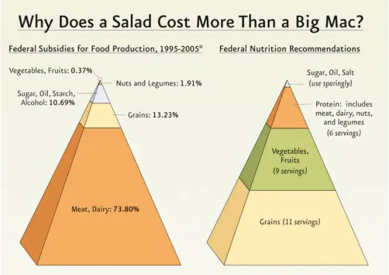
Example:
What Makes a Bad Infographic?
Again, determining good vs. bad depends partially on your viewpoint, but context matters. For example, a bad infographic can look like it’s loaded with data from afar just because it contains a pie chart, but the information within doesn’t tell an accurate story that solves a problem.
Some of the worst infographics may contain:
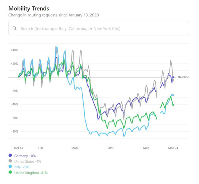
1. Information That Leads Your Audience Astray.
Misleading information can be damaging to your brand in the long run. In this example, Apple attempts to show how many people stopped walking during quarantine based on information generated by Maps. However, it’s misleading because not everyone uses Maps while walking.
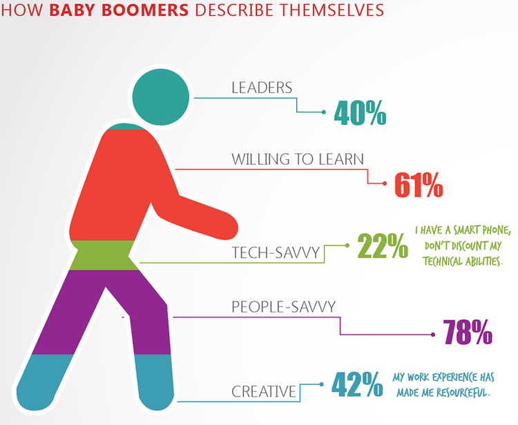
2. Information That Has No Value.
Is there meaning in the data points you’re bringing to the table? Add up the math in the infographic below… not quite sure this comes to 100%.
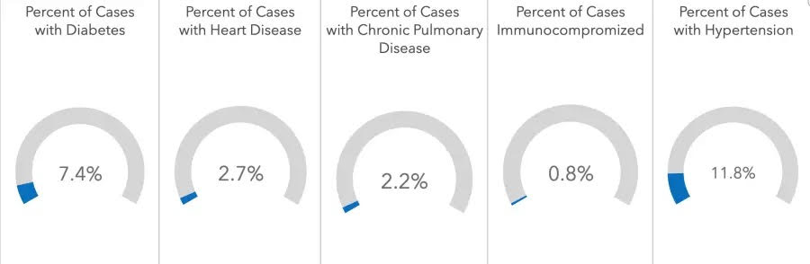
3. Design That Doesn’t Compel Readers.
If your design is too boring or too loud, it can make it easier for readers to click away before they finish absorbing the content. This infographic is just a picture of graphs, nothing more.
4. Visual Elements That Don’t Represent Your Brand.
The face of your brand should always be kept in mind when creating content. Don’t let a certain visual representation or style distract you from sticking to your brand guidelines. At most, you would expect this infographic to have food imagery. But it’s hard to understand who the brand behind this infographic is as well.
How To Improve Your Infographics
When it comes to creating infographics, the last thing you want to do is pull random numbers off of the internet, throw them into a pie chart and paint a pretty face on the content with colors. Proper research, planning, design and organization will go a long way and help you create an infographic with a long shelf life. Avoiding common mistakes, such as using misleading bar graphs or ignoring the narrative, is crucial.
Here’s how to develop an infographic that will perform well on social media, your website and other content marketing channels:
- Do your research. What does your target audience want to see? During your topic research, look for data and information relevant to your brand and bring value to your readers.
- Write an outline. Outlining makes it easier to get the information organized and can help you decide how to set up the content when it’s time to get started on the design process. This is also a great time to decide what type of infographic you want to create, whether it involves bar charts, line charts or other visuals.
- Find valuable, reliable sources. Credibility means everything when you’re creating and sharing content. All data points should be sourced from high-quality sources if you want to be considered trustworthy by your audience.
- Determine your design. Once your outline is complete, you can get started on the infographic design process. Remember to follow your brand style guidelines, but don’t be afraid to have fun and follow a theme if it’s going to make the content easy to digest. Utilizing templates can expedite this process, allowing designers to focus more on typography and the overall narrative.
- Utilize your infographic and promote your content. Once your infographic is complete and ready to go live, be sure to distribute it! Don’t let this content marketing asset go to waste. Promote it on social media, send it to your audience via email and post it on your blog. A well-crafted press release can also help spread the word about your latest visual masterpiece.
With the right plan of action, you can create visual content and share information that keeps you top of mind for your target audience and makes it easy to remember your name.
Looking for more valuable content marketing tips, for infographics and beyond? Subscribe to our newsletter for regular updates on industry happenings, tips and tricks and more.
Editor’s Note: Updated July 2024.