“A picture is worth a thousand words” is like the peanut butter and jelly sandwich of axioms: It is still as relevant today in the digital marketing age as it was 100 years ago. Studies have illustrated that the average person remembers only one-fifth of what he or she reads, findings that may sound somewhat counterintuitive considering the marketing world has traditionally argued that words = power, which then = money. While there is no denying that words are an exceedingly powerful tool in creating a brand slogan or crafting a catchy jingle, they are but a piece in the overall marketing equation. The question remains: How can you get prospects to remember the other 80 percent of your message?
Effective marketing is an art form, but science (data) tells us approximately 83 percent of learning occurs visually, thanks in no small part to the fact that the human brain processes images 3X faster than text!
There’s a visual element that is quickly becoming a new norm in content marketing: The infographic. By taking your carefully crafted, researched and written words and transforming them into visuals that help tell the same story, marketers have the chance to make their brand messages more memorable – and more shareable!
An info-what?
With our improved understanding of the importance of images, it is hardly surprising that marketers have increasingly sought to promote both copy and visuals at the same time. Consider the information graphic, for example, which is more commonly known as the infographic. For those who may not be familiar with the term, IGs are “graphic visualizations of information, data or knowledge,” and they are fast becoming one of the most effective tools in a marketer’s arsenal. Underscoring their effectiveness, studies suggest that people are roughly 30 times more likely to read a high value infographic than a text article!
But to create a graphic that can have a positive impact for your brand, it’s important to use these visual layouts to share meaningful and accurate information. A good infographic marries researched or thorough editorial story telling with great design that conveys the meaning or message. As SearchEngineLand’s Danny Sullivan once said, “Crap in infographic form is still crap.” And, as Brafton has reported, Google’s Matt Cutts has also noted the rising levels of spammy infographics creeping up on the web (more on this later).
Any infographics you create will do better if they’re closely related to your business, and it needs to be fully disclosed what you are doing. – Google Distinguished Engineer Matt Cutts
A good infographic is built on the same principles of other components of a content marketing campaign: It has to tell a good and relevant brand story.
Moreover, infographics are extremely versatile as almost all businesses and verticals can benefit from them. I’m sure you’re asking what, exactly, is the real return on an infographic, and in an effort to answer that, let’s quickly examine two main areas (social and search) and discuss how and why infographics will add value – I’ll even give statistics to back up my claims.
Infographics = instant visual engagement + extended reach through shares
Part of the huge success and popularity of infographics is that they easily “go viral,” a term that is golden in marketing – and especially online marketing.
I attended a trade show recently and as part of our setup we brought along one of our custom infographics – “Why Content for SEO.” What stood out to me was how many people came streaming by just to see the infographic, it was obviously captivating enough that people were telling their colleagues to come by to find more information. This is exactly what happens online -people find something and if it’s compelling enough they will share with their audiences.
Then, that new audience comes to your site to investigate (like they came to our booth), and thus the circle continues to happen.
Social media marketing platforms were created to increase demand and most importantly share information. I mentioned earlier that infographics are meant to “go viral” so it should be of no surprise that a recent study showed that in the month of March the hash tag, “#Infographic,” was tweeted 56,785 times.
I mentioned earlier that infographics are meant to “go viral” so it should be of no surprise that a recent study showed that in the month of March the hash tag, “#Infographic,” was tweeted 56,785 times.
So all of this information boils down to the most important question of all: What does this mean for you, a content marketing specialist looking to drive traffic and conversion for your website? Well, if you think about the fact that nearly 10 percent of all U.S. website traffic goes to Facebook; the approximately 400 Tweets sent every day; and the fact that visuals are embedded in memory – it’s a no brainer. Considering all the information I have thrown your way – and I admit, there is a lot of it – let’s imagine the traffic numbers coming into the site after posting an Infographic on Twitter. As the infographic starts to go viral (garnering @mentions and Retweets), it will draw more and more traffic, with users increasingly accessing your website. Additionally, think about the huge number of Internet users who will begin to share the information to their collective audience base and the effect that sharing will have on your site’s traffic figures.
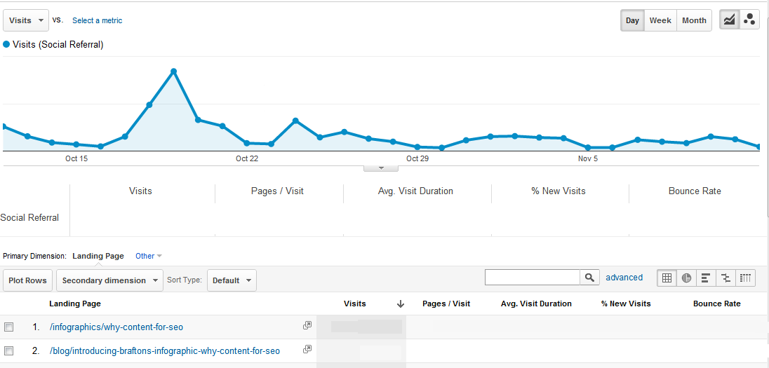
In the month after Brafton posted our Why Content for SEO infographic, it was the No.1 site landing page for all social referrals to Brafton.com. The related blog post was the No.2 page capturing social clicks. The infographic also gave us a more than 100 percent lift in social traffic in the first two weeks following its launch. Not only was it bringing more traffic, but these social visitors were clearly engaged by the graphic – they viewed more pages, stayed on-site longer and boasted a lower bounce rate than the social traffic in the two weeks prior to the infographic launch. We also saw social traffic conversions nearly double. Ultimately, the numbers prove it all: If you develop a graphic and push it through the social channels, not only will you be in demand, but also people will start to pay close attention to your brand and your digital footprint.

Good infographics = enhanced search visibility
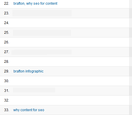
Now let’s take a moment to talk about the SEO benefits. In the year between April 2011 to April 2012 there was on average about 300,000 Google searches for the term ‘infographic.” Researched graphics that you support with search-friendly content have strong potential to catch search clicks. In fact, for Brafton.com, we saw a 20 percent lift in organic search traffic in the two weeks following the publication of our first infographic. During the first month it was live on our site, the name of the graphic became one of the top 30 keywords driving search visitors.

Increased search traffic hitting the site is good in and of itself, but it also gives you additional analytics on what people coming to the site are looking at. You can analyze which pages a wider net of visitors are viewing, what prove to be exit pages, what’ pages have the best conversion rates, etc. and then you could target your content and photos to help support those endeavors – and fuel more SEO wins.
Also take into account that the infographics are actually helping build out a stronger search presence due to social shares in light of social search factors.
I’ll end by saying this: Infographics are a FANTASTIC way to engage with your audience, increase sharing and build up your brand. But you can’t dress a wolf up in sheep’s clothing—What I am saying is don’t abuse the infographic by providing false information, and don’t provide irrelevant information that you think will go viral just to get inbound links. Matt Cutt’s was recently quoted saying Google is starting to find a way to analyze the data in graphics.
Take into account that the infographics are actually helping build out a stronger search presence due to social shares in light of social search factors.
Additionally, Cutts and others have said infographics, like other forms of content, must be developed with the user in mind. He said, “Even if it’s attractive, an infographic that includes inaccurate or otherwise irrelevant data may be considered spam.”To really get the most search benefits from graphics, Brafton’s clients publish an SEO-friendly article – but I’m sure you are asking, “Why would we do that Abby after you said we can get all this value through an infographic alone?” Great question! For me to answer that I always go back to basics “Content is King,” therefore in order to get the most bang for your buck attach that article to the graphic because this will get crawled and indexed by Google.
The specifics on how Google will be conducting this type of fact checking remain to be seen, however when it does happen, expect this to have a fairly strong impact on your SEO results both in the positive and for those who are cheating the systems, negative. And even in the present, convertible visitors who are doing their homework on purchases will catch you if their shopping research shows the information you present in a graphic is false.


