There is nothing more exciting than reaching a marketing goal, or even watching that little arrow point up if you’re en route to one. You’re in Google Analytics Real Time, and your heart is probably pounding and you may feel like you’re betting on the ponies at the Kentucky Derby. Sipping on a mint julep feeling stylish in your statement hat, you see ole’ Sea Biscuit coming down the long side and it looks like he’s got the lead!
But in reality, you’re not at the Kentucky Derby. There are no ponies. Instead, you’re hunched over your laptop staring at a graph, creepily smirking and having inner turmoil about whether to instant message coworkers the live updates or not. You’re sipping on a lukewarm K-cup brew and rocking jeans on casual Friday.

Visually there is quite a gap between perception and reality. When choosing graphics for your marketing content, you need to overcome this very challenge to convey that same blue-ribbon feeling when you’re working with geeky concepts like ‘marketing strategy’, ‘conversions’ and ‘search engine optimization’.
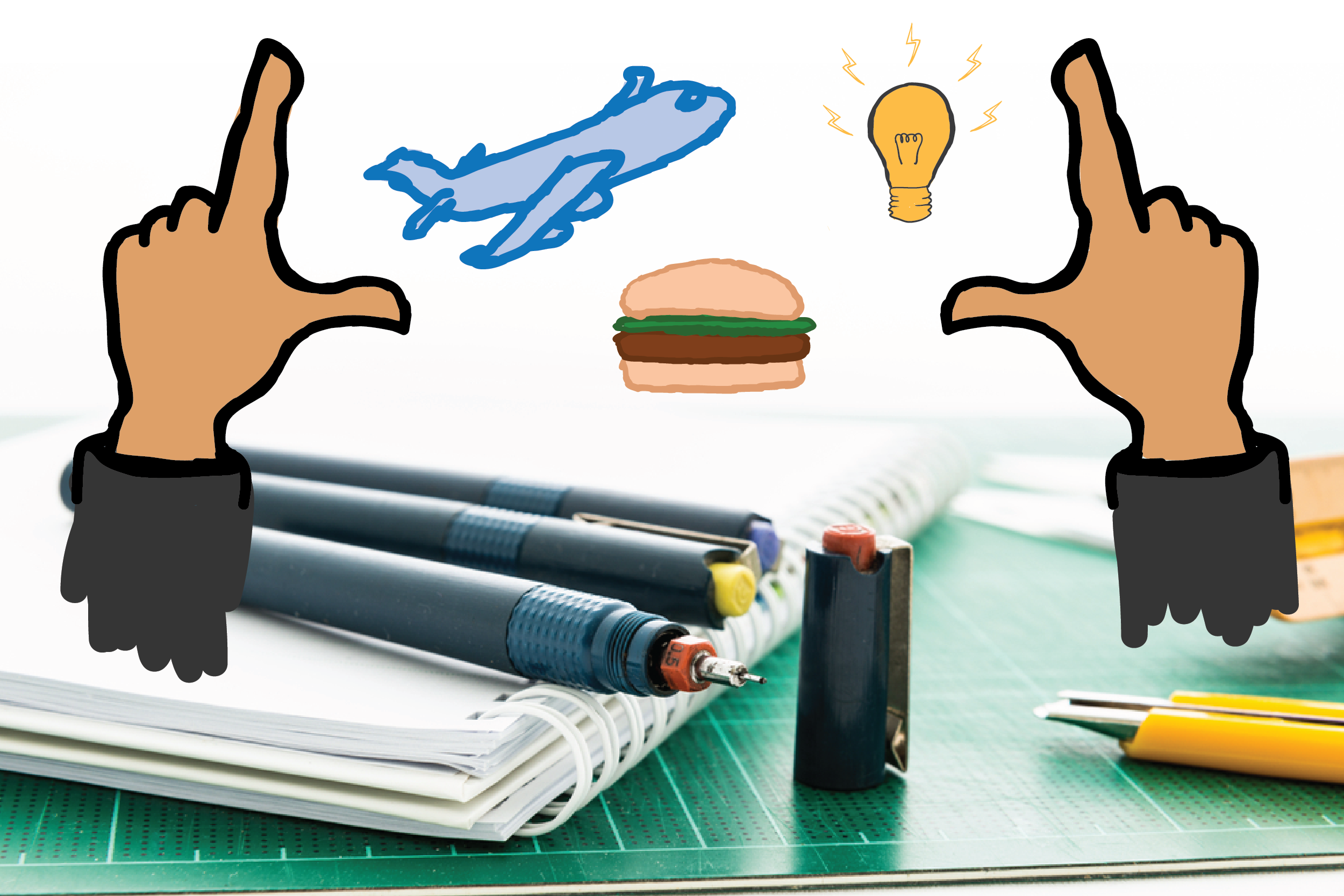
If you’re choosing an image for – let’s say – ‘marketing strategy,’ put the chess strategy image down. Don’t you click that jigsaw puzzle image, either, and forget about the hand in the air writing with a sharpie. These are fine to use sparingly because they do visually convey the point, but overuse will make you a one-trick pony when you’re really killin’ it like Sea Biscuit.
As the graphic designer for Brafton, this is an everyday challenge. My job is to turn (sometimes boring) marketing concepts like someone literally hunched over a computer into engaging graphics. It is no small task to dig so deep creatively, so – how do I do it, you ask? Well, [hair toss, bat eyelashes], I have a few tricks up my sleeve.
 Show that blue ribbon feeling, not the actual chart.

Computers have helped graphic design tremendously, and I love my iMac so much I tuck it in at night. But, they can also be an enormous crutch.
Why? We’ve been trained to think in boxes, because it is click-and-drag easy to make a perfect square on a computer. But you need to think outside of the box to depict more interesting concepts.
If you’re stuck, the best thing to do is to get off the computer, change your way of thinking and look at the topic in a new way. You see a computer screen, you think in a computer screen. But no one wants to look at that over and over again.
 Tell the story with a fun metaphor

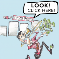
So – the real story is that clearer CTAs helped one business achieve more conversions. That’s great content, but a visual snoozefest.
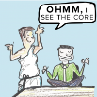
Peel back the geek-layers and find the ultimate core of the story. Once you have the most basic concept, find an engaging and parallel metaphor and tell a fun story. Just make sure that whatever metaphor you choose, it relates to your audience and is smartly engineered so readers can easily connect the dots.
Discuss the metaphor idea with your writers and ask if they can sprinkle some metaphor-flavored copy into the writing. This will ensure a spot in the winner’s circle.
 Don’t be so literal

No one likes a Captain Obvious, and if you thoroughly explain every concept, then you don’t have enough faith in your audience. Or, your metaphor just isn’t working and it’s back to the drawing board.
Your audience shouldn’t need to see a computer screen to know you’re talking about digital marketing. They shouldn’t need to see an actual chart, a CTA button or search bar for them to understand the concept that you’re talking about. Trust that your audience will follow along and have incentive to do further digging if they want more information.
 Keep it simple

Details help tell a complete story, but they can quickly become too much for a single graphic.
In our story: Sea Biscuit slightly stumbled coming out of the gate, then found a spot on the rail and hugged it so sweet victory. His jockey had a ham sandwich for lunch that day (with light mayo, a pickle on the side) and listened to The Eye of the Tiger on repeat before the race.
These specifics create a better picture, but need to use discretion to make an effective visual. Including too much bombards your audience, makes for an ugly graphic and causes readers to think you’re not confident about your idea.
Create a fun snapshot that highlights only the most important points, which will intrigue and pull your audience into the story.

Be true to your branding
Whatever your concept, be mindful of your current branding and stay within the style guide.
This means consistency and repetition. You’re not being boring if you’re using the same brand colors and elements continually, you’re creating a strong impression that will resonate with your audience.
It’s absolutely okay to stray from the exact branding when working with a fun theme for a project, but there must be something that still ties into your brand’s identity. You wouldn’t recognize a jockey if he’s wearing a cowboy hat. Consistency builds credibility.
Turn what’s basic into something interesting
So the bottom line here is learning how to pull the valuable core from your content and place it onto an engaging and powerful stage. It takes a of big thinking to finesse perception versus reality on such complex subjects.
How do you make your casual jeans and a K-cup brew feel as exciting as a statement hat and mint julep? The answer is to have fun, think simply and let the meat of the content to handle the rest.