Hi there fellow web marketers. Press play on the video, or scroll down to read a written transcript.
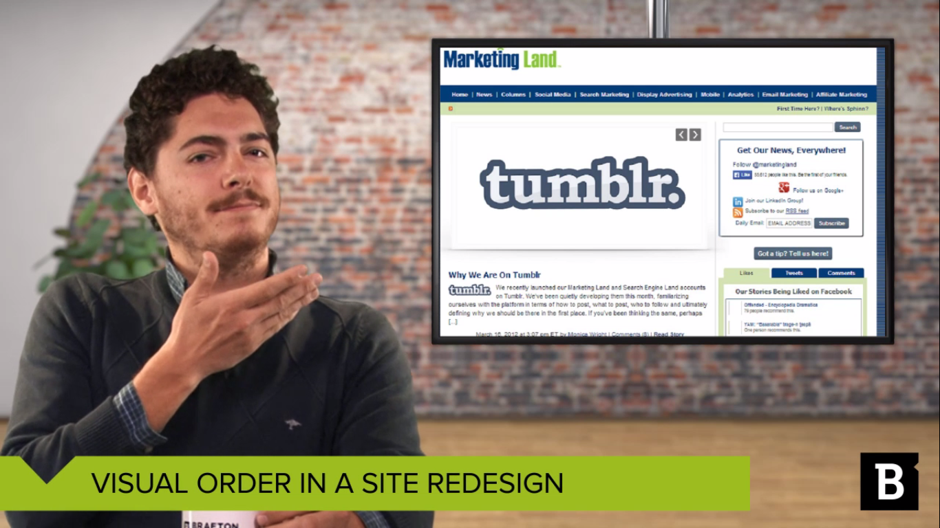
Take a good look at this website. If your reading habits are anything like mine, I’m sure you follow Marketing Land very closely. So when their site layout switched from this…
…to this, it was hard to miss. They took a gamble on the importance of visuals in content marketing. And I think it’s going to pay off. Let’s look at what they’ve done. First and foremost, they’ve gone all in on emphasizing visual design. With all due respect, the new layout is more attractive. But that’s not all that’s going on.
What’s the biggest and therefore dominant part of this page? The most recent headline. There’s no mistaking it. It takes up half of the space above the fold, and it can even fit a little extra description to draw readers in.
This design also manages to get three headlines above the fold. The hierarchy here is clear: Read the biggest one first, and then move on to these less recent stories.
Want to learn more about user experience? Download our UX eBook
Here’s an example you might be more familiar with. Remember what Yahoo used to look like? There isn’t much of a hierarchy. You’d have to go through every single pixel with a fine-tooth comb to know what was most the most important.
Now look at Yahoo. They’ve clearly figured out how to organize content. You can see that recent stories get precedence, and visual cues help direct people to the right spots on the page.
You should use these kinds of visual cues to point people to content marketing materials that count the most, like popular articles, high-investment graphics or assets behind a download wall that generate leads. This means that some content will get more emphasis than others, but that’s OK.
Ultimately, you want to divvy up visual weight based on your business objectives. If your primary goal is readers and thought leadership, then go ahead and take a page out of Marketing Land’s book. On the other hand, if you want to collect leads and drive conversions, consider giving your calls to action more visual oomph.
Seen any great site redesigns? Let us know in the comments below, or by tweeting @Brafton.
I’m Alex Butzbach. Thanks for watching.