

Inspiration is like the snow leopard. You may never see it if you don’t go out looking for it.
Fortunately, the internet exists. And you can Google things like “content marketing inspiration” or “clever digital marketing campaigns” or “content marketing examples” when you’re experiencing a creative drought.
And if that’s how you got here, then you’ve come to the right place, because this blog post is all about great examples of content marketing that inspire us to do better. If you were actually searching for “snow leopard,” we don’t want to disappoint you either, so here’s not one, but two snow leopards:
(Disclaimer: There will be no more snow leopards in this post.)
With that, we can move on to some examples of really great content marketing. Here they are, categorized by content type, but in no particular order:
Blog content
John Deere – “The Furrow”
John Deere has created one of the best B2B content marketing blogs we’ve ever seen. They write about the subjects their potential customers care about – soybean crop pests, livestock, tractors, rain – in smart, interesting and, at times, beautiful ways. In one of their more recent posts, “Let it Rain,” Dean Houghton does a lot of things right:
- He breaks up the copy into sections using boldface text.
- He quotes Walt Whitman in his introduction.
- He includes original photography that’s contextualized with image captions.
- He supplements the title of the piece with a snippet to introduce the topic.
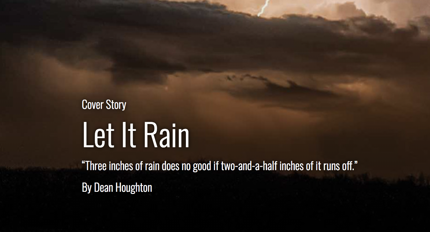
This is top-of-funnel B2B content marketing at its finest. The content is relevant to the company’s target audience, and the blog finds interesting ways to create new and original copy that’s on subject (see “Telling Tractor Stories”).
This is also a great example of content that generates off-site results. John Deere has created a blog that people will actually want to read. Every time that blog links back to the company’s website, Google interprets it as a sign of authority. TL;DR: you’re doing yourself a solid for SEO.
Square – “Town Square”
You know those little squares that plug into a smartphone’s headphone jack so you can swipe cards? What if we told you that the leading manufacturer of those squares (called “Square”) had its own blog. What could they possibly write about? Their product is literally a square.
Square’s “Town Square” blog is a reminder that the age of interruptive marketing (aka in-your-face promotions that make you stop what you’re doing and pay attention) is coming to an end. Square’s utility is readily apparent: It turns your smartphone or tablet into a point-of-sale system. And rather than talking about that value proposition in 50 different ways, over and over again, they decided create blog posts about topics that are important to their target audience: small businesses.
Take the example of “Are You Selling Enough Every Day? Here’s How to Know,” which helps new business owners figure out how they’re doing in the early days. Useful, direct and relevant.
Additional kudos to Square for using social icons to make their content easier to share, and also for creating custom imagery in their copy.
Social Content
MailChimp (Instagram)
MailChimp, for those who don’t know, does a lot more than just post stop-motion videos of monkeys. They’re an email automation platform that we’ve surely referenced a time or two before on this blog.
And while that might not be readily apparent based on their Instagram feed, what is apparent is that the company values creativity and individuality. In other words, their Instagram posts are all about brand awareness, For example, this video of baby ducks singing has seemingly nothing to do with anything:
But they are swimming over a MailChimp logo. Sometimes, branded content is less about the specific message, and more about the impression it leaves. And while a video of ducks might not belong on MailChimp’s blog, Instagram is a pretty good venue for this type of fun, branded content.
Adobe (Instagram)
We expect interesting visual content from Adobe’s Instagram feed because, well, they’re Adobe. Instagram is a place where people post cool photos, videos and other visual content, and Adobe is a brand that’s all about helping people create cool photos, videos and other visual content. It just makes sense.
So, for example, people get the point when they see a stop-motion game of the popular retro video game, Snake, reenacted with what appears to be Gushers fruit snacks.
But just because they can, Adobe also added an element of timeliness to its posts. Like this one in recognition of World Environment Day.
Branded social media content for the win.
Eventbrite (Twitter)
Facebook Advertising 101: A Cheat Sheet for Event Organizers: https://t.co/a4TkL9MRjE #eventprofs pic.twitter.com/kzRdMUQo1Z
— Eventbrite (@eventbrite) November 9, 2017
Eventbrite’s Twitter account is a lesson in “keep it simple, stupid.” They don’t do anything over the top. They curate good content from a variety of sources that they know their audience cares about.
What’s more, they use custom illustrations graphs and photography to accompany their Twitter content. And guess what? It works. Eventbrite has some 273,000 followers and counting.
Here’s to being simple but effective.
General Electric (Snapchat)
It’s admittedly rare that you’ll see B2B organizations use Snapchat stories in their content marketing strategies, but not altogether unheard of. The platform has some 178 million daily active users, after all – and General Electric has taken notice.
As you likely know, General Electric has a hand in just everything from national defense to your refrigerator. They also deal with gas turbines, and in case you needed proof, here’s a snap from one of their employees showing as much.
This is another simple but cool concept. Let’s face it: It’s not always clear what GE does, but you see their logo everywhere. By showing an employee at work, we suddenly have a face and a voice to put to the company, as well as a demonstration of the kinds of things these real human employees work on.
In other words, good job, GE. Your Snapchat story makes you a little less faceless and a little more human.
Video
Volvo Trucks – “The Epic Split”
This may just be our single favorite B2B content marketing asset of all time. It features Jean-Claude Van Damme, everyone’s favorite Enya song and of course, a split so epic that it makes the Golden Gate Bridge wonder what it’s doing with its life.
Functionally, this is also a superb example of video content marketing. Volvo has created something entertaining and impressive that also clearly illustrates the value of their products.
All around satisfying.
Dissolve – “This Is a Generic Brand Video”
It’s always interesting when we see a brand sort of poke fun at itself. That’s exactly what Dissolve does here. Because even though it’s riffing on the “generic brand video,” it does so using the very stock footage that the company sells to its clients.
But here’s the thing: Before I saw this, I had no idea that Dissolve existed. And now I do. In other words, they’ve created something that improved brand visibility, and likely drove up click-through rates, too. Two million-plus views is nothing to thumb your nose at, after all.
Note: A simple but effective way to create original branded content is with a how-to video that answers a very practical question. They might not have the razzle-dazzle of what Volvo and Dissolve have done here, but they can be produced on a lower budget, and provide a lot of bang for their buck.
Ebooks & white papers
AlienVault – “Insider’s Guide to Incident Response”
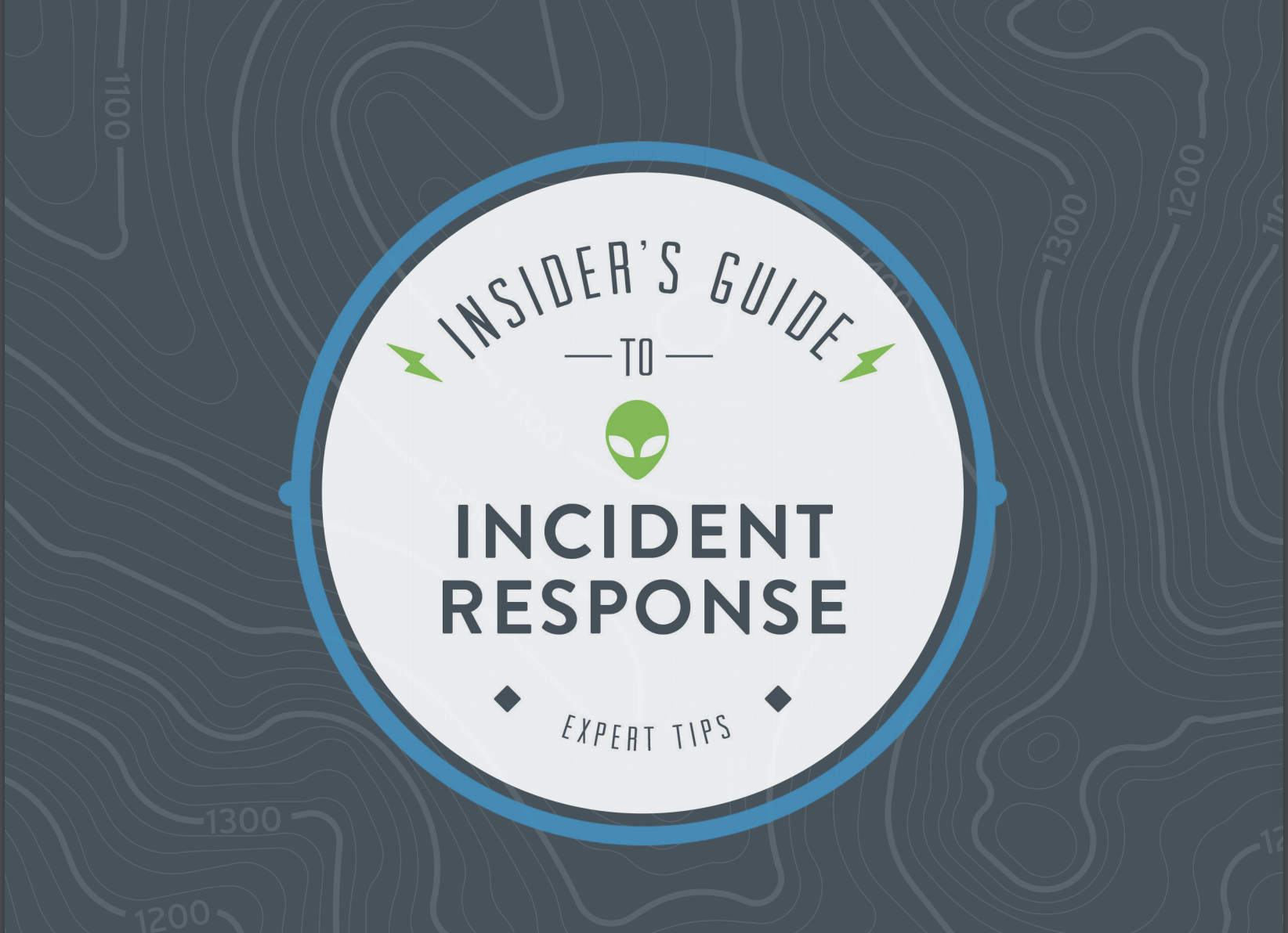
The concept of an “eBook” in content marketing can be admittedly amorphous. Everyone seems to have a different idea of what it is. But the simplest way to think of an eBook is as textual marketing document that uses branded imagery to help tell the story.
So for instance, in 48 pages, cybersecurity vendor AlienVault doesn’t use a single stock image. Instead they incorporate plenty of highly-stylized iconography, along with charts and graphs, all of which accompany a story told through text. The layout is polished, not overly stiff or two dimensional, and it just has a fun feel to it. All of these attributes, paired with informative copy, make this is a killer example of an effective eBook.
And while this particular document is on the longer side at 48 pages, bigger isn’t necessarily better. What’s important to take away from this asset is the creativity and liveliness of it.
IBM – “Better Outcomes with IBM Big Data & Analytics”
White papers are generally less visually lively than eBooks, and tend to be more text heavy. The reader’s focus is meant to be on the ideas or the technical aspects of topic.
So while the design work and formatting on this IBM white paper is less audacious than say, AlienVault’s eBook, the content is rich with information and thought leadership, which is exactly what many technical decision-makers are looking for.
Many CTO or CIOs will also appreciate the unassuming character of this white paper. Because it’s not as heavily branded as an eBook, decision-makers will detect less of a marketing motive, and may be more inclined to read through the entire asset.
Infographics
LinkedIn – “Well-Balanced Blog”
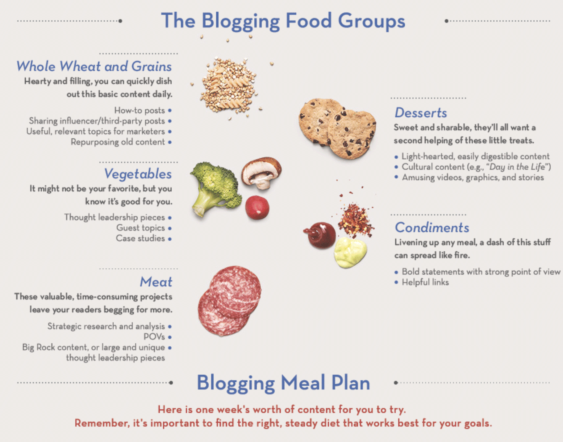
This appetizing infographic from LinkedIn does three things exceptionally well:
- It parallels a subject that the reader may not know a lot about (creating a well-balanced blog) to something that they can easily understand: A balanced diet.
- As you’ll notice going deeper into the infographic, it uses the visual cues introduced early in the asset to convey information using no words at all later on, which is incredibly impressive.
- It’s just beautifully designed. The right amount of white space here keeps it from being cluttered, while the food photos add dimension to keep it from feeling flat.
There’s just so much to learn from this.
Marketo – “Virtual Reality: A Fresh Perspective for Marketers”
So the obvious aspect of this infographic is the iconography moves. It’s not exactly an interactive infographic because you can’t actually interface with it. Nevertheless, it feels like an experience because of the animation.
It’s also an appropriate use of moving images given the subject matter, virtual reality. In other words, the animated aspect isn’t just a gimmick. It feels like it belongs in this particular asset.
Case Studies
Cisco – “Sydney Harbour Bridge Case Study”
Every great case study does three things:
- It relies on the voice of real people, whether that’s an actual voiceover, as is the case in this video case study, or quotes baked into the copy of a written case study.
- It tells a story in a sequential manner starting with a problem, moving into a solution and then closing with the benefits, potential benefits or results.
- It uses visualizations to complement that story. In this case, the story is told entirely through voice over, and complemented by video footage.
A case study could just as easily be a formatted, written version of this video script with photography and images to accompany it.
If you don’t have the budget for a video case study, or the subject matter doesn’t lend itself well to that medium, you can still bring a compelling use case to life with strong writing and good complementary visuals.
Email marketing
Dropbox
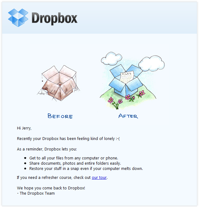
Ah yes, the classic “reminder that we exist” email. It’s generally good practice to send these out during periods of inactivity among your existing clients. It’s even better practice to keep them simple enough to load well on any screen, but also engaging enough to be worth the recipient’s time.
This particular email marketing effort uses custom illustrations to get a point across and pique the recipient’s interest. It doesn’t try to do too much; rather, it does just enough. And really, that’s the point of email marketing. It’s easy to get carried away with crazy ideas to increase click-through rates or drive the target audience to action.
But remember: Your target audience only has so much time in the day, especially a B2B audience.
Canva
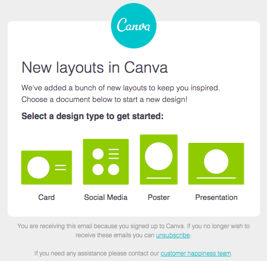
Here’s another example of a well-assembled email. Unlike the Dropbox example, this one starts with text and closes with iconography. The header is direct, which is good for click-through rates, and the copy in the body of the email is very clearly leading up to something.
That something is a set of clickable calls to action that are also simple visualizations of the very thing the email is about: new design templates.
Genius.
In case you’re still not feeling inspired …
Give it a minute. It’s better to sleep on an idea than to spend time and money executing on something that feels forced or uninspired.
And if that doesn’t work, maybe you just need a kick in the pants. So here’s Shia LaBeouf reminding you to DO IT.


