

Every CTA button can be linked to ROI — if it’s good enough.
Through effective CTA marketing, emails are the backbone of your inbound marketing strategy, and they can be deployed at every stage of the sales funnel.
Few content types are so versatile, so it makes sense that a generic CTA won’t move the needle. Marketers need to engage their reader audience and propel them toward a desired action — all it takes is a successful CTA.
Let’s explore how to do just that.
What is CTA marketing?
CTA marketing is the use of optimized phrases and design to generate an immediate response from readers. By using an action phrase on clickable CTA buttons, marketers can accomplish a number of key objectives, like increasing subscriptions, setting up customer demos or improving website traffic.
CTA theory: How the brain works (and your marketing should too)
The CTA is how you seal the deal. It’s the home-run hitter of your emails.
And its effectiveness can be traced back to simple visual cues the human brain picks up on. So, CTAs are just as much brain experiments as they are marketing tools. Here’s why:
- Human attention spans are less than 8 seconds.
- The brain processes visuals 60,000 times faster than text.
- Up to 90% of information absorbed by the brain is visual.
These physiological facts can be easily transferred over to your marketing campaigns. In addition to email marketing, CTAs factor prominently on social media, in blog posts, on conversion landing pages and for downloadable assets like case studies, eBooks and white papers.
CTA marketing fast facts
The numbers on CTA marketing are quite astounding, yet it’s safe to say companies are not placing enough investment in click-through rate optimization.
Consider:
- Placing CTAs on company Facebook pages can increase conversions 285%.
- Adding CTAs to articles proved to increase one-month revenue 83% for one of our clients.
- Dependent upon branding, orange and red CTAs can boost conversions 32.5 and 21%, respectively.
- CTAs shaped like buttons spur clicks by 45%.
- Personalized CTAs convert 42% more than generic ones.
- Email CTA buttons (rather than just text/link) increase conversions 28%.
Click-through rates on email CTAs: Why they matter, and what you may be missing
Click-through rate is the percentage of users who click on links within your emails.
This means they were intrigued enough to open them in the first place (open rate) and found an element of an email enticing enough to want to learn more.
The average email open rate is about 15 percent, but the average email click-through rate is just 3.2 percent. So the impetus for marketers is to format their emails in a way that drives up CTR even if open rates remain static.
CTR provides much more insight into audience intent than a more surface-level engagement metric like open rate, and based upon this information you can refine subsequent email marketing campaigns whether they be nurture, drip, newsletter or standard promotional outreach.
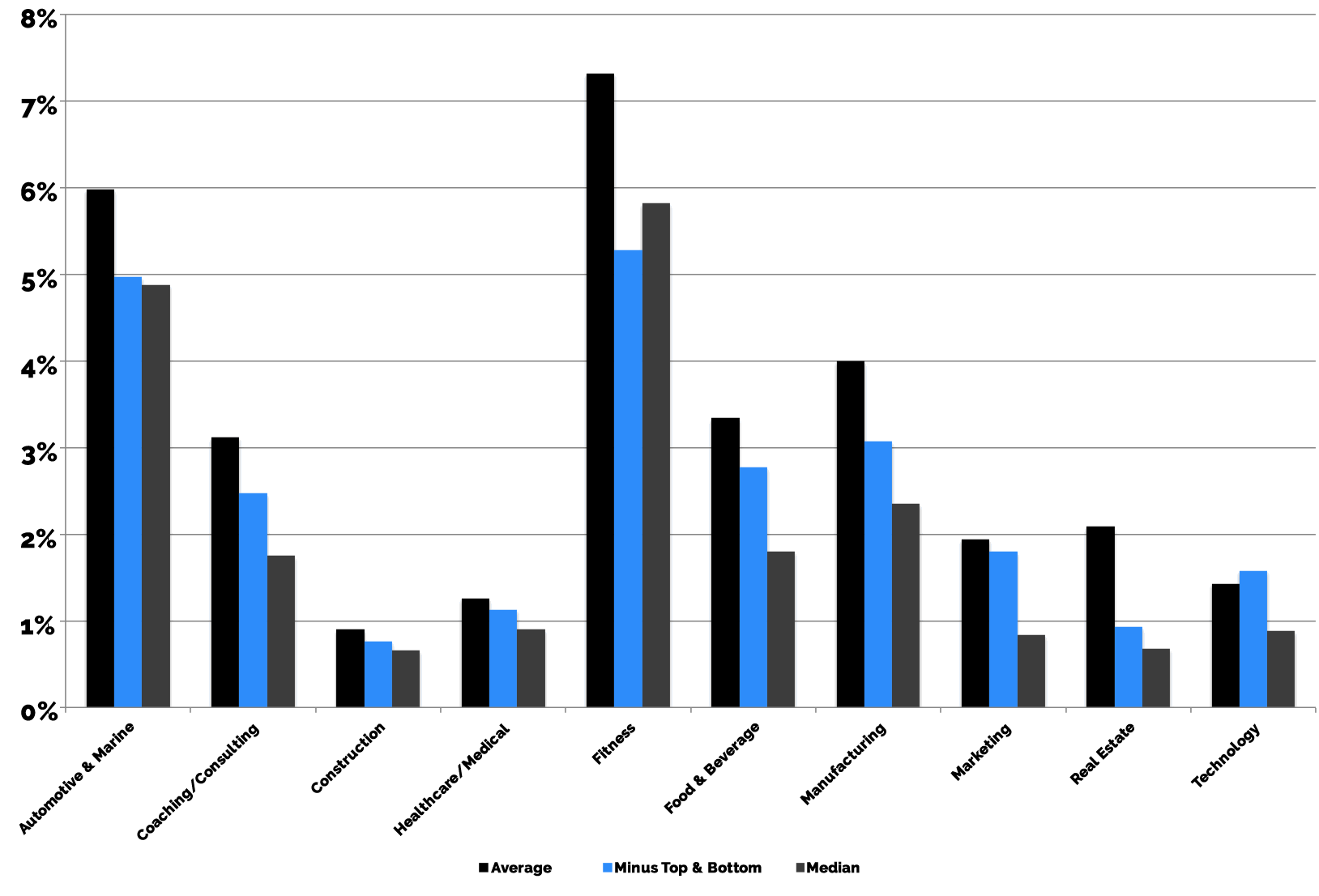
And this holds true across every industry. Here’s a look at CTR by economic sector:
A CTA’s core function is to provide a singular outlet for readers to engage with you, which it accomplishes by directing users to a specific page on your site, often a conversion landing page for middle- or bottom-funnel content. If it’s not being clicked, it isn’t working.
Though CTAs often appear at the end of emails, they shouldn’t be considered afterthoughts or even the final piece of the puzzle: They are the sole reason for the email in the first place.
Applying conversion rate optimization best practices to your email marketing campaigns
Increasing CTA click-through rates boils down to several fundamental practices that every marketer can utilize starting today.
Many of the same methodologies that apply to conversion rate optimization can be used specifically for email CTAs. Those include:
Placement
Email CTAs most often appear in the top third, and in general, you want to cut to the chase pretty quickly. Do not bury CTAs in the middle of your body copy or slap them on just before your email signature.
Verbiage
When you can, go shorter. The key is to be concise, use action verbs like “Get,” “Buy” or “Start” and opt for second person voice. Your button text carries a lot of weight.
Color
For the most part, CTA color should be dictated by your overall brand guidelines. Clashing colors is an immediate optical turnoff, so don’t go for the visual wow factor without matching CTAs to your branding. About 50 percent of companies use the exact same color for their brand logo and their CTAs, which, most often, is blue. Anecdotally, companies have seen success using orange and red CTAs, as these colors are brighter and more dominant on a screen.
Shape
CTA buttons perform best when they are rectangular with rounded edges. Humans naturally avoid sharp corners, and the subtle rounding of CTAs forces the eye inward toward the text on the CTA. Known as a “soft rectangle,” our brains process them faster than sharper, edgier shapes.
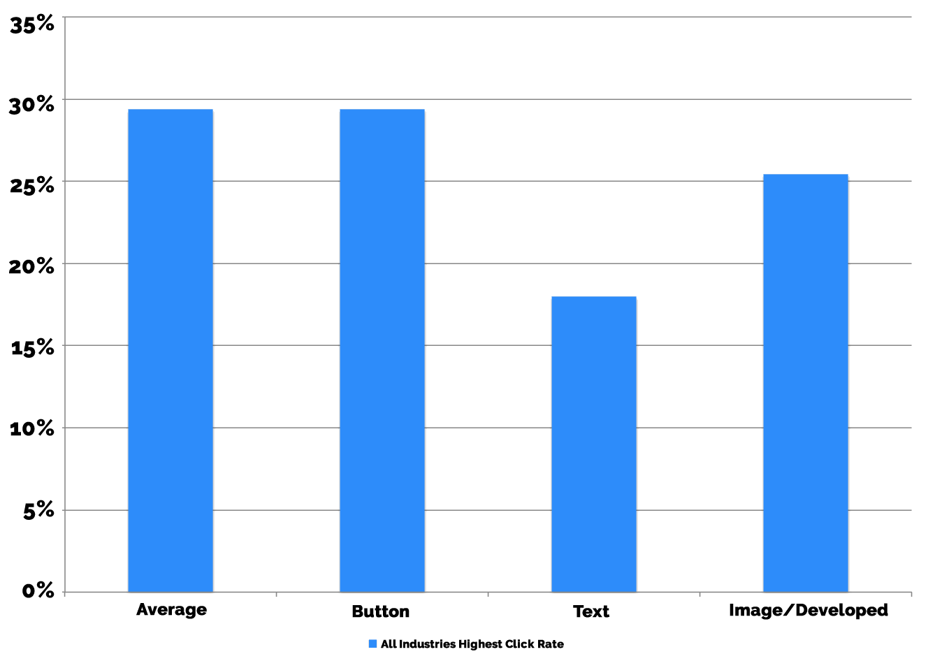
While CTAs can technically be a simple text link, those tend to perform worse than CTA buttons or even more complex image-based CTAs that require coding. Broken down by click rate (not click-through rate), we see buttons work best:
Urgency
Your email subscribers are by definition more qualified as leads than the average visitor to your website. They are subtly further down the funnel than traditional first-time web leads and, as we mentioned before, are inundated with emails each day. CTAs should convey urgent messages that encourage quick, decisive activity. To do this, add restrictions, action phrases and items of exclusivity to your wording, such as “Half off for today only!,” “Free trial for a limited time” or “Download now for VIP access.”
Size
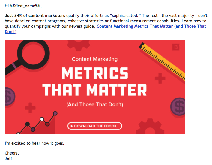
CTA size may vary slightly based on how it renders within users’ inboxes. As a general guideline, email CTAs are typically between 47 and 50 pixels tall. Thin CTAs that scale to the full width of the email (like a banner) are rarely used anymore, and most email marketing tools use default CTA templates that are 47 pixels tall with 20 pt bolded font. However, at Brafton, we’ve found success using a 600 pixel CTA on mobile which renders as a large, rectangular shape on desktop. See below:
Frequency
The use of CTAs should always serve the end goal: a click. But that doesn’t mean using multiple CTAs within the same email. In fact, the opposite is recommended. Each email should be sent with one clear purpose, with one direct CTA to push readers onto the next step. About 17% of brands place the same CTA several times throughout individual emails, though the majority (56%) opt for a “one email-one CTA” model.
Emails should be as frictionless as possible.
If I as a reader have to wade through several paragraphs of text, consume several different font sizes and color schemes, question the motive of your email or hesitate to understand what to click on (The many hyperlinks you used? The 3 clickable CTAs you embedded? The reply button?), I’m out. Within seconds. Maybe even faster than that. Nanoseconds. I hate emails.

Use your email analytics platform to track CTR and optimize accordingly. More advanced optimization techniques may include using heat-mapping, live experiments and A/B testing to determine how impactful your CTAs are and which components of your emails can be adjusted for greater CTR.
Subscribe to
The Content Marketer
Get weekly insights, advice and opinions about all things digital marketing.
Thank you for subscribing to The Content Marketer!
The latest in email design
Email automation and analytics tracking are becoming more sophisticated, allowing content marketers to better understand their audiences, prospects and high-value leads.
But front-end optics are also undergoing change. In 2018, some of the more prominent email design trends are finding their way into newsletter templates, promotional offers and other forms of marketing campaigns. Think:
- Human-centric messaging and imagery: Using first-name greetings, human senders (rather than company) and topical photos.
- Interactivity and content diversity: Embedded animations, quizzes, rating systems, etc.
- Simplistic text: Text still plays a huge role, as a growing number of email recipients can snuff out salesy emails if there are too many colors or images. Short, direct copy without bells and whistles works.
- Enhanced visuals: Custom illustrations, .gifs, emojis, etc.
Great examples of email marketing CTAs
Some of the best email marketing is happening right now. Yes, RIGHT NOW!
Here’s evidence from both B2B and B2C brands:
Airbnb: “Discover hosting”

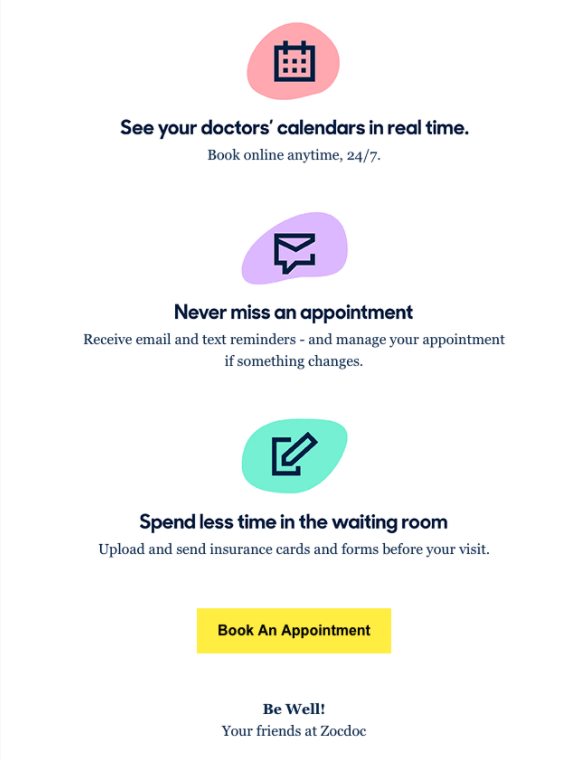
Zocdoc: “Book An Appointment”
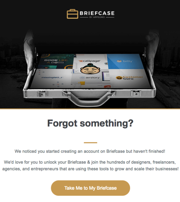
Briefcase: “Take Me to My Briefcase”
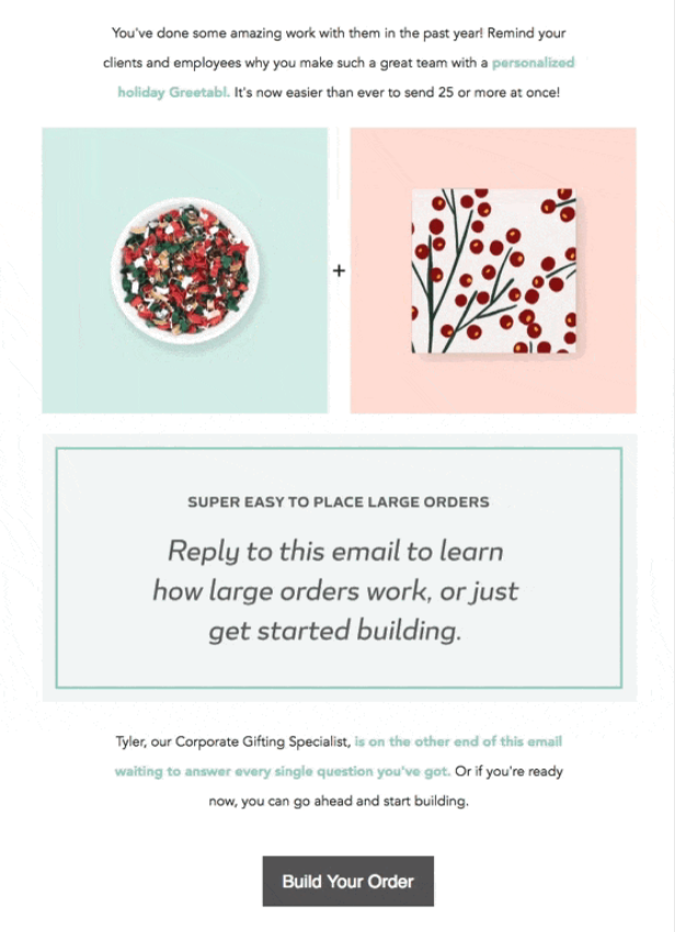
Greetabl: “Build Your Order”
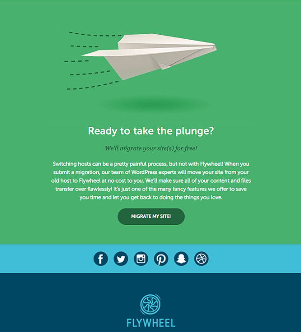
Flywheel: “Migrate My Site!”
What are some of your favorite CTA marketing techniques you’ve seen this year?
I’m listening.
Editor’s Note: Updated May 2021.