“Every organization has an identity, if not by plan, then by default.”
Those words came from the late Malcolm Grear, internationally renowned design educator, holder of more honorary doctorates than you can shake a stick at, and creator of some mighty fine logos. In essence, he was saying that organizations that fail to design identities will end up with consumer-designed identities they might not like.
“Visual marketing creates an identity for your business,” said Brafton Design Director Ken Boostrom. “If you’re not making proper use of graphics and video and UX, you’re still creating an identity. It’s just not a very good one.”
While there’s no shortage of design elements to take into account, your logo is the obvious place to start. If branding leads to recognition and trust, your logo design acts as that first firm handshake that puts customers at ease.
“Everyone’s selling something, even if it’s just themselves,” Ken said. “The first priority of a logo is to identify: Who are you?”

Answering the big question
“Who are you?” is a deceptively complicated question for logo design to answer. How’s a single symbol supposed to encompass an organization’s goals, values and history?
Fortunately, designers have a roadmap to get them started.
While Hollywood may portray many artists as id-driven virtuosos who are struck with inspiration in a passionate yet messy display of acrylic paints, a much more rational approach exists:
- Explore.
- Plan.
- Concept.
- Implement.
- Evaluate.
“Step one is gathering any examples in your field of expertise,” Ken said. “For instance, if you’re a bank or credit union, you’ll look at other financial institutions. Collect all the visuals that surround you in your industry and ask yourself, ‘How do these other brands position themselves?’”
Ken recommended sticking to a predetermined timeline during the exploration stage.
“If you don’t give yourself a time limit, you’ll get lost,” he said. “There’s no shortage of visual marketing you can collect.”
After you figure out what your competitors are saying about themselves, it’s time to determine how you will differentiate.
“Line it all up and categorize it,” Ken said. “What do you like? What don’t you like? What is being done that is working and why? From there you can start planning your own design.”
It’s vital to consider where the logo will be used and how. Whether it’s a corporate logo or a design meant for product packaging, it will likely be recreated in multiple sizes and formats, from vehicle signage to digital assets.
At the same time, you can’t lose sight of your logo’s No. 1 job: Identifying and signalling your area of expertise.
Concepting means creation, when designers put their bright ideas to work. Sketches are examined and tested from every angle. It’s here the best-laid plans may go awry.
For example, some designers may be tempted to put imagery and type too close together, or worse yet, mix icons in with letters.
“It never works,” Ken said. “When you reduce the size, it becomes illegible. It all falls apart. You should aim for clean and simple – something that will work in all sizes and in different formats. From a coffee cup to a pen, it’s got to work everywhere.”
Once a selection is made, implementation begins, with the logo going into production and released to appropriate vendors. From there, it’s a matter of evaluating the results.
“From a coffee cup to a pen, your logo design has got to work everywhere.”
Singing the praises of symbolism
It’s easy to underestimate the power of logos.
According to researchers from the University of Southern California Marshall School of Business and Imperial College London, symbols used as logos beat out brand names when it comes to creating an emotional connection with consumers.
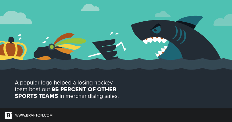
Look no further than the San Jose Sharks for proof of concept. Even non-hockey fans are likely familiar with the Sharks logo (it’s not every day you see a shark chewing through a hockey stick). A year after introducing it, the Sharks had the highest licensing revenues of any team in the National Hockey League, to the tune of over $100 million. Not only that, they outsold 95 percent of all other sports teams (including football, baseball and basketball) in terms of merchandising. All this, despite having a losing record at the time.
Logos aren’t just an artistic decision, they’re a financial one. People are drawn to visuals that resonate.
“You need two things for a successful logo: what the client wants to say and what the audience wants to hear.”
Getting it right
Following the scientific method to create a million-dollar logo is obviously easier said than done. However, the biggest obstacle may just be the people behind a brand.
“You need two things for a successful logo,” Ken said. “What the client wants to say, and what the audience wants to hear. That’s where you start. You have to get as close as you can to boiling down everything to an image and maybe a couple words.”
Unfortunately, brands sometimes fail to give the audience equal weight. They confuse themselves with their buyer personas.
This is especially troublesome in today’s digital age, when logos are everywhere, often stamped over each page of a brand’s website and content marketing collateral.
“People see before they read,” Ken said. “You better make sure what they’re seeing will make the right impact.”
No pressure, huh?
You can study the world’s top-performing brands for inspiration. You’ll see that 95 percent of their logos use only one or two colors, and that only 41 percent of logos don’t utilize imagery. But before you get hung up on fonts and the value of grayscale, remember the words of Malcolm Grear.
Your brand has an identity. Make sure you, and your logo, are the ones that define it.


