

Go take a look at your business’s Google Analytics and see what your website’s most visited pages are. Chances are, your About page will be in your top 10.
Ever since we were children, we’ve been told to stay away from strangers.
So when we’re working online in B2B, and interacting with businesses all over the world, we like to get to know the people and stories behind them. That’s the purpose of an About page. As soon as someone browsing your site decides they’re interested enough to get to know you, they head over there.
This makes it not only one of the most frequently visited pages on your site but also one of the most critical to the conversion process. When people decide to check it out, you can take it as a sign that they’ve found your marketing content to be compelling – that they’re getting drawn into your marketing funnel beyond a casual browse.
But despite its importance, most businesses sorely neglect their About pages. When was the last time yours got a refresh?
All too often, it’s thrown together based on boilerplate bios and description blurbs from that time you worked with a brand strategist. They’re usually written in B2B corporate speak, despite your company’s best efforts to have a distinctive voice, and the content is usually more focused on what the founders want to talk about than what customers want to know.
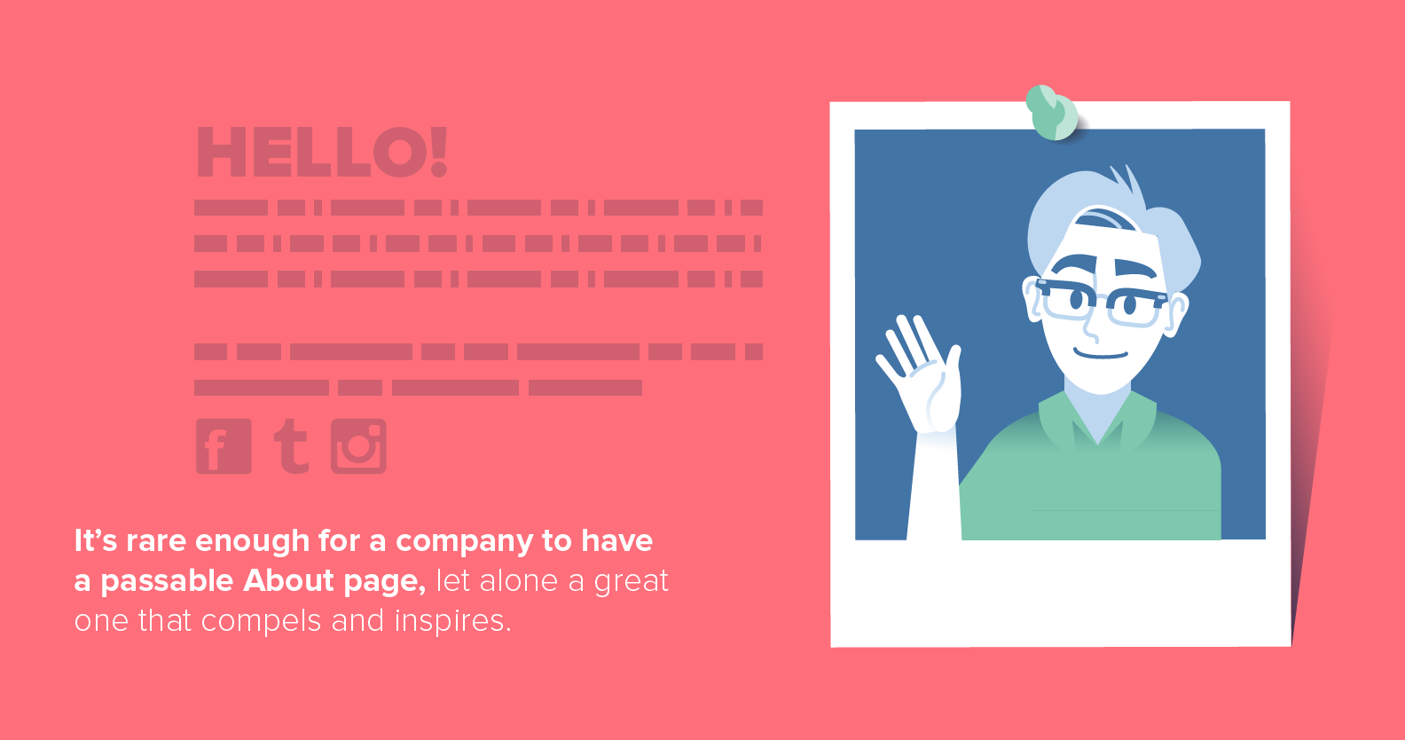
It’s rare enough for a company to have a passable About page, let alone a great one that compels and inspires.
The About Us page examples below manage to break the boring B2B molds and excite audiences:
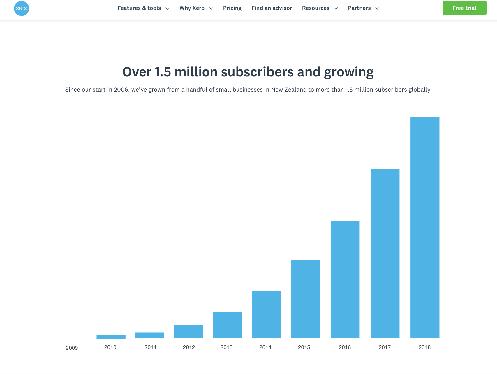
1. Xero kills the guesswork
First up, we have the About page for Xero, an accounting tool for small businesses. True to their accounting roots, their About page manages to be data- and numbers-heavy while still being more about their customers and story than accounting. It’s a great example of giving the reader the information they’re looking for in a way that’s true to the brand’s core value proposition.
From the first hero image, depicting a young woman working on her laptop in a stylish living room, the About page is customer-focused. It puts the spotlight on successful small businesses and the people that make them possible more than Xero’s own founders.
Customer-focused copy and data visualizations like the one above are supplemented with custom photography of their customers and team, for a more authentic connection than stock photos can provide.
The page tells the story of how Xero helps small businesses in many ways:
Hard growth data on their numbers of subscribers, partners and employees.
- Social proof numbers incorporated throughout, as well as a mention of their Forbes “World’s Most Innovative Growth Company” awards.
- Real customer stories using a featured testimonial section.
Finally, Xero ensures their About page is a conversion-goal-oriented piece of content with clear CTAs at the bottom. There are just two, and both are based on the main reasons viewers might visit an About page: joining the team as an employee or becoming a customer.
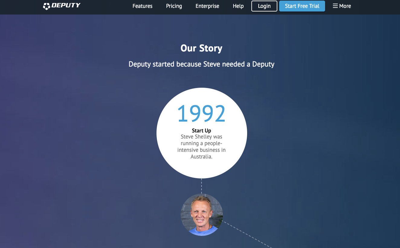
2. Deputy’s journey timeline
Next let’s look at Deputy, a workforce management and scheduling tool that finds a different but equally engaging balance of storytelling and numbers.
Deputy’s About page is designed in a full visual timeline format for the majority of the page’s scroll depth. They’ve summarized both why the founder started the company and how the company has grown since, in essentially a few paragraphs. Of course, they’ve also made sure to cite important stats like growing a previous business to 1,500+ people and Deputy’s customer base to 100,000.
The timeline format is a popular About page asset, and for good reason. It’s easily digestible and readable, so you can understand what a company is all about with just a quick scroll. However, you can learn more details about their leadership team, values and customers in smaller sections below the timeline.
Below the numbers-heavy timeline, the page takes on a more human feel, with photos of the board and territory managers. There’s also a background photo featuring customers’ employees so HR professionals viewing the page can potentially see their own businesses reflected back at them in the photos and stated mission.
3. HubSpot highlights purpose
HubSpot’s About Us page is an especially interesting example, because in addition to introducing their business and software, they also need to introduce the inbound marketing movement they helped pioneer more than 10 years ago.
The page starts off with a mission-driven video that explains how they define inbound business, marketing and relationships. Audience understanding of “inbound” is a prerequisite to understanding what HubSpot does or why they do it. The video is highly polished, meant to inspire the viewer regardless of whether they’re looking for new software, a new career or even a new stock to invest in.
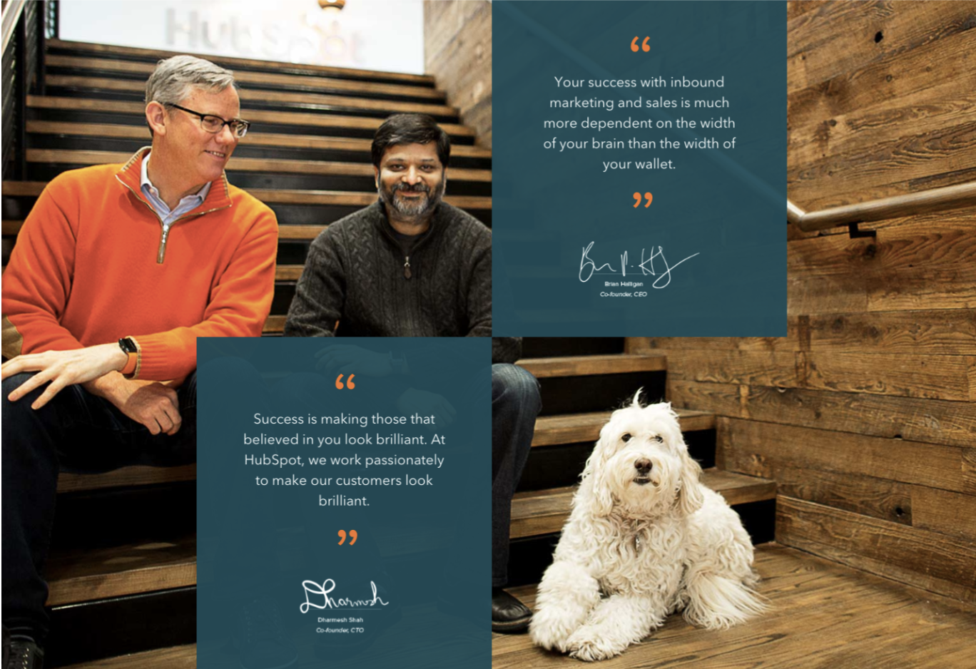
The rest of the About page follows the mold: professional while still feeling human and friendly. For example, one of the photos was likely taken on a professional set with a green screen, yet everyone in the picture is full of energy mid-movement, and one is wearing a banana suit. It’s a delicate balance of brand values that HubSpot handles well.
The page includes the brief story of how HubSpot’s founders met and went into business together before shifting the focus back to everyday employees and their customers. They explain the company’s “culture code” using a slideshow, and then showcase videos explaining each product.
HubSpot’s About page has a lot to accomplish, that’s for sure. It manages to do all of its jobs well by featuring multimedia slideshows and videos breaking down the information. This way the company can manage to tell its bigger story without overwhelming visitors with a boring prose-based narrative.
4. The people behind Airtable
Airtable’s About page puts the main focus on the people more than the product. The majority of the page’s content is dedicated to letting you meet the team. They don’t just highlight their executives, advisors and investors, but every single employee.
Here’s where it gets interesting: Updating the team member list at a fast-growing tech company would normally be an annoying chore. But instead of a static page that the company needs to add new people to, they’ve embedded an Airtable base that shows a gallery of employees that’s likely based off an existing directory updated for other uses as well.
It’s an incredibly clever way of subtly showcasing their product’s benefits – instead of talking about their product, they’re using it themselves and showing you how easy it makes aggregating information for any number of purposes.
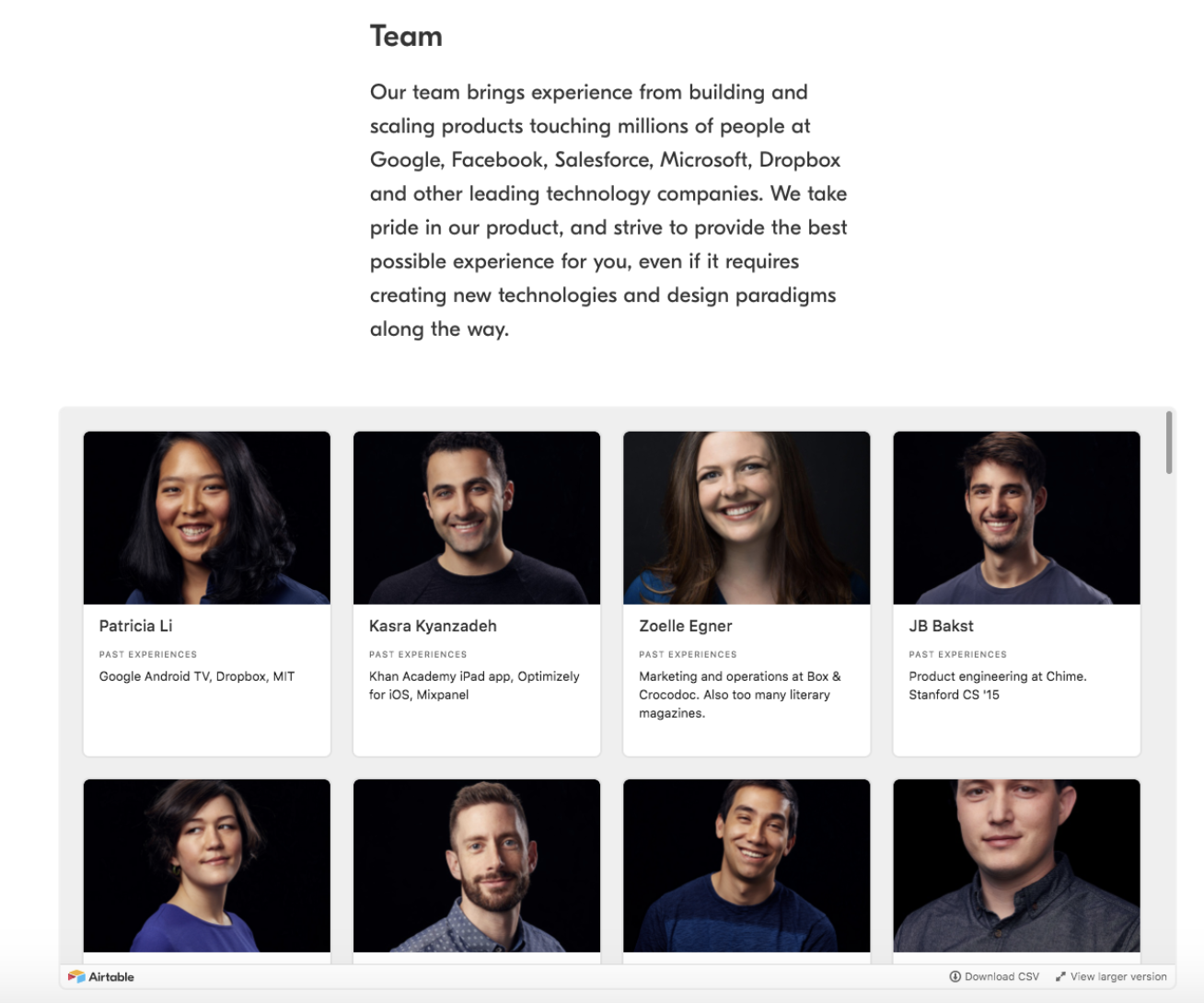
In addition to building credibility through the bios of their large team, they’ve also featured social proof in the form of usage statistics, notable customers and linking to a dedicated timeline of people praising them on Twitter. Once again, they’ve taken a common activity like cross-promoting social media profiles and put a unique spin on it.
One of Airtable’s strengths as a product is its fresh take on storing, handling and displaying information. Through their About page, they’ve proven that in several ways without necessarily talking about it.
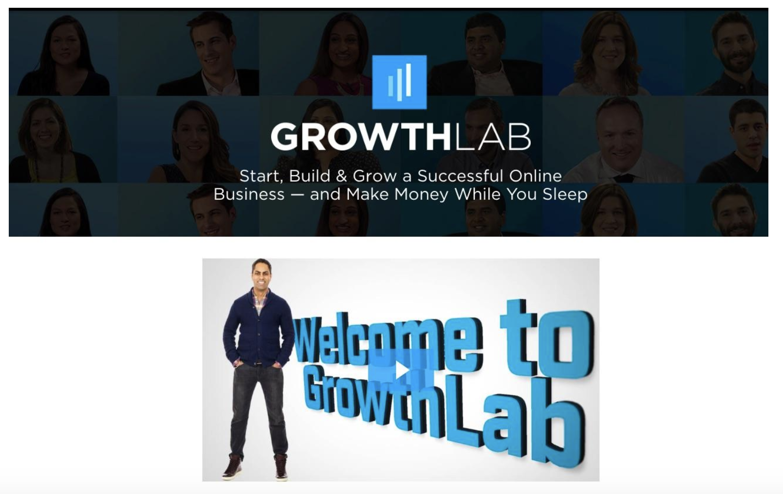
5. GrowthLab oozes expertise
GrowthLab’s About page is different from most of their other content. Known for their long-form content contributed by experts in the online entrepreneurship space, their About page relies on their experts to tell the brand’s story.
For example, the publication is owned and operated by bestselling author and thought leader Ramit Sethi, who’s great at capturing attention and inspiring an audience. So the About page simply lets him do that. Instead of a long timeline or story, when landing on the page you’re hit with a video front and center.
It’s only one minute long, and Sethi doesn’t share his own story – he jumps right into what he does best: motivate and inspire.
The written copy on the page follows the same theme as the video – it’s all about tapping into the reader’s emotions and making us want to dig into the site more. For example, the blurbs link to many of the site’s best articles within the copy before directing you to their different products. Those content pages, after all, are where you’ll become more familiar with the site’s in-depth resources, key to its primary value proposition.
6. The many pivots of Moz
Moz has a long story to tell for a SaaS company, having originated as an agency before gaining a global SEO industry audience as the SEOmoz blog in 2004. Moz embraces this rich history on the About page, not skipping any phase. Instead of focusing in-depth on just one or two defining moments, like starting the company, it walks you through a few key chapters from their story.
Through this written timeline format, Moz takes visitors on a tour through both the business facts like funding and executive changes, as well as the company culture. As a values-driven company known for its commitment to culture, they also needed to explain information like what “TAGFEE” is (Transparent, Authentic, Generous, Fun, Empathetic, Exceptional) and where the company name came from.
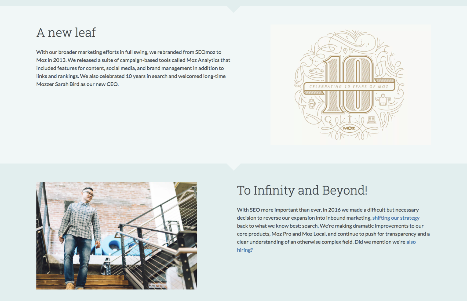
Rather than hard CTAs inviting us to check out different products and content assets at the bottom of the page, Moz has woven links to relevant content throughout the copy. This gives them the chance to teach readers more about claims to fame like Whiteboard Friday and company strategy without straying from the summarized chapter format they’ve chosen.
Moz is, of course, primarily a software company nowadays. But the Moz brand is bigger than that, and the About page trusts us to already care enough about their software that we’re mostly arriving on this screen to find out more about other aspects of their company.
7. All aboard the Zapier train
Zapier is another example of a company with branding that aims to inspire a movement in addition to explaining their software.
As a company whose mission – and product value proposition – is to use technology to make human jobs easier, they put the people front and center on their About page. Photos of their team are all over, from large group portraits to animated gif headshots of the entire team.
One thing their page does especially well is infusing the mission and core values into all sections of their copy, instead of only addressing each aspect in its own blurb section. Even when the main topic of a section of the page is unrelated to their mission or values, Zapier’s mission and values are still cleverly and implicitly present.
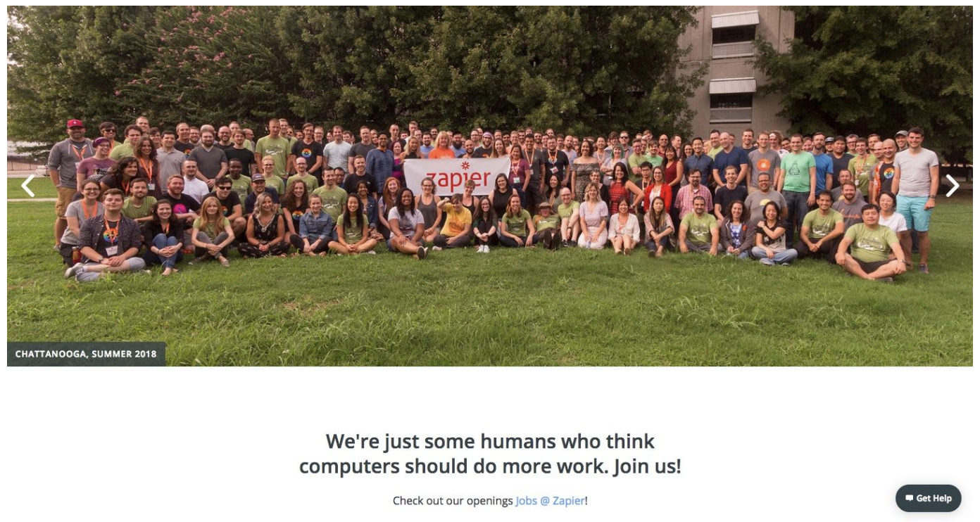
For example, their call-to-action to look at job openings is one place they mention their mission again: “We’re just some humans who think computers should do more work. Join us!” They also frequently mention their remote workforce, again reminding you of their belief in using tech to make human work easier.
8. INBOUND takes a stand
As mentioned above, HubSpot’s started and entire business movement, and it takes more than one website to spread and support that movement. The INBOUND website houses their spin-off events, media company and community, which includes their conference and related interview video series.
Since a main goal of the website is to further inspire business professionals to adopt “the inbound way,” primarily by attending a conference, the About page is focused on thoroughly explaining the thought behind the mission in a way that inspires.
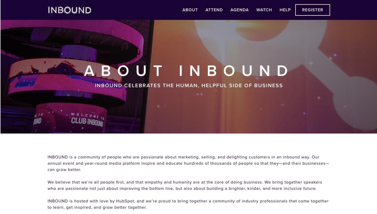
For example, they’ve got several power phrases like “building a brighter, kinder, and more inclusive future,” and “we’re all people first.”
To avoid espousing motivation with no credibility, the About page balances that with a heavy dose of social proof as well, mentioning numbers like the 24,000+ attendees at their most recent event and naming past marquee speakers like Michelle Obama and Gary Vaynerchuk.
9. Agente Studio’s how and why
Agente Studio is another values-first company that literally puts them first on their About page. While most companies would list what they do before why and how they do it, this company follows the popular Simon Sinek adage and starts with why.
Instead of going on about their technical skills and types of design and development they offer, the agency focuses on the end-user experience, which is what their prospective clients will care about most.

They talk about the emotions their clients’ users will feel, using powerful phrases like “surprises and impresses.”
In fact, after that, the page goes on to display the agency’s core values, completely skipping over all the technical jargon you would expect to find with a design and development agency.
10. The Copywriter Club goes copy first
Most B2B sites and media properties feature photography of people in business casual dress working at laptops or having fun in open working spaces and conference rooms. But when two pro copywriters who get paid to help brands stand out start their own podcast and community brand, you won’t get much of the status quo.
So on The Copywriter Club’s About page, you’ll find more images of dinosaurs and plants than whiteboards and tablets. But obviously, given the site’s founders, the copy is where this page really shines. It dives into the brand’s history, how the founders met and whom they work with – and have you hooked every sentence of the way.
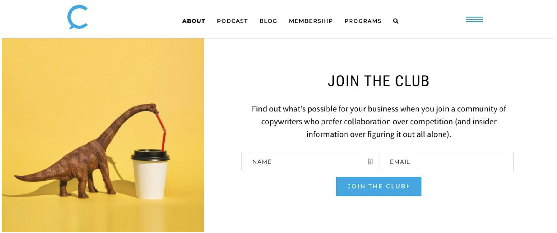
Immediately, they capture their target audience with something highly relatable to them: “Sure, you could respond to yet another job posting on Upwork, cross your pinky fingers and wait to be chosen.” And with bold headlines like “Did Kira and Rob really meet on Tinder?” and “I dig em dashes, ghost stories & asking good questions,” they hold your attention all the way to the footer.
With relatively short copy and just a few images, they convey clearly that they’re not like other business podcasts and media brands; they let their brand personality and conversational tone shine through.
11. Trello’s social proof
Trello’s About page is simple and straightforward, similar to their product. It tells their story in a no-fluff manner, through simple bullet points listing the most important moments in the company’s history.
But for the most part, Trello lets social proof tell the story. In addition to press and customer logos, which many other companies include, Trello goes further and publishes quotes from press coverage that explains the tool.
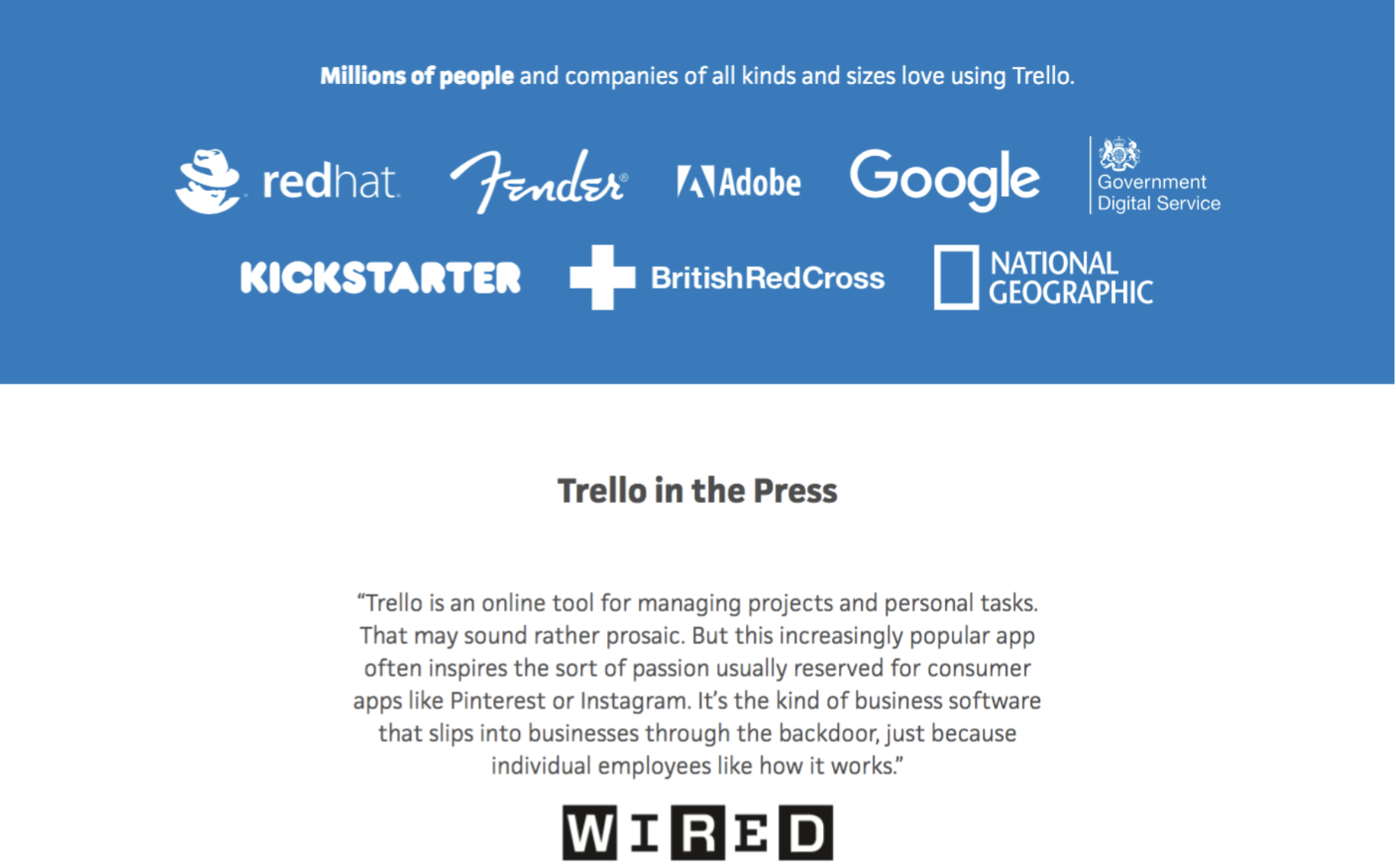
This lets them brag a bit more than they could get away with writing in first person. For example, they quote a reporter who wrote, “It reminds us of the early traction that Dropbox…and other apps up there had.” They likely couldn’t get away with comparing themselves to Dropbox on their own, but as a quote from an authority, it’s more reputable.
12. The empathetic feels at Content Grind
Please forgive me for tooting my own horn, but I do honestly believe that the About page for Content Grind, a content marketing community blog that I edit, is another example from a B2B content/media brand worth checking out. Our goal, like that of GrowthLab, INBOUND and The Copywriter Club, is to hook our audience through capturing and relating to them.
This is important with B2B brands that focus on topics like mindset, motivation and inspiration. Their target audiences are used to landing on a professional website and getting straight business advice.
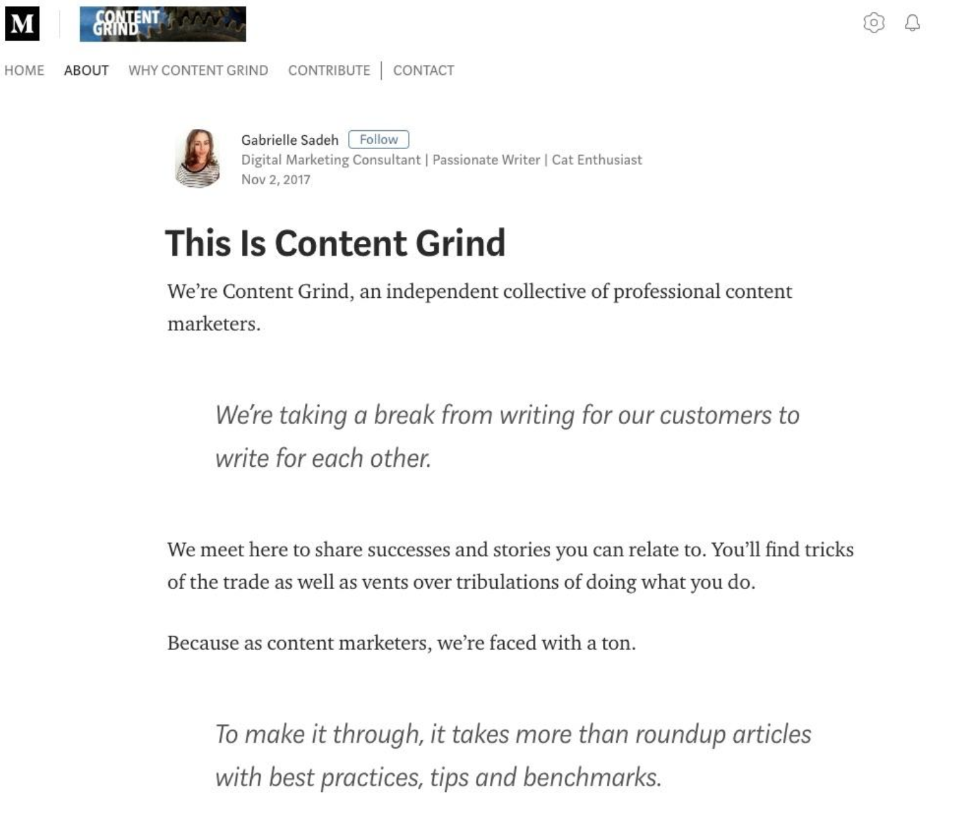
The quicker Content Grind and other brands can make themselves stand out and communicate their true missions, the more likely a reader is to stick around.
Readers won’t find the same types of articles here that they’d see on other content marketing-focused blogs, and they need to realize that to appreciate the brand fully.
Practice your handshake
Essentially, the About page is equivalent to a handshake when making connections for your business. It might seem small and unimportant, but it’s a crucial part of making an early impression that leaves people looking forward to your next interaction together.
And that next interaction is everything.