

The design of your blog page sets the tone for all of the resources you publish. A layout that’s cluttered, scattered or visually ineffective doesn’t paint the greatest picture. For a compelling user experience, it’s essential to create blog layouts that are user friendly, easy to read and aesthetically pleasing. By applying blog design practices that incorporate a clear table of contents, readers can quickly find the information they’re looking for and thus enjoy a more streamlined reading experience.
The combination of graphics, photography, text, SEO, UX and UI isn’t easy to pull off using only a free WordPress theme or page builder, either. From ensuring your brand identity is properly represented to leveraging responsive design principles and ample white space, there are multiple considerations that can help your blog stand out. Minimal blog approaches can showcase a clean design while supporting easy functionality.
So we scoured the web to find some of our favorite blog post design examples in an effort to provide some practical takeaways. Take a look! These blog designs demonstrate how to focus content for maximum impact, while adopting design and blog post strategies that emphasize clarity and purpose. Through a careful blend of clean minimalist aesthetics, user-friendly navigation and visually appealing features, each example aims to elevate the overall user experience.

1. Vox
Vox, an independent media company, leverages its primary brand color tactically throughout its blog page, beginning with its logo in the top left corner to the yellow CTAs and header highlighting.
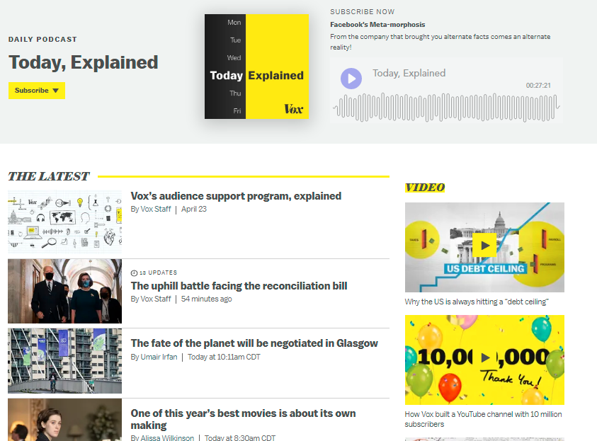
The use of a yellow border brings shape to the overall design as well, creating separation between content and white space.
Vox is also able to weave in various content types, alternating between articles, podcasts, display ads, videos, newsletter CTAs and sponsored content. Even the two-and three-column formatting, along with varying thumbnail image sizes, helps to add hierarchy and emphasis.
The company clearly tries to adhere to title length and meta description best practices. It also makes extensive use of question-based headlines and its well-known “explainers.” In total, these features lead to a well-structured, click-worthy and optimized page for both readers and search engines.
In its posts, Vox prioritizes a straightforward structure that makes it easy to view blog content and encourages readers to keep scrolling. With a design that seamlessly merges vibrant highlights and ample white space, Vox ensures a minimal blog post feel that still remains visually appealing. This type of approach also shows how design practices can blend creativity with clarity, resulting in a user-friendly layout.
2. MailChimp
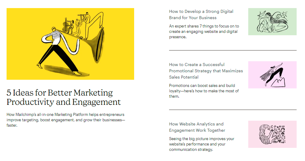
Leading email automation provider MailChimp fully leans into its brand image and illustrative design style on its blog page.
Using a muted palette of pinks, yellows, blues and greens, MailChimp pairs each blog post with a custom illustration, often in an abstract style. Its clean and accessible typeface also works well against prominent negative space.
One key page layout feature is the subdivision of content themes via H2 headers. In this case, MailChimp has categorized its individual blog posts under topics such as:
- How to make automations work for you.
- How to create on-brand designs.
- How to turn customer insights into actions.
With just a quick scroll, readers can understand what subject matter is featured on the company blog and choose a destination page that best suits their interests. Beneath this user-friendly veneer, MailChimp’s design and blog concepts revolve around strong brand identity and a consistent color palette. The company’s style is enhanced by eye-catching illustrations that immerse readers in an engaging user experience.
Their approach makes it easy to create blog synergy, enabling visitors to focus content on exactly what they need. Additionally, a well-tuned table of contents and distinctive blog elements could help visitors quickly filter out topics of interest, showcasing how main principles can be seamlessly introduced. By pairing each minimal blog post with unique imagery, MailChimp effectively captures attention and delivers a clean design that resonates with its audience.
3. QuickBooks
The QuickBooks resource center promises “resources to help start, manage and grow your business.” And, true to its word, there are plenty of guides, listicles and tutorials to help budding business owners understand the core concepts of entrepreneurship.The accounting software firm covers a lot of ground on a wide range of topics, all closely related to every phase of business a reader might need to know. These include taxes, planning, expenses, how to do payroll yourself, technology and much more.
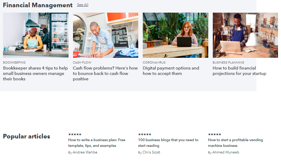
With content laid out in rows and the use of a consistent set of four image tiles, the QuickBooks blog is simple and comprehensive at the same time. The company also uses a star rating system to spotlight popular articles, enticing new readers to dive into trending, practical content backed by social proof.
Furthermore, QuickBooks demonstrates how a responsive design ensures content is equally accessible on various devices. Their user-friendly resource center improves the reading experience by focusing on relevant, easy read topics, reflecting practical blog design practices and an emphasis on clarity. Whether you’re running a local or travel blog, this kind of structure can also scale well to accommodate diverse subject matter.
4. Canva
Of course the world’s favorite graphic design tool sets a high bar for blog design. Canva’s thumbnail and banner images speak loudest, with a beautiful two-, three- or four-tile display divided by subject matter.
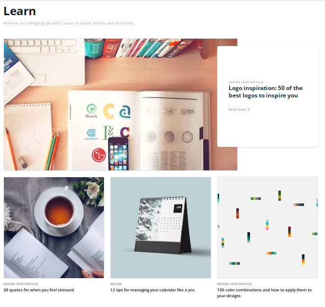
The images are also hovered animations, adding more depth, movement and interactivity to each post. Favoring hi-res photography and clean illustrations, Canva provides a robust blog with helpful design, marketing and branding resources for individuals and businesses alike. By using hi-res photography and interactive elements such as hovered animations, Canva shows how design practices can greatly influence the user experience.
The site embraces a clean minimalist aesthetic that draws attention to the essence of each blog landing page. Whether you’re exploring blog design examples or seeking inspiration to create visually appealing content, Canva’s approach underscores the value of a consistent, brand-aligned style.
5. Figma
Collaborative interfacing tool Figma delivers detailed, colorful imagery against a simple blog column format and white space. What Figma gets right is how much each illustration can communicate its brand and content effectively.
For example, Figma’s use of directional cues like arrows, cursors and geometric shapes draws the reader’s eye to key messages within its images. Those messages connect closely to the title of each blog post, creating a cohesive theme across the entire page.
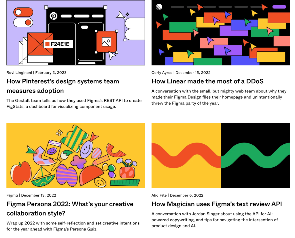
The company publishes a variety of blog content types, too, including product announcements, Q&As and educational posts, ensuring the blog isn’t one-note. In addition, Figma provides a compelling illustration of how to integrate a dark mode option or contrasting palettes to suit diverse user preferences, improving the overall user experience.
6. Think With Google
Few organizations have access to the type of marketing research and consumer insights Google does. That’s why Think With Google is such a treasure trove of new data, enlightening ideas and burgeoning trends shaping today’s economy.
Loaded with sleek, flat animations and thinly weighted line drawings, the blog page of Think With Google may at first glance appear restrained or plain. But each blog post is filled with additional data visualizations that help tell a dynamic, analytical story.
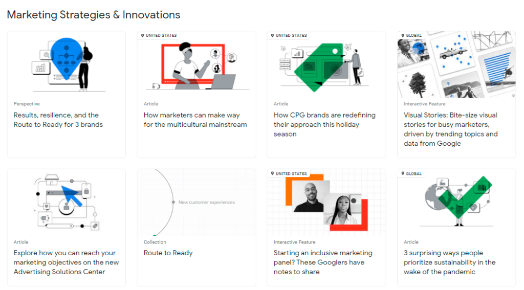
And Google doesn’t stop at conventional articles. It also posts unique, horizontal features called “visual stories.” These assets contain graphic design, animation, video interviews, audio and even more data — all packaged in a clickable, paginated format that makes SlideShare look archaic.
Want to witness the latest in blog post design technology? Look no further than Think With Google. Similar to other top-tier blog design examples, Think With Google ensures a seamless reading experience through clean design elements.
By presenting data in visually appealing formats, Google balances function and form, showing that a minimal blog format can still communicate complex information effectively. For marketers seeking fresh insights, adopting a flexible blog design blog approach like this can set the stage for deeper engagement.
7. Adobe
Adobe, the digital world’s much-loved creative software powerhouse, is no stranger to hi-fi digital marketing.
It continues to push the boundaries of content creation, social media and graphic design — in its own brand and vis-a-vis the companies that use its services. Adobe’s blog layout looks more lifestyle than it does B2B SaaS.
With a focus on multifaceted imagery — like fun, digital illustrations, fashion-forward photography and, at times, esoteric designs — Adobe allows visuals to dominate its blogging strategy.
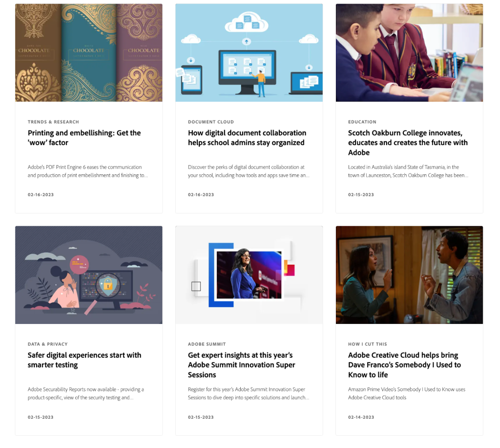
The company also includes embedded videos of its products, touting the latest advancements in its technology offerings, like augmented reality. This is in addition to its many partnerships with top institutions like the Smithsonian, Google and the London Marathon, lending collective power to its blog subdomain through brand association.
Adobe’s approach to blog design practices also shines in its easy-to-navigate layout. By prioritizing a user-friendly structure, Adobe harmonizes creative visuals with a focused content strategy. This allows viewers to instantly identify the type of blog posts they’re most interested in, making the site feel like both a design blog and a functional resource hub.
Whether you’re exploring new ways to create blog features or looking for advanced tips to refine your brand identity, subscribing to The Content Marketer can help you stay at the cutting edge of design blog post strategies.
Subscribe to
The Content Marketer
Get weekly insights, advice and opinions about all things digital marketing.
Thanks for subscribing! Keep an eye out for a Welcome email from us shortly. If you don’t see it come through, check your spam folder and mark the email as “not spam.”
8. Axios
Do you have two minutes?
That’s all you need — if that — to get the gist of an Axios post.

News outlet Axios is very transparent in its mission, editorial guidelines and approach to content — outlined in its Axios Bill of Rights. Exemplified by its Smart Brevity® tagline, the company is the master of no-frills, urgently terse blogging.
It famously sections its blog post template into bullets, with headers that progressively dive deeper into the topic. If you just need quick highlights, you can glean what you need in seconds. If you want to understand more about a current event, read just a few more bullets. If you want to be fully aware of the world’s happenings, read till the end of the post.

This clever structural choice intentionally allows readers to tune out at their own pace. We’re all time-crunched and attention-fractured, and Axios understands this better than most.
The simplest blog on this list gets the job done. In addition, the Axios layout showcases how a clean, minimalist look can be highly effective in delivering key points. By stripping out extraneous elements, the blog retains a user-friendly vibe that fosters a direct and rapid reading experience. If you’re exploring a simple magazine blog template, Axios can serve as a prime example of how to keep content succinct while offering meaningful insights.
9. TikTok
TikTok is more than just a video platform. Its blog is a great way to stay in the loop with the service’s latest news, product updates and interesting stories about the TikTok community. The design is simple and user friendly, and readers can filter content by country and language for a personalized experience.
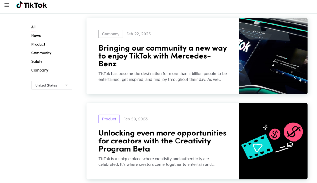
Plus, the company uses an infinite scroll blog design, allowing users to scroll through the entire blog archive without having to navigate to new pages. This feature is aligned with the latest Google updates for mobile: Search engine results on mobile screens will no longer have “See more” buttons at the bottom of pages. Instead, Google will automatically populate more results with each scroll.
Featuring infinite scroll also underscores the platform’s dedication to a slick user experience. TikTok’s blog demonstrates that a minimal blog post layout can still be entertaining and well-structured, ensuring that visitors quickly discover new updates. This design approach would be equally beneficial for a personal travel blog, a brand identity page or any other site that values immediacy and high responsiveness.
10. Grammarly
Grammarly’s approach to blogging is to be as clear and comprehensive as possible — while using incredibly concise language (very fitting). Then, throw in customized illustrations, step-by-step guides and lots of examples for good measure.
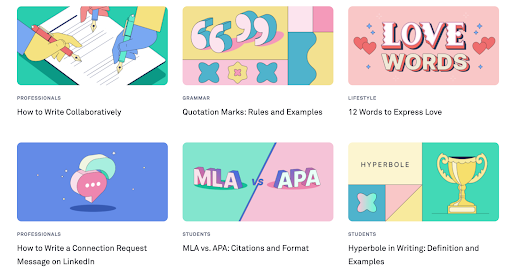
Users will most likely never run out of things to read on Grammarly’s blog. The individual posts are often incredibly long-form, authoritative and optimized for search. From exploring common grammar mistakes to sharing how to express love when writing, the blog has something for everyone.
But somehow, even with a diverse range of topics all geared toward different audiences, Grammarly has mastered the art of making it all look cohesive — and it’s all thanks to its consistent use of design elements. The illustrations are so clever that even without reading the title, users can tell what the post is about.
Grammarly’s blog is a perfect illustration of how focusing on simple visuals can lead to a design that is both visually appealing and easy to navigate. By adhering to blog design practices that highlight clarity, Grammarly ensures that visitors can quickly view blog sections that match their needs. This principle can be extended to any niche, from a general blog landing to a more specialized design blog post series.
11. Moz
Moz, a popular SEO software provider, uses its blog page to not only publish great content but to promote individual authors as well.
Putting their employees — and external experts — front and center, Moz essentially uses a micro-influencer strategy. Past and present Moz staff like Rand Fishkin and Dr. Pete wield considerable influence in the SEO space, and their posts often get thousands of comments from a large, active marketing audience.
Additionally, Moz makes great use of recurring series, like Whiteboard Friday and Daily SEO Fix, to drive new and returning traffic to its site.
A two-column blog template with custom illustrations makes the blog page easy to scan and scroll. There are few bells and whistles — just great studies, updates and opinions on SEO. Moz’s deliberate highlighting of individual contributors also fits perfectly into current blog design examples that center on community and thought leadership.
Emphasizing authors can reinforce brand identity, while also ensuring a user experience that invites robust interaction from readers. This approach also complements a responsive design, ensuring a consistent view blog structure on any device.
Designing Your Blog Posts
Blog themes come in many shapes and sizes. WordPress, HubSpot, Squarespace and Wix are some of the most popular blogging platforms and content management systems, providing the foundation for the top themes on the web.
Newer technologies like Webflow development, Foleon and Contentful offer next-generation page builders that seamlessly integrate interactive content and custom templates, transforming any article into a more complex, engaging marketing asset.
Whether you’re creating a travel blog, a brand-focused blog design personal site or a robust corporate blog landing, the right design blog strategies can make all the difference. By leveraging blog templates that incorporate a table of contents or highlight a dark mode toggle, you can deliver a user-friendly and easy-to-read experience for your audience.
Depending on your target groups and goals, you can also embed additional features into your blog template, such as:
- Pop-up ads.
- Newsletter signups.
- Share buttons.
- RSS subscriptions.
- Author bios.
- Recommended reading carousels.
- Various other CTAs and banners.
In some cases, these elements will appear on the left or right sidebar, at the bottom of the page or interspersed throughout the blog post. To adhere to Google’s Core Web Vitals, don’t upload, plug in or embed too much imagery or coding that slows down overall page speed.
And of course, when in doubt, keep it simple.
Adopting UI and UX design principles can further enhance your site’s performance, ensuring that both visual aesthetics and technical functionality align for a more enjoyable reading experience. By embracing features like a table of contents, a clear blog format and plenty of white space, you can also encourage visitors to linger longer, exploring additional sections of your content.
Implementing these features with a focused content setup ensures that each blog post resonates with your target audience. Consistency in blog designs and alignment with your brand identity fosters a cohesive user experience. Whether you’re referencing popular blog design examples or customizing a simple magazine blog template, a thoughtful approach can help maintain a clean design that stands out.
In conclusion, prioritizing design practices that seamlessly blend user-friendly navigation, visually appealing layouts and straightforward structure can translate into significant advantages for your blog. Those who adapt these concepts to their own design will likely see boosts in engagement, loyalty and overall success.
What are some of your favorite examples of blog design?
Editor’s Note: Updated June 2025.