

Your blog posts aren’t driving anywhere near the engagement they should be. If that scenario sounds familiar, it’s worth revisiting the importance of visual content and evaluating whether you’re taking full advantage of every image, graphic and video at your disposal.
Without visuals, words alone may not be pulling their weight. Even the most eloquent prose can benefit from a splash of color, an illustrative chart or an engaging GIF that captures attention in a fraction of a second.
Keep in mind that I say this as a content writer who very much believes in the power of the written word! However, recognizing the importance of visual content doesn’t diminish great copy — it enhances and supports it, offering readers a richer, more immersive experience.
The truth is that visual communication is a highly effective way for marketers to reach people. Enhancing your blog posts with visuals and other rich media helps readers consume your content, increasing the chances they gain something valuable and come back for more. In fact, time and again, studies confirm that visual content’s superpower lies in its ability to create memorable impressions and encourage deeper engagement.
Why is visual content so important in content marketing?
Blog posts are the bread and butter of your content marketing strategy. And while your words are responsible for building the narrative, visual elements play a considerable role in making blog posts the compelling and engaging content your audience is eager to see. Understanding the importance of visual content means acknowledging that today’s audiences expect more than text; they look for quick, eye-catching cues that make complex information instantly understandable.
It’s a hard truth, but I know that no matter how incredible my writing is, the only person who’s likely to read every word is my mom. Everyone else is scanning for the highlights, which is precisely where visuals come to the rescue.

In the age of shrinking attention spans, we have to create the type of content that’s easily digestible and skimmable. Visuals help break up the text and highlight important takeaways so readers can scan through content and still understand the message. This bite-sized accessibility turns casual scrollers into committed readers.
A lot of this comes down to how our brains work. The majority of people are visual learners, and many of us find it easier to comprehend and retain information when it’s presented visually. It’s in our nature to respond to visuals, which is why I understand that you (and even you, Mom) don’t always have it in you to read every word of my blogs. By catering to our brain’s preference for images, you honor the importance of visual content and make learning feel effortless.
Interestingly enough, we’re finding that longer blog posts often outperform shorter articles in every possible way — search rankings, traffic, engagement, you name it, and longer is usually better. And by longer, we mean upward of 3,000 words. How are you supposed to publish such high-performing behemoths without boring your readers with chunks of text? You guessed it: Spice up the copy with some visual storytelling. When you weave images, charts and videos throughout, you’re not just padding the post — you’re reinforcing the importance of visual content to sustain interest through thousands of words.
Data consistently proves that visuals significantly boost engagement.
Image SEO is also a thing, meaning Google pays attention to the visuals in your blogs, too. You can optimize your images with SEO-friendly captions and alt text, as well as ensure their size and format don’t affect loading speeds. This dual benefit — appealing to both humans and algorithms — is another compelling example of visual content at work in modern digital marketing.
Typically, you’ll want to use JPG files for photos and screenshots, while PNG is better for detailed images and high resolutions. Almost always, JPGs will be better than PNGs for the web. Try to size your images between 1500 and 2500 pixels wide, keeping them under 1 MB if possible.
The importance of visual content also applies to another area of your content marketing strategy: social media. Platforms like Instagram, LinkedIn and X thrive on visuals; your blog’s imagery can seamlessly transition into these spaces, reinforcing your message and boosting brand recognition.
Data consistently proves that visuals significantly boost engagement, which is an important consideration when you’re ready to promote your blog content on your social media platforms. Make your life easier and use one of the visuals from your blog post in the social media post promoting the content. A vibrant graphic or a tantalizing excerpt image amplifies shares and reiterates the importance of visual content in multichannel promotion.
From a big-picture level, visual content can enhance your brand storytelling efforts by creating a consistent and recognizable aesthetic for your company. A cohesive visual identity becomes a silent ambassador for your brand, reminding audiences of who you are and what you stand for every time they see your imagery.
What types of visual content will complement your blog posts?
If blog writing is on your to-do list, visual content creation should be as well. Treating imagery and copy as equal partners is central to embracing the importance of visual content, ensuring your narrative resonates across learning styles.
Generally speaking, you’ll want to embed a visual every 400 words or so. Visual content can stop people as they scroll, and they’re likely to read a few lines before and after visuals. This rhythm prevents reader fatigue and reinforces key points at just the right intervals.
Headlines, subheadlines, bulleted lists and other formatted text will help break up chunks of copy in between visual content. Combined with strong visuals, these elements guide the reader’s eye, creating a smooth, enjoyable journey through your article.
With all that in mind, create an easy cadence of visuals and skimmable headlines that keep readers scrolling through the entire post. For longer blogs, especially, mix up the kind of visuals you use throughout the post. By diversifying images, infographics and videos, you keep momentum high and consistently grab and keep attention.
Embed a visual every 400 words or so.
Here are the visual elements on the menu:
Images
Photos are the low-hanging fruit of visual content, so make no excuses here. When in doubt, you can always find or create images to break up your text.
As long as you choose high-quality images that are relevant to the surrounding copy, they can only do great things for your blog’s performance. Just be sure to keep track of the images you use to avoid boring readers with repeated photos. Plus, make sure your image file sizes are optimized for the web to prevent irritatingly slow loading times on the user end. Small touches, like descriptive file names and alt tags, can compound the SEO benefits and deepen search visibility.
Best practice: If you have original images of your product or service in action, definitely use them. Otherwise, look into stock photography platforms with authentic imagery that doesn’t scream cheesy stock photo. Twenty20 is a Brafton favorite!

Case in point: This isn’t actually a photo of me writing this blog post, but it could be. Nonetheless, it keeps you engaged and helps break up the text in a visually interesting way.
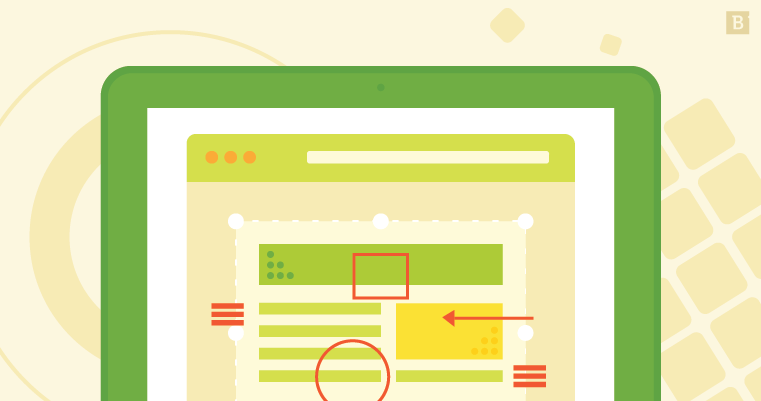
Screenshots
Give readers a transparent look at the content from your perspective with screenshots. They’re especially useful if you’re describing a process on an online software or application. The visual of your screen at each step helps readers better understand the description. By turning abstract directions into concrete visuals, you can hit home the topic and ensure the reader fully understands what it is you’re writing about.
Here’s a great example: In a guide to going out of office, Slack describes how to set your OOO status on Slack, complete with screenshots directly from the app.
Another prime opportunity for screenshots is when you’re referencing a research report that already has its own graphs, charts or other data visualizations. As long as you credit the source, feel free to embed screenshots of the data you reference in the copy.
Best practice: Take screenshots of your screen and then annotate the images with arrows, boxes, circles and text to better explain your point. Annotated screenshots not only simplify complex workflows but also clarify details that words alone might miss.
Infographics
When your blog posts cover complex processes or highlight important statistics, infographics are the supreme data visualizations to embed within the copy. They condense elaborate concepts into one glance, using data storytelling to highlight insights uniquely.
Plus, creating an infographic means you can own an original visual that your readers won’t have seen anywhere else. Such original graphics tend to have the highest levels of performance and engagement on your site.
But wait, there’s more: You can also crop parts of the infographic for the snackable visual content that’s perfect for promoting your blog post via social media posts. If you want to go the extra mile, you can even create animated or interactive infographics to boost user engagement.

Best practice: While the design is important, the copy is the true meat of an infographic. Do your research carefully to nail down the most hard-hitting points, and carefully craft your copy to string together the data in a compelling visual story. The synergy of insightful copy and eye-catching visuals boosts engagement and pushes persuasive communication to the next level.
Check out our master list of infographic best practices (infographic included!) for even more insights on this valuable form of visual communication.

Illustrations
When stock photos just won’t do and infographics aren’t quite right for the content, consider creating your own custom illustrations. You can use them for the feature image or create them to highlight certain points throughout the blog post. Bespoke illustrations let your brand’s unique personality shine through.
Keep in mind that these illustrations should all fall under a distinctive style that reflects your brand voice and messaging.

Best practice: While any good illustrator can replicate what another started, it helps to have one in-house designer dedicated to all of your blog and website graphics. That way, the aesthetics stay consistent and you can ensure you have the resources to create custom illustrations for as many blog posts as you need. Consistency amplifies recognition and is critical for establishing brand authority.
Pull quotes
If you have powerful quotes from an employee, executive, influencer or industry expert in the copy, consider bringing extra attention to them by creating a graphic. It can be as simple as the text on a background, but you can also add images or illustrations as you see fit.
Illustrating copy isn’t reserved solely for quotes from people. You can also highlight important takeaways and hard-hitting sentences from the post with a visual element. These pop-out moments make your most quotable insights impossible to miss.
Best practice: If you plan to use pull quotes frequently in your blog posts, develop a consistent style that you can easily replicate each time. A predetermined template expedites production while maintaining the polished look that speaks to the importance of visual content in professional publishing.
Social posts
When relevant, you can embed social posts in your copy to drive home a point. All you need is the embed link directly from the post.
You can show off your own social content, which may even have the added bonus of increasing engagement on those particular posts. Alternatively, you can share posts from other companies or influencers that may feature an opinion, quote or discussion that’s relevant to your blog content. This real-time integration of external voices fosters community and sparks conversation.
Best practice: In its heart of hearts, social media is about being current. Avoid embedding posts that are more than six months old unless there’s a specific reason to do so. Freshness matters, and timely visuals remind readers that your company is up to date on what’s going on and relevant.
GIFs and memes
If your tone calls for it, feel free to give your blog posts a casual touch of humor with relevant GIFs and memes. They show readers that you have an approachable, human side — and you might even be cool enough to be up-to-date on the internet’s latest trends.

GIFs and memes are also easy visuals to consume, making them helpful elements when you’re trying to convey a specific emotion or feeling. Their quick-fire impact demonstrates the importance of visual content in evoking instant emotional responses.
Best practice: Read your audience. GIFs and memes can come off tacky or offensive if you use the wrong ones or if they don’t resonate with your usual crowd. When used thoughtfully, they can humanise your brand while keeping things light
Videos
HubSpot found that 54% of people want to see more video content from marketers. You don’t want to let the people down, do you? Video is among the most engaging forms of visual content, and it has a reputation for boosting blog performance by considerable measures. Few medium sare more powerful than motion pictures that combine sight, sound and story.
As with anything visual, original video content is your best move. However, embedding relevant videos published by other companies won’t hurt either. Just remember to give credit where it’s due.
Best practice: Don’t forget that while you can create videos specifically for blog posts or landing pages, you can also repurpose video content. As long as it’s relevant to the blog post, don’t hesitate to embed it. Repurposing maximizes ROI and gives your content multiple touchpoints with your target audience.
CTAs
A custom call-to-action button is another way to break up the text with a visual — but these do more than look good. They take interested viewers to other pages on your site that can further boost engagement, click-through rates and conversions.
As with other visuals, you’ll want to create a consistent style for these. Some you can use verbatim on several blog posts, while others may call for slight tweaks to make sure they make sense for the article topic. Clear, visually striking CTAs guide user behavior toward desired outcomes.
Best practice: Mix them up! CTAs aren’t just for redirecting viewers to a landing page that sells your product or service. They can also link to relevant gated content, such as eBooks and white papers, or prompt users to subscribe to your mailing list, follow your brand on social media or sign up for a free trial.

Time to get visual
Now that we’ve established how well words and visuals work together, make room for visual content creation in your editorial calendar. Not only will your blogs be better off for it, but your audience will begin to see your brand as a consistent source of highly engaging and reputable content. Embrace the importance of visual content at every stage of production, and you’ll watch your blog posts evolve from plain text to powerful, share-worthy experiences that captivate readers and drive results.
Editor’s Note: Updated March 2026.