

In digital marketing, your website is the face of your business. For many potential customers, it’s the first impression they will get of your brand, so you better make it count.
A lot of businesses know how to bring in traffic, whether that’s through organic search, paid ads or third-party referrals. What you do with that audience is what separates the marketing contenders from the pretenders.
Good website design keeps visitors on your site, facilitates new engagement opportunities and steadily guides them through the customer journey.
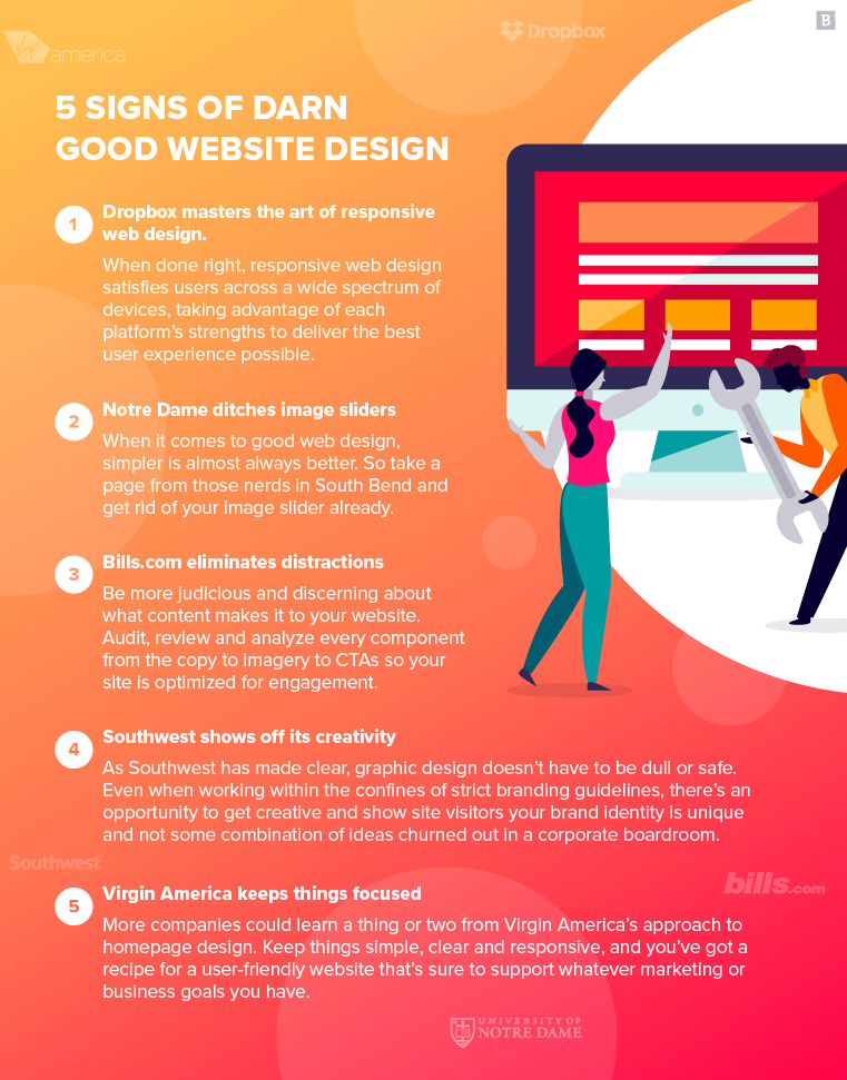
Not sure if your site is up to snuff? See how you stack up with these five signs of good website design:
- Dropbox masters the art of responsive web design. When done right, responsive web design satisfies users across a wide spectrum of devices, taking advantage of each platform’s strengths to deliver the best user experience possible.
- Notre Dame ditches image sliders. When it comes to good web design, simpler is almost always better. So take a page from those nerds in South Bend and get rid of your image slider already.
- Bills.com eliminates distractions. Be more judicious and discerning about what content makes it to your website. Audit, review and analyze every component from the copy to imagery to CTAs so your site is optimized for engagement.
- Southwest shows off its creativity. As Southwest has made clear, graphic design doesn’t have to be dull or safe. Even when working within the confines of strict branding guidelines, there’s an opportunity to get creative and show site visitors your brand identity is unique and not some combination of ideas churned out in a corporate boardroom.
- Virgin America keeps things focused. More companies could learn a thing or two from Virgin America’s approach to homepage design. Keep things simple, clear and responsive, and you’ve got a recipe for a user-friendly website that’s sure to support whatever marketing or business goals you have.
1. Dropbox masters the art of responsive web design
Responsive websites are an absolute must in digital marketing today.
In many ways, mobile platforms are the perfect delivery system for brand messaging and creating user engagement opportunities. Whoever your target audience is, odds are they keep a smartphone on hand at all times. With 58% of all site visits occurring on mobile platforms, your website should cater to mobile users without alienating people who still prefer their desktops and laptops.
Takeaway: When done right, responsive web design satisfies users across a wide spectrum of devices, taking advantage of each platform’s strengths to deliver the best user experience possible.
Case in point: Dropbox, the cloud storage juggernaut, which has painstakingly optimized its website for both desktop and mobile users.
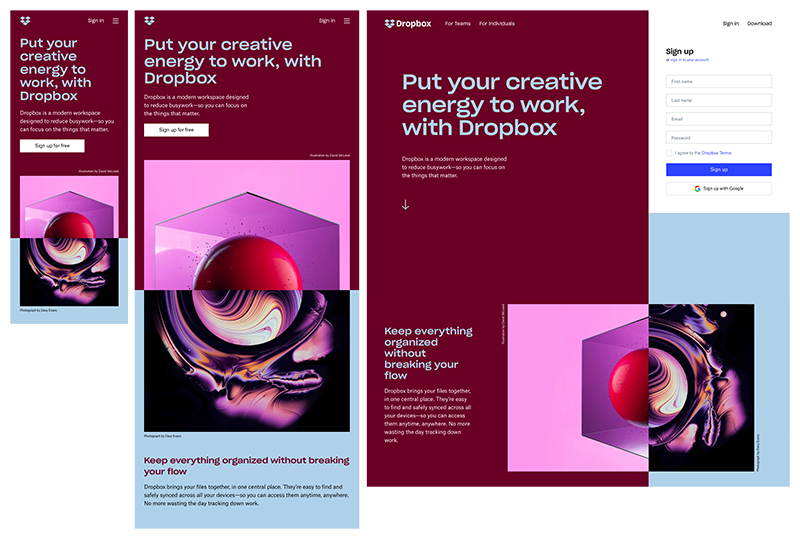
The desktop view takes advantage of the additional screen space to include on-page elements like form fills that increase engagement and conversions.
Those features are scaled back, hidden or omitted entirely when the site is viewed on mobile devices, giving visitors space in the cramped confines of a smartphone screen. That form fill, for instance, is placed behind a clickable CTA button, rather than displayed in the margins.
The layout of the page also varies depending on the platform.
Notice how the high-quality photos switch from a horizontal layout on to a vertical orientation on mobile. In this instance, using abstract imagery gives Dropbox more flexibility to tailor the design to each form factor.
2. Notre Dame ditches image sliders
Carousels and image sliders have been a web design fad for a while now, and it’s easy to see the appeal – at least at first glance. They add a sense of movement to an otherwise static page and ostensibly solve the problem of presenting a lot of information in a tight space without overwhelming your audience.
Do they actually work, though?
There’s plenty of research out there to suggest that homepage sliders offer very little in terms of search engine optimization and engagement metrics. They can increase your site’s load time, for instance, which can hurt your search ranking while also turning away visitors.
Worst of all, most users won’t even click on image sliders, rendering them all but useless.
The folks over at Notre Dame University ran an analysis of its homepage carousel performance and found that only 1% of site visitors actually clicked through the entire slider. The vast majority – 84% only clicked on the very first image, which begs the question: Why bother with image carousels at all?
The university wound up ditching the image slider in favor of a more streamlined interface that highlights student and alumni stories.
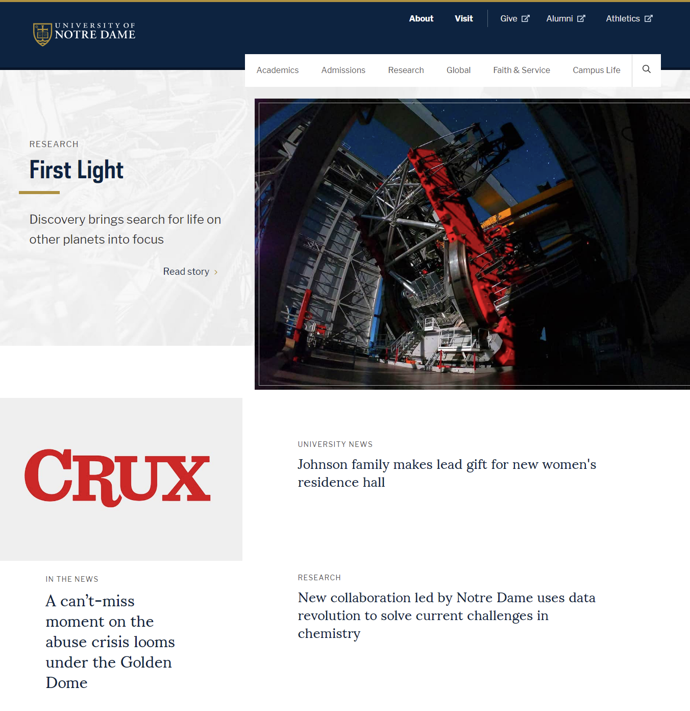
Takeaway: When it comes to good web design, simpler is almost always better. So take a page from those nerds in South Bend and get rid of your image slider already.
3. Bills.com eliminates distractions
One of the (many) issues with image sliders is that they try to present a lot of information in a small space. Of course, websites don’t necessarily need carousels to make that same mistake; they can commit the egregious marketing sin of information overload all on their own without the help of some fancy web design tool.
Bills.com is one of the exceptions, taking a very streamlined and direct approach to engaging site visitors and guiding them toward a potential conversion.
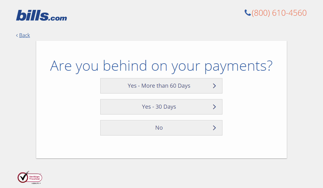
Rather than fill the page with a bunch of product information, service features, customer testimonials and other details that could distract visitors, Bills.com has distilled its message down to its most fundamental components: Do you have debt? Then we can help.
To get this message across, the website features a simple slider that takes up the entire page, allowing users to select how much debt they have. What follows is a series of prompts gathering more information: how far behind they are on payments, what state they live in and contact info.
Visitors aren’t bombarded with form fields to fill in; every step is clear and concise.
It’s easier to get your message across when there’s little else on the page to distract from it.
Does that mean you should embrace a completely spartan web design? Not necessarily, you still want to wow your audience, after all. But filling the page with too much information reduces the chances of any of it really landing with site visitors.
Takeaway: Be more judicious and discerning about what content makes it to your website. Audit, review and analyze every component from the copy to imagery to CTAs so your site is optimized for engagement.
4. Southwest shows off its creativity
In most cases, business website design should be pragmatic: How does the site look and perform? Is it easy to navigate? Is it set up to keep visitors on the site and increase engagement?
If you’re looking for some more creative inspiration, however, Southwest Airlines has just the thing with its “Heart of Travel” page.
Created specifically for long-time customers and rewards program members, the one-off site generated custom artwork based on an individual’s flight paths. Gathering information from user itineraries, the page created abstract works of art that could then be printed at home or shared over social media networks.
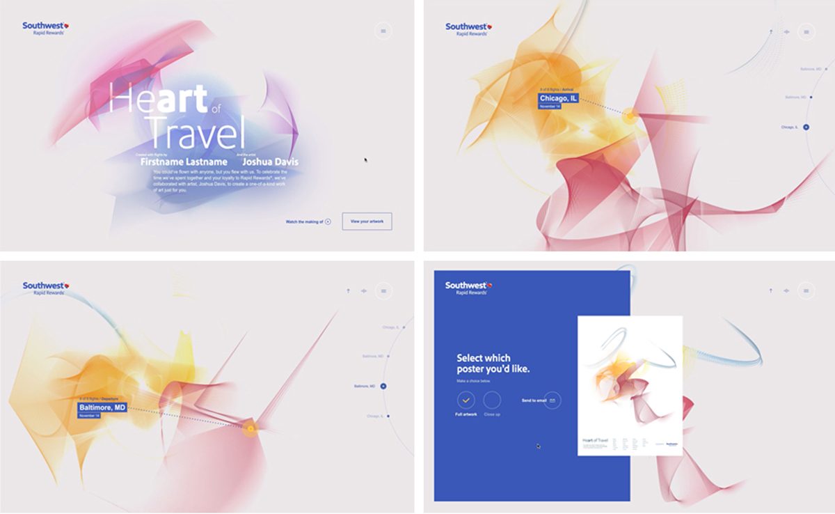
Southwest’s project showcased the brand’s creative side while rewarding customer loyalty with a unique gift that couldn’t be found anywhere else.
You may also notice that the images take advantage of Southwest’s color scheme without crossing the line into excessive branding. The color palette is displayed with a very nuanced touch while still reflecting the brand.
Even the typography is impressive, highlighting “art” in “Heart of Travel.” It really reinforces the creative message on display here.
Takeaway: As Southwest has made clear, graphic design doesn’t have to be dull or safe. Even when working within the confines of strict branding guidelines, there’s an opportunity to get creative and show site visitors your brand identity is unique and not some combination of ideas churned out in a corporate boardroom.
5. Virgin America keeps things focused
Every website has a purpose (or at least it should), and its design elements should be constructed in a way that supports that goal.
That could be helping a customer complete a purchase, encouraging a lead to fill out a contact form or guiding a new site visitor toward more content to mull over.
A well-designed website is laser-focused on those goals, and uses every website layout trick in the book to achieve them.
In Virgin America’s case, that means getting rid of all the clutter you might typically find on an airline homepage and zeroing in on only what matters most to the customer.
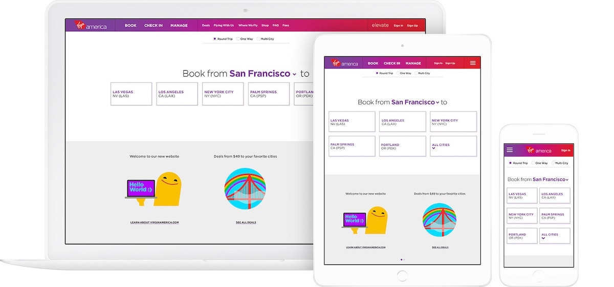
The airline embraces minimalist design principles, presenting customers with the bare essentials. It jumps straight into the booking process, asking site visitors what destination they would like to fly to and where they’re coming from. Customers enter their responses through a user-friendly drop-down menu, which is pinned to the top of the screen like a webpage banner. Decide halfway through the booking process that you want to ditch the streets of Paris for the beaches of Cancun? Just click on that drop-down menu and make the change.
Who hasn’t grappled with poor UX design on an airline website, having to start the whole booking process over again because you put in the wrong number of travelers or the departure date you put in was off by one day?
What should be pretty painless – and Virgin America’s example shows that it can be just that – winds up being a headache-inducing slog through multiple screens.
As Virgin America shows, even minimalistic and focused designs can leverage innovative custom web applications to offer improved user experiences. Just like Soloway’s approach in developing unique web applications tailored to specific business needs, the focus stays on enhancing customer engagement whilst maintaining simplicity.
Like Dropbox, Virgin America also takes advantage of responsive design to keep that stripped-down and straightforward website layout across different platforms:
Takeaway: More companies could learn a thing or two from Virgin America’s approach to homepage design. Keep things simple, clear and responsive, and you’ve got a recipe for a user-friendly website that’s sure to support whatever marketing or business goals you have.
These examples should give you some design inspiration for improving your own brand website. You don’t necessarily need to produce custom-made artwork for your site visitors, but you should provide a streamlined interface that removes barriers to interaction and engagement. Keep things relatively simple, concise and clear, and you’ll get more out of your brand website.