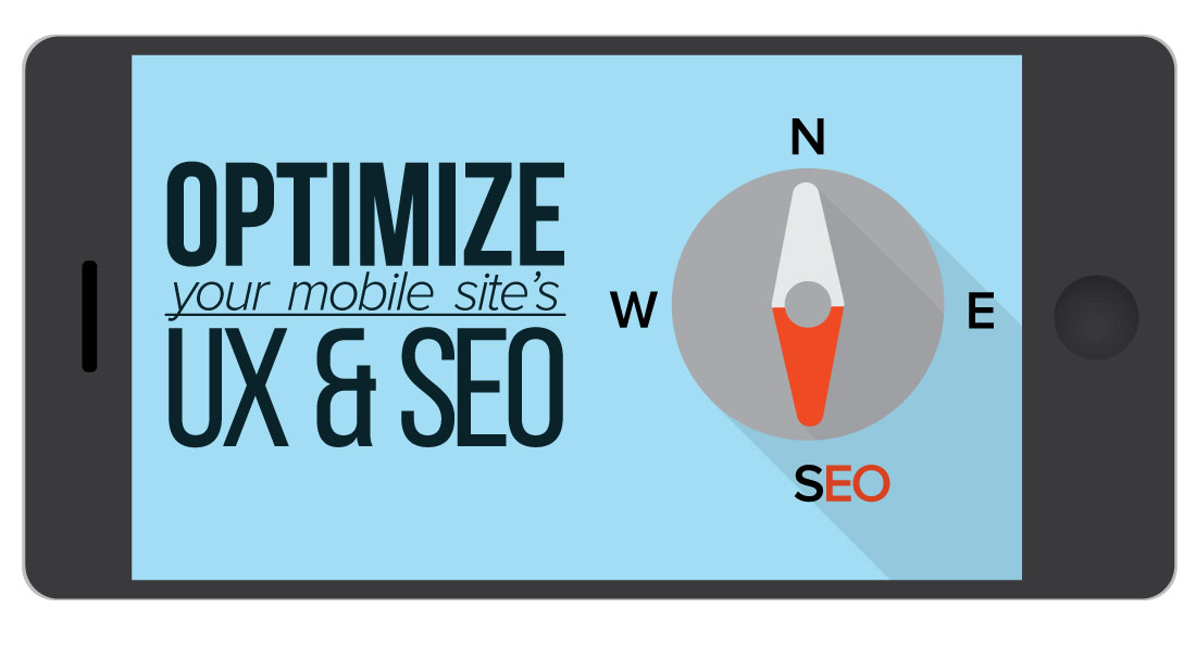

When optimizing your brand’s web presence for the mobile experience, you might frame your strategy by answering questions like:
- How does our site look on our customers’ phones?
- What do our customers look for in UX and functionality on our site?
- How does my site fare on mobile search engines?
- How well do we take advantage of user locations?
- Are we in line with our users’ search intent?
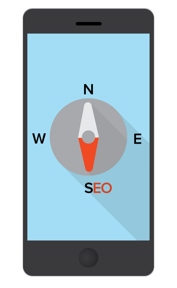
- Are people really mobile-first?

One question that you might not have asked yourself yet is: How do executives at Google search on mobile?
Google’s vice president of Search, Amit Singhal, has been searching and browsing almost entirely on mobile for the past year. He looks for the easiest and shortest way to navigate the web, find what he needs, and accomplish his goals. Among Singhal’s main considerations in his mobile-only lifestyle are: the number of taps required, the load speed of a page, and the accuracy and relevance of search results.
While studying search trends and patterns of your customer base can certainly help inform your mobile strategy, what better way to stay on the cutting edge of the mobile lifestyle than by examining how its largest influencers interact with it on a daily basis? After all, when Singhal runs into problems in his mobile search experience, it’s his job to engineer the improvements.
What can we learn from Amit Singhal’s mobile lifestyle?
“The web still hasn’t been fully designed for mobile” said Singhal, so take note. Using the daily life of Google’s search guru as a model can shed light on how to design and optimize your brand’s mobile web presence.
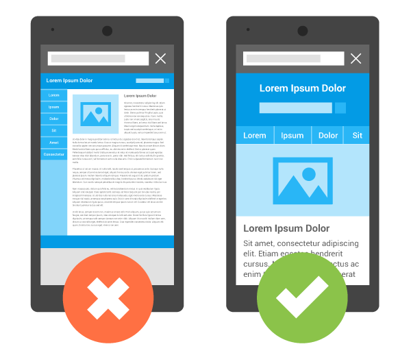
Sites with small, precise buttons ruin the mobile experience
“I’m using a thumb that’s the size of a quarter. Imagine on the web if your mouse pointer was [the size of a fist]. Would the web design look like how it looks today?” – Amit Singhal
While a desktop computer’s screen might be anywhere from 11 inches to 27 inches or more, most phone screens are between 4 and 5.5 inches. Good UX strategy should help to design the important parts of a website to fit on a mobile screen – and equally important, cut any content and material that isn’t absolutely crucial.
Complex login fields wreck the mobile experience
“I shudder whenever I land on a site where I have to to type in a login and password. I’m just speaking from the heart on this. Even though Chrome has my password saved and everything, it still doesn’t feel great.”
Big thumbs on a small touchscreen can make tasks like entering passwords or filling out forms difficult and time-consuming, even for the most dexterous. Remembering passwords and detailed information is also a common challenge (especially on a mobile device, without easy access to all your passwords in documents or on sticky notes taped to your monitor).
The simpler you can make accessing your site’s full experience on mobile, the more likely your audience is to use it, and the better their experience with you will be.
Make your mobile design as universal as possible
Singhal uses both a 5.1-inch Android and a 5.5-inch iOS device for his searching and browsing.
“We have users on all platforms, and I love them all.”
When deciding between using adaptive or responsive design for your mobile site, our best bet once again is to do what Google does. They are the deciders of what leads to healthy SEO, and what counts for high-quality mobile design.

Not only does Google employ responsive design on their own pages (try re-sizing a browser window on YouTube and watch the video window scale down with it) but they recommend using it for your site too, and frequently update their ranking algorithm to reward mobile layouts.
Phones are different sizes, and the experience often varies from operating system to operating system – planning and testing for as many formats as possible best assures a unified user experience.
Raise your voice
“I’m swiping and voice searching far more than letter typing… In my personal time, I find myself talking to my phone. I feel very proud on how much progress we have made with voice search…”
In 2016, almost every mobile device has a digital personal assistant built in to the operating system, whether it’s Siri, Cortana or Google Now (or upcoming developments from Facebook and Amazon). Intelligent, on-tap services like these sit somewhere between Microsoft’s Clippy and Spike Jonze’s movie Her, and 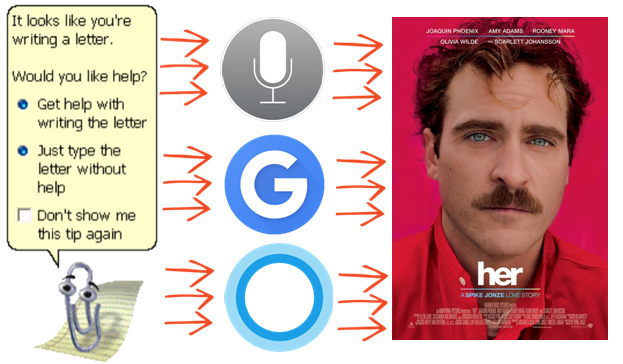 offer a contextual response to casually phrased, human inquiries.
Singhal mostly searches the web with his voice, and the most-optimized results will take advantage of Google’s modern algorithm, which focuses increasingly on user intent (often searched in natural language) rather than keywords. Optimizing your mobile site for voice search is steadily becoming more important to reach more users. For more information about Google’s quality guideline updates for SEO & content marketing, take a look at our blog here.
Tap, don’t type
When Singhal is in a meeting, he’ll swipe-type, which uses quick fluid motions of the hand, taking advantage of autocomplete, autocorrect, and intelligent word and phrase suggestions, and only requires one hand. Further, when searching, he often takes the path of least resistance – the fewer taps required, the easier the path to an answer, and the more satisfied he is with his online mobile experience.
“Mobile is fundamentally a “tapped” device, it’s not a “typed” device. I pretty much count how many taps that I have to do before I get what I want… Using autocomplete [Google has] built models that are so awesome that within two or three taps, I roughly get what I want, which is two or three characters all lined up.”
___________________________________________________________________________
If Google’s vice president of Search is looking for the quickest, easiest, most painless mobile process, it is safe to assume that your potential clients and audience are too. Learning from the processes and questions of the tech influencers who engineer our mobile infrastructure is the best way to stay as up-to-date as possible and enhance your mobile SEO and UX.
For more information on:
- mobile optimization
- user intent
- mobile and local SEO
- digital personal assistants
head to our blog, here.