

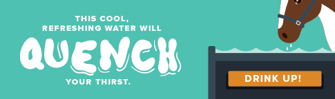
As the saying goes: “You can lead a horse to water but you can’t make him drink.”
You know what I think? If that horse was given a good call to action, like “Drink this water to quench your thirst,” I think he’d be more likely to take you up on your offer of a cool, refreshing sip.
(However, I’m no horse mind reader. He could be pretty stubborn.)

My point is this: You can create content all day that satisfies your readers’ needs, but if you’re not pointing them in the direction of the next step, chances are they’re not going to take it.

There is where an effective call-to-action comes in. By creating marketing CTAs that guide target audiences to the action they need to complete, not only do you generate new leads, but you provide your visitors with the information they are seeking. It’s a total win-win.
But you aren’t going to get those great lead gen results just by slapping any old CTA up there. A CTA needs to be good – no, great – at encouraging your readers to take that valuable next step in the journey.
What makes a great CTA great
If there’s anything I want you to take away from this post, it’s that your marketing strategy isn’t going to be successful without CTAs – and that means in every piece of content you produce. Here, I want to cover the main elements you’ll need to create an effective CTA that will bring in leads from all of your content resources.
1. Anchor text
An anchor text CTA is basically a call-to-action in writing. It’s usually inserted in the first half of a blog or other piece of written content. Check out this example from HubSpot:
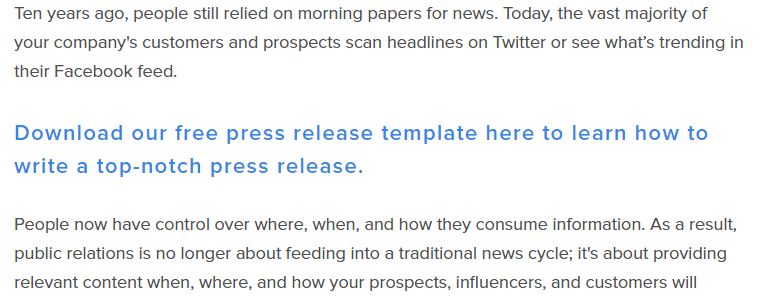
Via: HubSpot
Anchor text CTAs, linked to landing pages elsewhere on the site, lead readers right to what they’re looking for.
These types of CTAs are incredibly effective at generating leads. Between 47 and 93 percent of leads were generated by HubSpot’s anchor text CTAs (not only the one listed above – just overall). That’s pretty powerful.
When creating anchor text, keep in mind that you want to use action-oriented language. “Download now to…” “Click here to…” or “Get the latest news on…” are all examples you can play around with to see what works for your audience.
With anchor text CTAs, don’t be afraid to make them longer.
Also, with anchor text, you can make the CTAs longer. Your prospects aren’t going to click on something that’s too short and perhaps not clear as to what they’ll get. They came to your site for a reason, so use that longer-form CTA to show how you’re giving them what they want.
2. Text for CTA buttons
For CTAs that are more designed focused, you’ve still got to use the right verbiage. Just like with anchor text, action-oriented language is the way to go.
But with design CTAs, which feature a clickable button for prospects, you don’t have as much room to stretch out your message. So be as efficient as possible. Phrases like “Download Now!” or “Subscribe” are good examples of short and sweet wording. Of course, you can use the rest of the CTA above the button to further explain your offer.
Here’s one from QuickSprout that will appeal to the marketer in you:
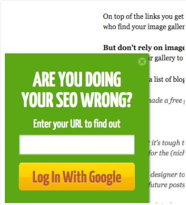
Via: HubSpot
These types of CTAs are more likely to connect emotionally with your readers. They could be scared they’re missing out on something, or compelled to click right away. Whatever the case, prospects will find visual calls to action enticing – one brand saw an increase of 45 percent in clicks when they used these button CTAs.
3. CTA colors
Now here’s where the fun comes in. Kind of.
Using any color you feel like may sound fine and dandy, but there’s a whole lot more to it when it comes to choosing the right hue for your CTA button. You want your CTA to stand out from the rest of the content on the page, and selecting the right color is how you’re going to meet that goal.
There’s no one specific color out there that’s going to shoot your lead gen through the roof. It’s up to you to play around with the colors and see what works best for your brand and your audience. But there are some stats that show brighter, more dominant colors get more clicks:
- One company found that by changing their CTA buttons to orange, they were able to see a 33 percent increase in conversions.
- Red has been proven to significantly increase leads for several brands, with one business experiencing a 34 percent growth.
Of course, the color you choose should also depend on the entire color scheme of your website. Select a color that contrasts nicely with your site, not one that’s a total eyesore.
I’ll just say this: Look at the two examples below. Which one are you more likely to click on?

4. Placement
Location. Location. Location. Where a CTA is placed on a page is just as important as the language it contains and the colors it features.
You might think that including a CTA above the fold so a reader notices it right away is the best place to put it. Not necessarily. One marketer found that putting a CTA above the fold drove down conversions by 17 percent. People aren’t reading websites like they read newspapers. They aren’t bothered by having to scroll down a bit to get more information.
But placing the CTA right at the bottom may not work, either. One brand compared two different placements of one CTA – they found that the page with the CTA below the fold but right after that first scroll down saw 41 percent more conversions than the page that placed the CTA at the very bottom.

But wherever you decide to insert your CTA on a page, don’t make that its final resting spot. Always test out various placements to see how your readers are responding. This is the only way you’re going to find out what really works.
Creating a great CTA might take some time and patience, but in the end, it’s going to be a valuable tool that converts your visitors. Don’t leave your prospects – and your lead gen efforts – in the lurch. Point them in the right direction with successful CTAs.