

Creating a project plan you understand is easy, but what if you want a chart that your entire team can read without difficulty? Can that be done?
Not only can it be done, but it’s also a simple process. Or at least, it can be with the help of a Gantt chart.
You can make this type of chart in a Google Sheet with just a few pieces of data and a single formula. It’s an ideal way for project managers — or really, any time you want to plan a project out — to visualize the smaller jobs that make up a larger project.
You can create one using either Google Sheets or Microsoft Excel, but in this article, we’ll be focusing on Google Sheets.
So, what’s a Gantt chart, and how do you make one? That’s what we’ll be exploring here.
What Is a Gantt Chart in Google Sheets?
Google Sheets is a great program to use if you’re a content manager, in no small part because of content calendars. But have you ever made a Gantt chart?
Who Can Use Gantt Charts?
Gantt charts are used in a wide range of industries by anyone who wants to ensure their project plan is both easy to understand and sensible for everyone on their team. Content marketers, business owners, team leaders and project managers are common types of people who would use a Gantt chart.
What Is Marketing Campaign Management?
Marketing campaign management is a series of tasks revolving around creating, executing and keeping track of direct marketing campaigns. Every step in the marketing campaign is accounted for with marketing campaign management, including its results. You’ll find Gantt charts very common here to help organize marketing campaigns.
What Is Lean Project Management?
This is an important concept to understand if you want to know the why of a Gantt chart. Lean project management involves maximizing the value of a project (from a client’s perspective) while minimizing waste that gets in the way of flawless efficiency. The term was originally a manufacturing term, but it has uses far beyond manufacturing projects and can be used by content marketers and project managers who want to optimize the content creation process, as well.
Subscribe to
The Content Marketer
Get weekly insights, advice and opinions about all things digital marketing.
Thank you for subscribing to The Content Marketer!
The Strategy Within a Gantt Chart
By now, you should understand the concept behind a Gantt chart. Now it’s time to discuss how you can implement one.
Why Are Timelines and Planning Important?
As the common wisdom goes, any plan is better than no plan at all. By extension, good plans are better than bad plans. Gantt charts are a form of a plan — a good one.
In a project management context, you can technically complete a project without the proper organization and timelines. But, you can reliably expect the project to take far longer and be done much less efficiently than if you had those things before starting.
What If You Need To Manage a Complex Project?
Some jobs will require more time and planning than others. While what constitutes a “complex” project is subjective, you’ll instinctively know if a project will take more organization than usual.
Note that I didn’t say a complex project was more difficult than a simpler project, because it doesn’t have to be. When managing a complex project, I suggest you take my favorite quote to heart: “Nothing is particularly difficult when divided into small jobs.” Henry Ford used this to refer to the construction of an automobile, but it applies to any large task that can be broken down into smaller ones.
A complex project may, if you look at it as a whole, seem overwhelming. But it’s not as if you’re going to do all of it at once. It’s best to take it in small parts that ultimately come together into one larger whole.
The whole, after all, is greater than the sum of its parts. That’s what Aristotle had to say about Gantt charts.
Planning Around Deadlines
One could easily argue that the purpose of a Gannt chart is to plan around deadlines. It includes the earliest an individual task can be started before extending the bar to the latest possible time it can be finished, creating a comprehensive set of deadlines for each task. You can tell if your efforts are sound based on the cohesiveness of the Gantt chart: If it makes sense, your project probably has a good plan behind it.
What Is Project Procurement Management?
Project procurement management refers to the choosing, organization and maintenance of goods or services your project is dependent on for completion. Explaining this concept could easily be its own article, but a procurement system is a necessary aspect of planning. Like fine wine and good cheese, it pairs well with other forms of planning by ensuring you have everything you need to complete a project.
How To Structure a Gantt Chart
Making a simple Gantt chart is easy if you know what to include. Let’s break it down into steps so you can follow along when you’re trying to make your first Gantt chart.
First, download this extension for Google Sheets. Then, take a look at a Gantt chart template, such as this one from Forbes (it’s free, by the way). We’ll be working without a predesigned free Gantt chart template, but know that it might help make your job easier. Be sure you’re using a Google Sheets template and not one for Microsoft Excel.
OK, it’s time to roll up your sleeves and open Google Sheets.
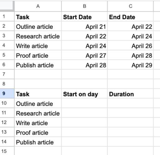
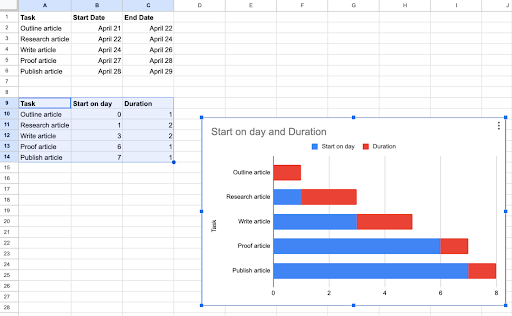
1. Create a New Sheet and Fill Out the Categories
Create a new spreadsheet and enter your project information. Title column A “Task,” (where you’ll put the task name), column B “Start date” and column C “End date.” Write down the list of tasks and fill the cells with the appropriate information — especially if you plan to sync this data from Google Sheets to PostgreSQL for deeper analysis or reporting later.
When you’re done, scroll down to the bottom of the list. Make a second table underneath the first with three more columns: “Task,” “Start on day,” and “Duration.”
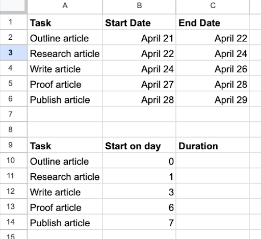
2. Fill Out the New Sections
For the first task on the list, put the “Start on day” as the number 0 to represent the beginning of the project. For the other tasks, “Start on day” should be a number representing the total days after the first task on the list. For example, if the second task on the list is planned to begin on the second day of the project, insert “1” as its “Start on day.”
3. Create and Apply the Formula for Duration
The task duration should be the maximum number of days allocated to finish the task. You can enter this manually or use a formula, which is simply the start date subtracted from the end date. Personally, I think the formula makes it easier. In our example, the formula would be:
“=C2-B2”
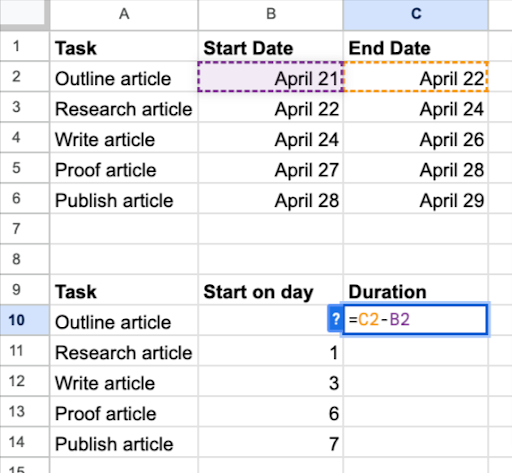
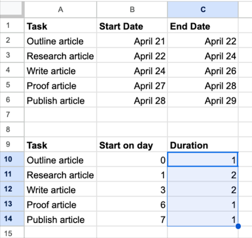
If you’ve ever worked with numbers in a spreadsheet program before, you probably know what to do next: Apply this formula down the list by clicking and holding the blue triangle in the cell where you first typed the formula. Drag this down to where your last task sits at the end of the column. This will apply the formula to each cell you dragged through.
4. Turn It All Into a Gantt Chart
It’s time to make all of this into a visual now.
Highlight all the cells in the second table (this is the one that includes “Task,” “Start on day” and “Duration”). In the top menu, click “Insert” and then “Chart.”
If you’ve been doing everything correctly until now, you’ll make a stacked bar chart. Your X-axis will include start days and your durations will be highlighted on the bars in red.
This next part might be a little tricky, so read these steps carefully.
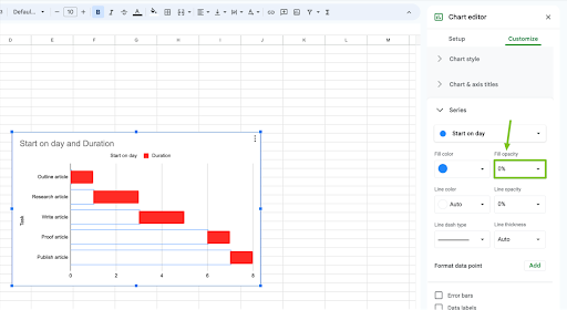
Remove the blue bars representing your start days by clicking on the chart, then clicking again on any blue bar. This should select all of them and open a “Chart Editor” tool on the right side of the screen.
Look for the “Customize” tab, then under that, you’ll see “Series.” Change the “Fill opacity” from 100% to 0%. The blue bars should become invisible.
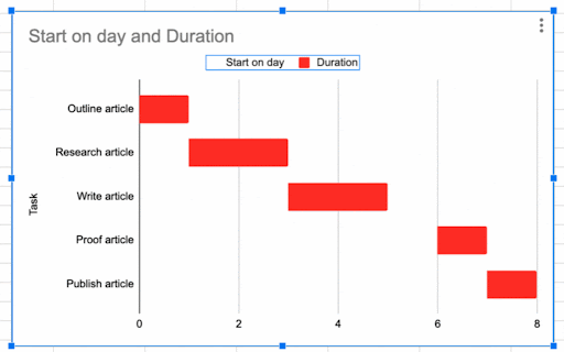
Now to get rid of the column labels. Again, click the bar chart, then the “Start on day” and “Duration” labels to select both. On your keyboard, hit the Delete key. The labels should be removed.
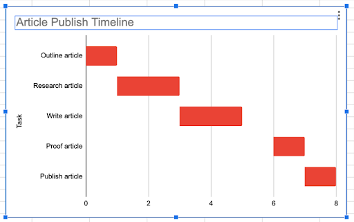
By now, you’re pretty much there, but it’s important to do these last steps: Change the chart’s title by double-clicking it. It should be highlighted. Then type in the chart’s new name.
You can change the axis titles by repeating the steps that take you to the “Chart editor.” Look for “Customize” and then click “Chart & Axis Titles.” In the “Chart Title” drop-down menu, you can individually select which titles you want to change.
Ta-da! You’ve created a spectacular new Gantt chart. You can customize it however you like, maybe add some arrows and symbols to show any task dependencies. Just be sure to add a key so anyone who looks at it can understand what those arrows and symbols mean.
Visualize Your Content Management Project Plan With a Gantt Chart
That wasn’t so hard, right? You can take any project schedule and not only visualize it with a Gantt chart, but see if it’s even workable to begin with. A Gantt chart only makes sense if the smaller jobs fit together to make the larger one, so you’ll know just by making the chart whether your plans are coherent.
Now go forth, and demonstrate your mastery of project planning. Don’t forget: No matter how large the job seems at first, it’s doable if you divide it into smaller ones with a Gantt chart.