
Have you ever walked into a new room and felt totally at home? The design makes sense, the furniture tastefully complements each other, and the color and lighting work together — everything feels put in place. In a room, this is known as feng shui. On a website, this is called information architecture (IA).
We naturally want to feel comfortable in a space whether that’s in person or online. Organization promotes a website’s purpose and directive, and could even give your products and services the chance they deserve for customer attention.
We’ll take a look at how IA and UX work together for a masterfully put-together website, and how to craft your own IA.
What Is Information Architecture?
IA is a method of organizing content effectively for the benefit of customer experiences. IA is the modern take on your library’s Dewey Decimal System or the ancient Egyptian scroll bibliography organization. For centuries, humans have had a knack for finding answers through the use of organization, which identifies one thing from another and then groups them together.
In the digital age, IA helps to create order among the many pages of content, design and data involved in your online presence. Its use is applicable to a mobile app, a blog, an eBook or even your brick-and-mortar store — anything that customers must navigate through and glean information from.
What Is The Point of IA?
The goal of IA is to ensure that customers spend less time looking for the information they need to make a buying decision on your products or services. In B2B decision-making processes, the user flow toward a sale is rarely quick. It may take anywhere between 6 to 12 months to close a sale. So cutting any wasted time along the way with organized IA could improve how well you stand out among your competitors.
Why Is IA Important?
While it’s imperative to organize your website content so it’s easily accessible, IA is important because it lets your customers know you understand them. Great IA may go completely unnoticed; it’s only when the user experience (UX) is interrupted that a customer begins to notice flaws.
Whether you have a large product list, produce a thought-leadership blog, run a news medium or a SaaS marketplace, proper IA can hold your customer’s attention, answer their questions and guide them toward a sale more directly.
We’re all looking for new customers, but maintaining the ones you have and creating loyalty is just as, if not more, important. When your customers don’t have to look high and low for answers and product details, you can more effectively highlight the values of your brand, developing customer loyalty and trust.
Let’s take a deeper look at how IA and UX design work together.
Subscribe to
The Content Marketer
Get weekly insights, advice and opinions about all things digital marketing.
Thank you for subscribing to The Content Marketer!
IA vs. UX vs. UI vs. Website Navigation
By now you must be wondering if IA and UX are intrinsically different, synonyms or both parts of a whole. If you were a betting man, the third option would get you the big bucks.
A UX designer would consider the entire journey a customer may have when they land on any page within your website — the colors, organization, navigation, links, CTA, etc. It works alongside a customer’s psychological attraction to colors, shapes and attention to ensure a page flows the way it should — toward the next phase of the sales funnel.
IA links all of the parts of UX to solve bottlenecks and problems a user might encounter before a user needs to create an IT service ticket for support.
Imagine this: A building architect creates a blueprint of every part of a store, from the physical dimensions of the structure to the plumbing and electrical features. IA does the same for content hierarchy, navigation and interactions within a website.
Actions necessary to comprise good IA include:
- User research.
- Business goals and budgets.
- The content from a website or app.
Where IA creates the vision and flow of a website, UX puts these needs into visual action.
Understanding User Intent and Navigation
The first step toward effective IA involves a deep dive into the user and their goals. A user’s intent will determine how they navigate through your website.
For IA design, user intent looks at how a user may land on a page, and where they might go from there. This intuitive prediction is based on the keyword a customer used, the question they may have and how they’re going about finding the answer.
The Science of Information Architecture vs. Website Navigation
Before we get into the weeds of organization and how to formulate your own IA design, it’s important to make a distinction between IA and website navigation. Website navigation is an organized list of other pages on your site. Typically it’s the menu bar at the top of a webpage or the hamburger drop down on a customer’s mobile device that allows them to access other internal pages within your website.

In short, website navigation is just the tip of the iceberg of good information architecture.
Information architects use spreadsheets and diagrams to understand content and hierarchy, then website navigation puts together a sitemap and prototypes based on that information.
The Principles of Information Architecture
If you’re new to IA design, a long spreadsheet of content, pages and apps could easily feel like an impossible undertaking. There are multiple places content could live within a hierarchy, so it’s vital to have some sort of guide to make the right decisions.
This is where the 8 principles of information architecture come into play. These principles help organize the decision-making process for IA organization, categorization and overall development.
These 8 IA principles were developed in 2010 by Dan Brown because there was little consistency among experts on what IA is and does.
These principles are guided by 3 basics of understanding:
- The architect’s focus is on the structure of the content, and then the user intent. This means the flow charts of the content should be a priority before creating a wireframe.
- The architect has a fundamental understanding of how users relate one topic to another and the functionality of each piece of content.
- The architect has done an inventory of all of the content, its functionality and how the IA will support the goal of the content.
With these points in mind, here are the principles of IA by Dan Brown:
1. The Principle of Objects
This principle asks architects to look at website content as if it were a recipe. Each piece of content is unique and recognizable, but at the same time, there are some pieces that could be exchanged for another or taken out completely without affecting the integrity of the recipe.
This is all to say, that website content should be treated as a living, breathing thing. One piece of content is vital one day, but could be irrelevant the next. “Objects are really templates,” says Brown, “So the methods and properties provide a framework for thinking about all instances of a particular object.”
It’s the designer’s responsibility to create the template for its structure.
2. The Principle of Choice
I don’t know about you, but when I’m hungry, every restaurant and cuisine sounds incredible — and I couldn’t possibly choose.
Similarly, looking at a website with too many choices can exhaust your cognitive load. The principle of choice helps to lift the load off of the user’s shoulders, while still offering them choices rooted in the subject they’re on.
Businesses often have a long list of services and products that they want every user to be aware of. However, when looking at a long list of information a user could easily get overwhelmed, feel anxious and hop off the page altogether.
Instead, start slow.
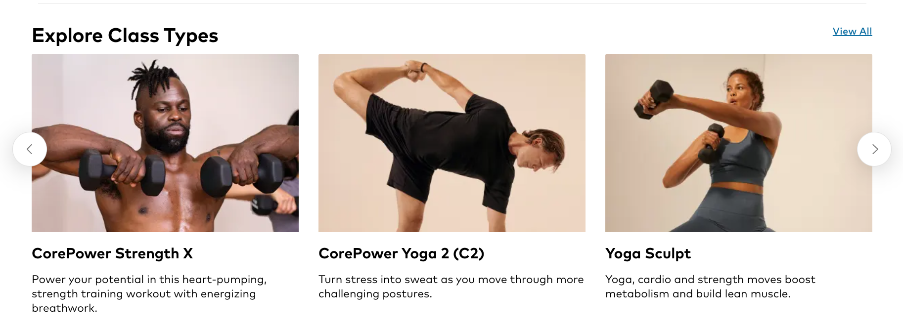
Give the user a list of basic options to choose from that relate to a more general topic. Here, Corpower Yoga offers students the chance to choose a class type based on a picture, the name and a small description — with only 3 options to choose from at a time.
3. The Principle of Disclosure
Building off the principle of choice, disclosure ensures that a user isn’t overwhelmed by information. Imagine a block of text about a page long with no pictures or breaks; this can look like an information overload and feel like noise.
This principle enables you to put the same content in different places of your website — leveraging the concept that a website is made up of layers. For example, you wouldn’t see a university’s entire catalog of classes (or even degrees) on the homepage because they’d never attract the right students.
For example, take a look at Boston University’s (BU) homepage:
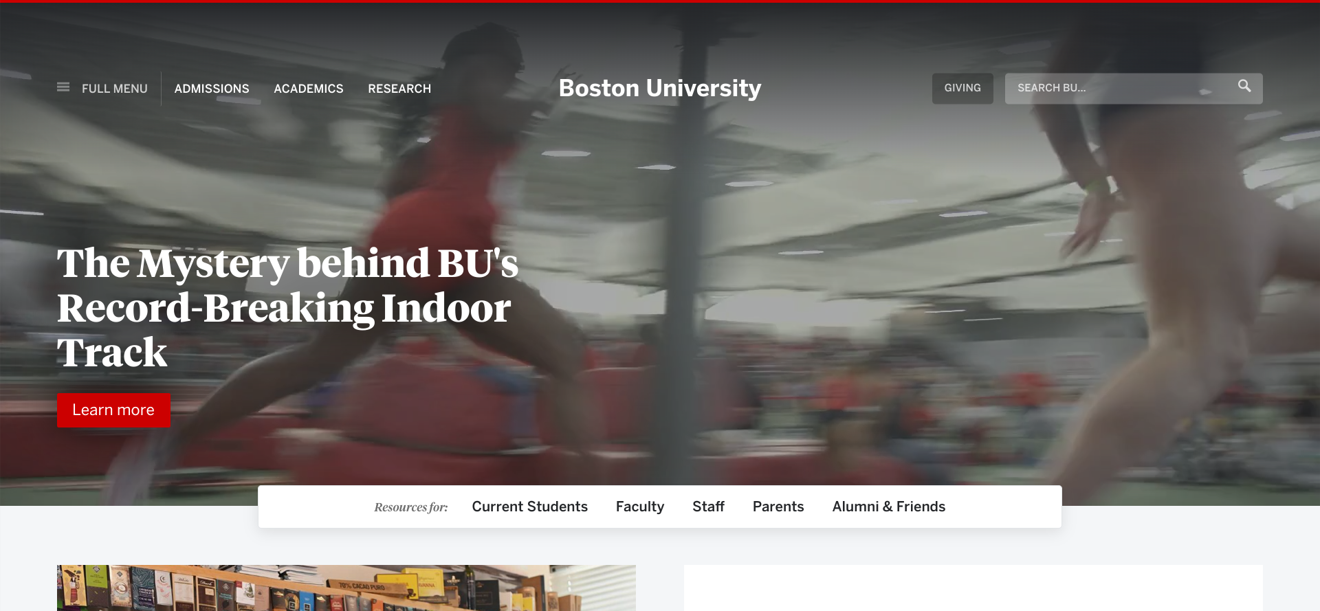
Its homepage includes the ‘Academics’ option in the banner up top. You may either click on this link or open up the hamburger drop-down ‘Full Menu’’ to the left which offers more subcategories for each option in the banner.
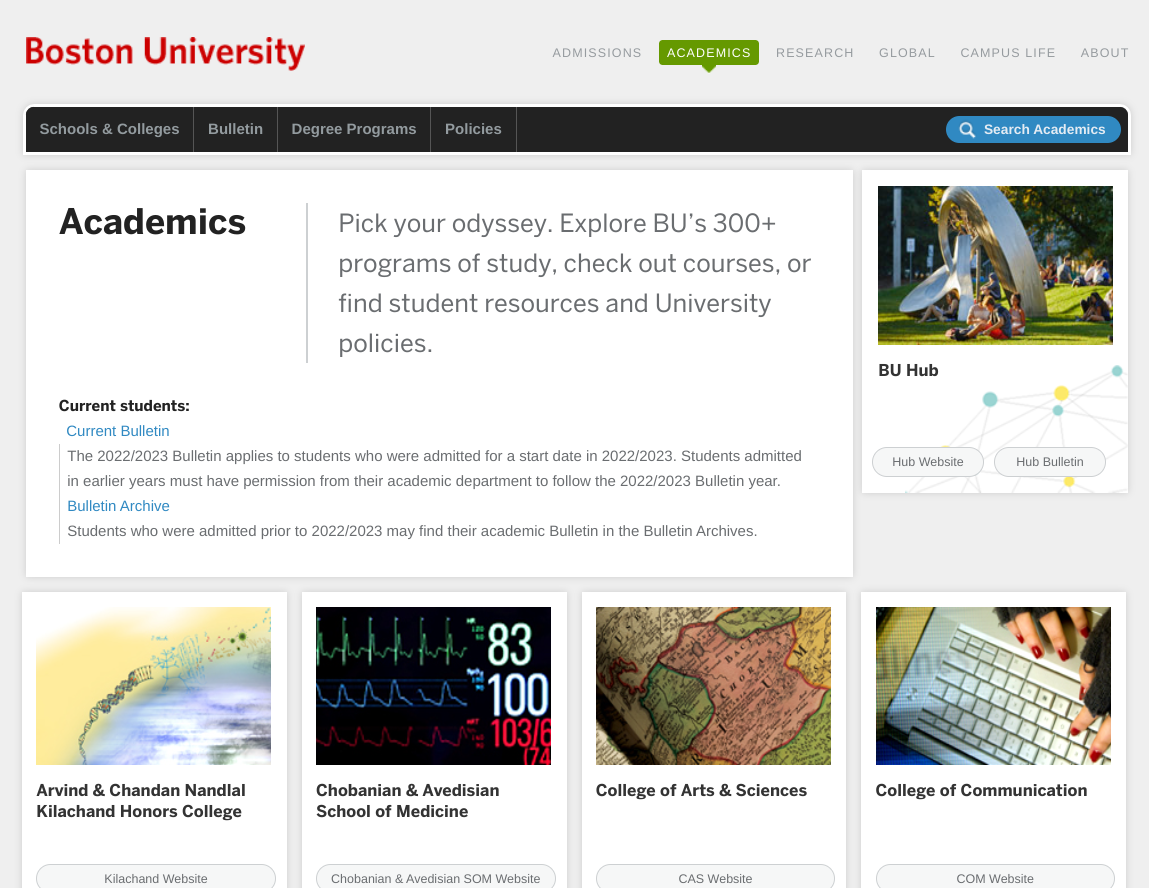
After clicking on the ‘Academics’ tab, you’ll find more information and then a list of their colleges.
This digression allows users to make a decision with just a little bit of information.
4. The Principle of Exemplars
If pictures speak louder than words, then say less! This principle urges designers to consider cutting down their on-page copy with the use of pictures instead.
In both of the above examples — Corepower Yoga and BU — pictures are the main focus for these pages. Of these options, the pictures used to describe the different colleges at Boston University better explain their purpose than those from Corepower Yoga.
Why? Well, the BU images are more specific to the college, whereas Corepower Yoga uses 2 similar pictures of people lifting weights. If Corepower had been more specific with their pictures, they might not have needed the short description underneath.
5. The Principle of Front Doors
In a big house, you might not expect everyone you know — guests, friends, family members and strangers — to always enter the home through the front door. Brown urges you to assume that about 50% of users will enter your website via some other page than your homepage — a side door, so to speak.
A side door must convey the information it intends to, such as a blog or a YouTube video, but it should also offer other elements to make the page dynamic like related topics and a navigation system.
Additionally, a side door takes the pressure off of the front foyer to tell the user everything there is to know about your website. Instead, the front door should only include the basic information needed to inform the customer what your business is about and the services you offer.
6. The Principle of Multiple Classification
Each customer identifies items and terms in their own way. To accommodate, you could include the same page under different categories so users have multiple ways to find content. Be careful not to put too many options in front of them, though, to avoid confusion and cognitive overload.
7. The Principle of Focused Navigation
Continuing the concept of avoiding information overload, navigation should remain as lean as possible while still offering the information users need. Among the design team, it’s important to name different navigation types to indicate their purpose rather than their location on the page. This way, everyone on the team knows how they function and what goes where.
8. The Principle of Growth
We know that the number of pages of content on the internet grows every day — even on your own website. This principle ensures that teams are prepared for a new piece of content because it aligns with other existing categories. That new category of content won’t disrupt the user experience design because of the previous principle — the principle of focused navigation.
Good IA takes these principles into consideration each time the designer approaches web design.
Content Hierarchy Best Practices (Examples)
Putting together your content hierarchy and organization systems may remain one of the more challenging aspects of IA. However, the best way to approach IA is to think of hierarchy from individual parts rather than from a top-down angle. You wouldn’t, for example, build a car from the top down. Instead, you’d assemble the parts first.
Content Inventory
Before you can order all of your content, you should probably know what all is out there. This step is called content inventory where you list the components for any future design project.
The inventory list involves certain elements of the content including:
- Meta elements such as keywords, tags and descriptions.
- Title of the content.
- Author and/or provider.
- URL.
- Copy.
- Audio.
- Videos.
- Images.
- Document files.
Here’s an example of content inventory from Adobe. You’ll notice not only the categories like page title and URL, but also the page level and the content type. Don’t forget to leave room for additional categorizations as you build out your IA.
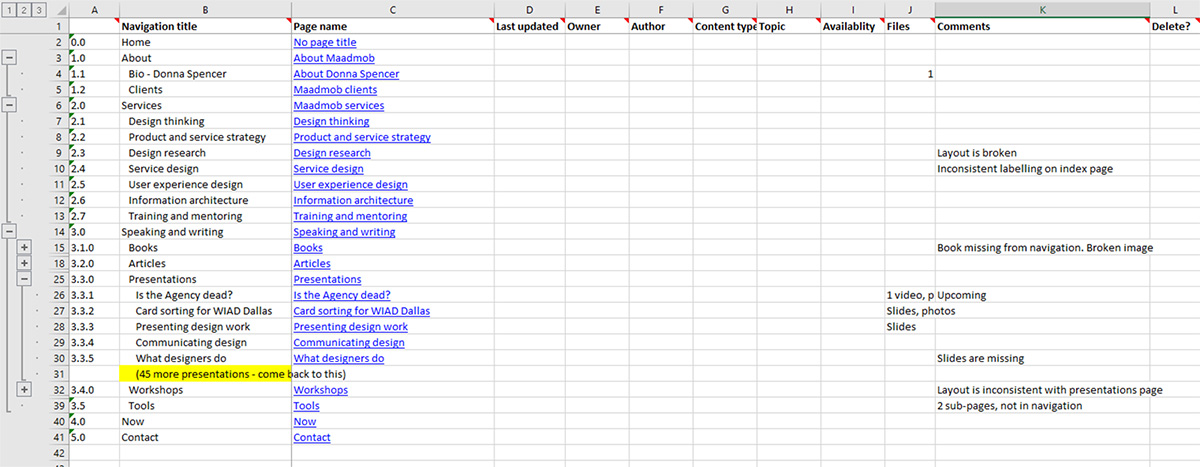
This list and its categories help designers identify components of content to plan the structure. It’s easier to categorize components and move each list item around in a spreadsheet than it would be to modify the design project.
Taxonomies and Metadata
Once you’ve laid out your categories and lists, you can begin to consider what each piece of content consists of within each category. In this step, you will attempt to categorize items so that they fit well within a group.
Metadata will ensure users can find your taxonomies through a simple search on the topic. This helps customers who aren’t scrolling through every item and can find what they need right away. Keep in mind that the more content types you have on your page, the more complex the taxonomy will be.
User Intent and Preferences
From here, you’ve got an understanding of how much content you have and how they relate to one another. What’s next is to decide where each page and category should reside in the hierarchy.
There are 3 main types of content structures:
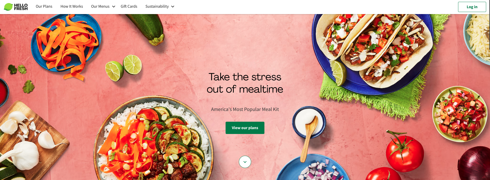
Sequential: A path is already developed for customers to follow and is typical for retail websites and apps. HelloFresh prompts users to pick out a plan right away, followed by preferences and plan sizes. This user journey finally leads to the purchase page.
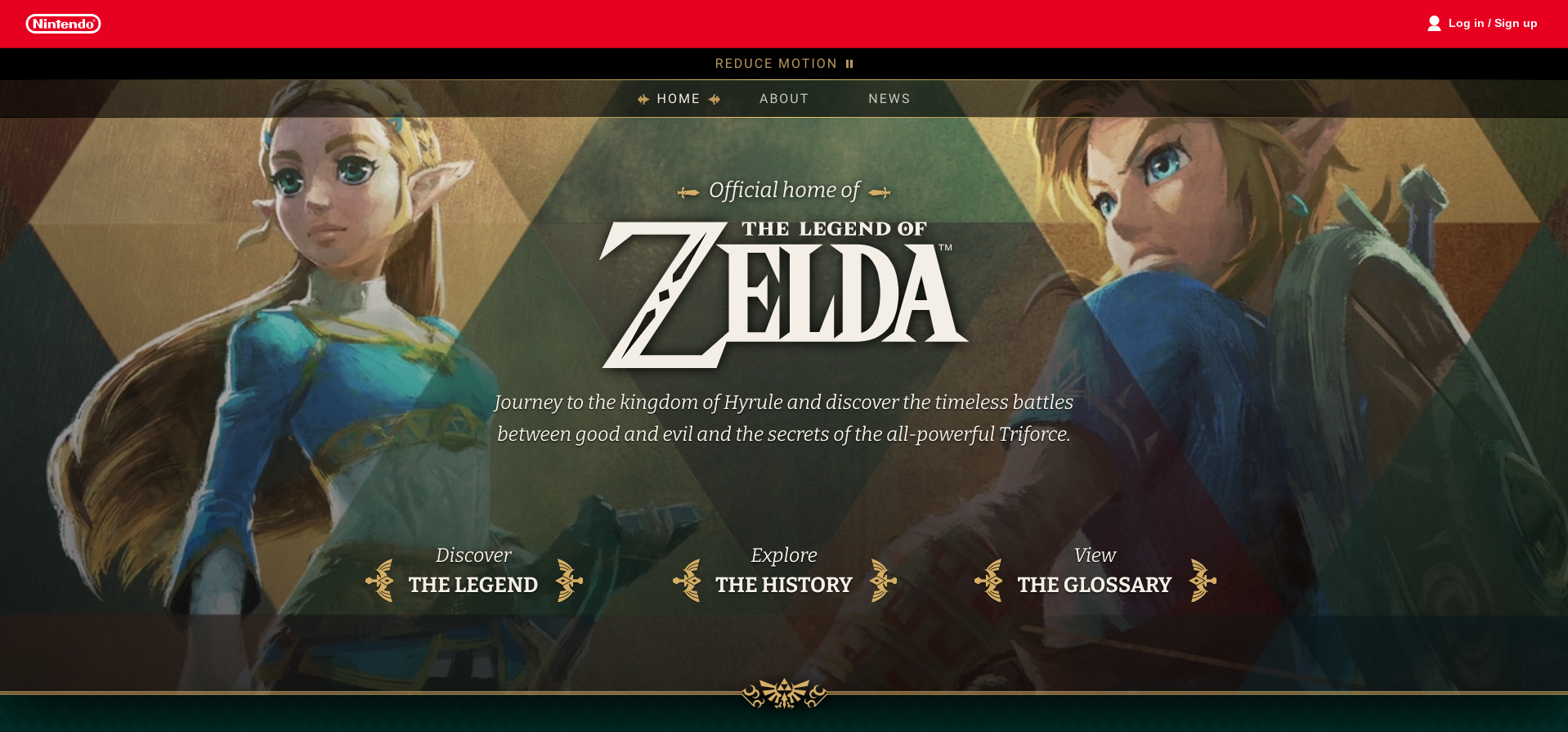
Hierarchical: The user is forced to make an assumption on the importance of each page. Here, the user can dive into the Legend of Zelda with the three most prominent links on the homepage.
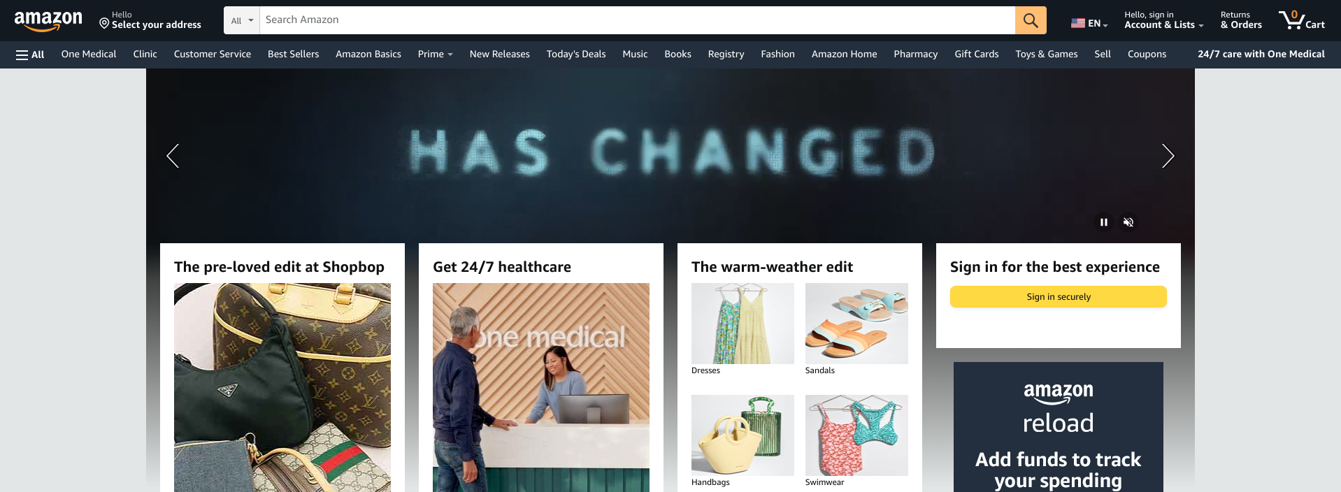
Matrix: Users can navigate anywhere in the site on their own accord after being given choices of content typical for news, opinion blogs or health care sites. Amazon gives you suggestions but ultimately, the entire site is built from the search bar at the top and the navigation bar just below it.
Although these examples are already built out and include visuals, these are the types of structures you could imagine for your website based on the user intent. The most prominent aspect of this step is understanding what should be most prominent for your users — what questions are at the forefront of their search before landing on your page.
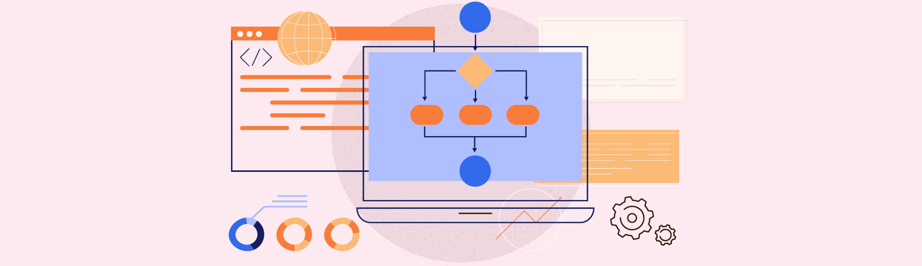
Content Diagram
After organizing your content and deciding where it should be placed in the hierarchy, it’s time to wireframe your content. Wireframing gives you a visual representation of how the content will lay out and relate to each other in a blueprint that UX designers can launch from. It’s a great way to plan out transitions and interactions across an organized general layout for your audience.
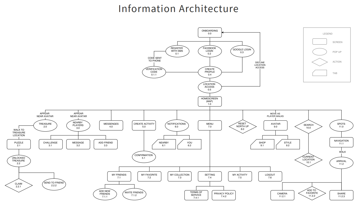
You can see here, there’s no reason to add color because it’s only for visual support, so an information architect can keep this part fairly simple. This example is a blueprint of an app and clearly lays out a legend for each shape, a small description of what the page is meant to be and how each page connects.
How Do You Know You Got It Right?
When designing the IA of your site, there are a number of things to keep in mind. However, the most important point is to lead with the user experience. Your preferences don’t relate as much to how a page should be structured as to how a user will expect to interact with it.
You could conduct A/B testing, gather feedback through interviews or organize other usability testing methods before launching to see how well users navigate your website. Effective IA helps build customer loyalty because it enables the users to get to the information or product they want.
Great IA offers excellent usability throughout the website to enhance user flow; it keeps customers satisfied, reduces bounce rates and improves the web site’s popularity.
There are many design software tools that can help launch your IA.
Examples of site mapping tools could include DYNO Mapper and Lucidchart. These will help you develop a blueprint for your website structure and demonstrate how each page connects to one another. This will help you organize your thoughts and visualize relationships between all of your pages.
With these tools and ideas in front of you, users can better navigate your site in an intuitive and usable way.