
No matter how great your content marketing is, website visitors are sure to give you a wide berth if your site is slow or poorly designed. Luckily, solid user experience can save the day.
In addition to ensuring the content you provide is valuable, you must invest in a website that is intuitive to use, easy to navigate and aesthetically pleasing.
Drilling down further, it’s vital your website boasts fast load times and functioning links. The saying goes that you shouldn’t judge a book by its cover. However, if your cover is slow or impossible to open, what’s inside won’t really matter.
Besides offering users a pleasant experience, balanced UX design can help with search engine optimization. Google itself has stated that well-designed on-site experiences impact search rankings, possibly meaning the difference between reaching your audience before competitors.
Lauren Fox, associate analyst for Brafton’s Consulting department, has collected three stellar examples of recent UX design to remember heading into 2017. Let these samples serve as a model for your own efforts.
Airbnb
The reigning champ of peer-to-peer homesharing, Airbnb has to work hard to gain user trust, both among those seeking lodging and those considering renting out their homes. The business must also prove it’s not only cheaper than renting a hotel room, but easier to arrange as well. Its website accomplishes this with clear, straightforward directions to either become a host or book lodging, all wrapped up in a minimalist yet warm design scheme that calls to mind art galleries and popular social media platforms alike.
“You’re basically on a getaway as soon as you land on the site (talk about good UX!),” Fox said.
Toby
Living in a digital world often means switching from browser tab to browser tab on our computer screens. Toby is a tab management platform that allows you to save the tabs you need without having them all open at once. This helps users stay organized and gives their poor computers a break from running so many programs at the same time.
Toby takes a potentially boring topic (tabs, yawn) and adds some pizzazz with a hot pink and sky blue color scheme that creates memorable brand recognition. Its website also aligns with its formal purpose, conveying essential information in well-organized snippets with plenty of appealing white space in between.
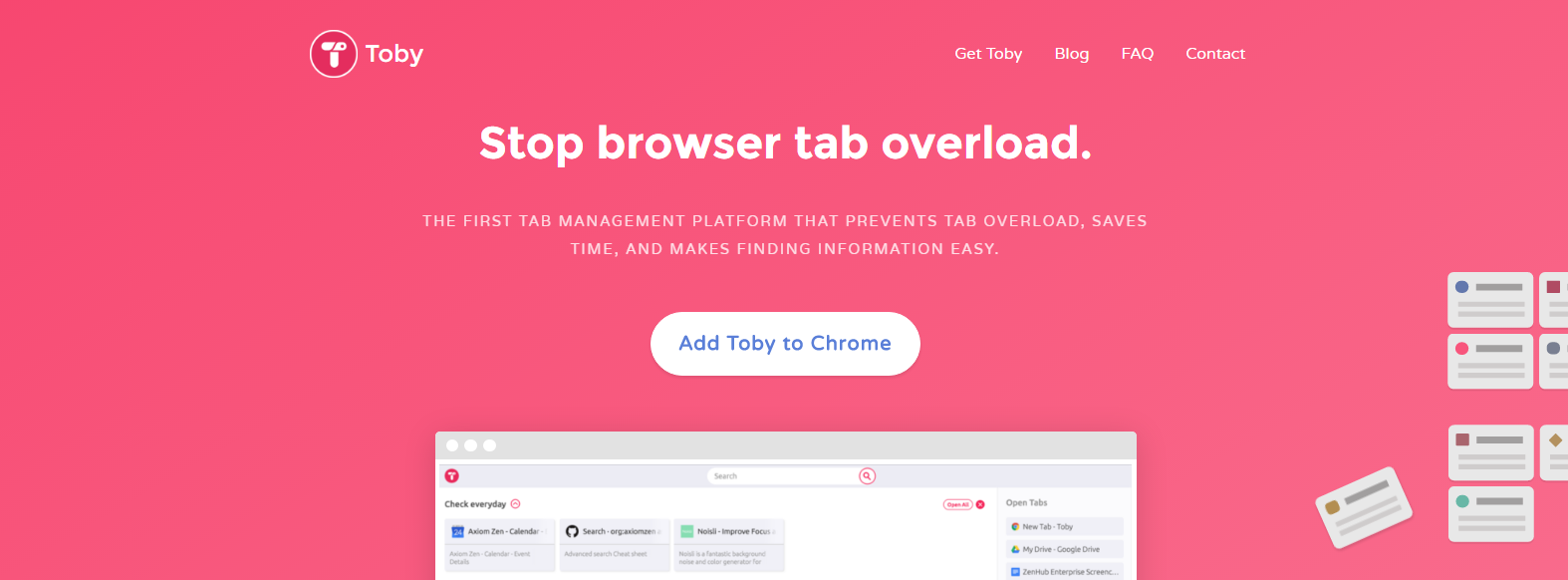
Toby’s hot pink approach to design leaves a memorable taste in users’ mouths.
“[Toby is] super easy to use and I think that’s because of the great user experience they’re giving you, both on the site and with the browser extension,” Fox said. “So if you’re guilty of having 23,453,457,652 tabs open at once, this should help with workflow, and your computer’s processor will thank you.”
Invision
It makes sense that Invision would know a thing or two about design – the company is focused on providing prototyping tools that allow you to add animations, gestures and transitions to design files.
Continuing the theme of excellent use of white space, the Invision website combines crisp, open areas with cool colors and call-to-action buttons that pop out with hotter hues. However, it’s Invision’s email marketing content that caught Fox’s eye.
“I love its format for an email newsletter because each section is clearly defined, and even though it looks super long, it doesn’t feel that way when you’re scrolling through in a browser or on mobile,” Fox said. “It’s very obvious with their pink buttons where to click to read more. Also, they’ve got some great email subject lines that catch my attention and get me to actually open the email.”
As these three examples illustrate, outstanding UX doesn’t have to mean including everything but the kitchen sink. Taking a minimalist approach helps vital information and more colorful outliers pop. Keep this in mind when planning your own UX updates in 2017.