

If you’re like me, you’re always on the lookout for new ways to prove what’s working and what’s not on a website. Since I’m coming at my clients’ content marketing strategies from an outside perspective, I often see places that could be better optimized to make more money.
Sounds great, right? Who wouldn’t be on board? Get the tech team on the phone and start making some changes!
Not so fast. Even if I provide strong metrics to back my suggestions, they understandably want a second opinion (especially if I’m not the type of person their website is targeting). Here are some methods I’ve developed to understand how visitors behave on sites, what that means for the strategy and how that information can be distilled to improve the bottom line.
Get a close look at audience demographics with Google’s Universal Analytics
Google recently made an official switchover to Universal Analytics, and with a little bit of front-end work, you get a lot of demographics data in return. Just put the Universal Analytics code in place, follow the short list of steps to migrate to the new platform, and you’ll find it’s fairly straightforward to start collecting a surprising amount of demographics data.
Overall Benefit: Universal Analytics allows you to segment out all of the different groups coming to your website based on their behavior on the website and other criteria.
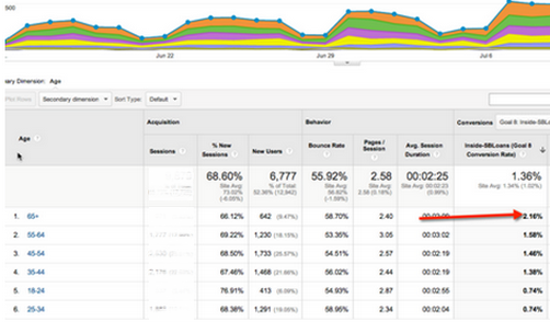
Step 1: Find out who IS converting on your website
If you’re looking for information about ecommerce sales or some kind of micro-conversion, you can segment by age group and look at the conversion rates for each group. Then you can start to dig deeper – for example, if women are converting at a much higher rate than men – why is that?
When I did this with one of my clients, we saw that people 65 and older were the demographic driving the most conversions.
Upon further inspection, we saw that most of the visitors in that demographic are males. From this data, you might assume that males are therefore the highest-converting audience, but that wasn’t the case.
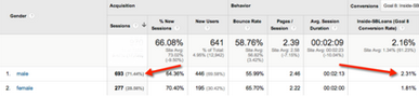
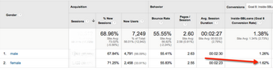
Female visitors are actually more likely than males to convert across the entire site (if you take age demographics out of the equation).
And among females coming to the site, the 45-54 age group converts the most.
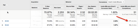
So the sweet spot for this company is targeting males over 65 and females between 45 and 54.
Step 2: Find out where they’re converting (and where they’re not)
The information above is the first piece of the puzzle, but it’s not actionable yet. The next step is to find out: What landing pages are they landing on? What are they clicking to that’s working so well? How are they behaving that’s conversion oriented?
You can do this with low-conversion behavior, too. What pages are people going to most when they leave before converting? Say they are going to pages D, E, and F – look at how can you you can make those pages more like high-converting pages A, B and C?
Step 3: Find out why they’re doing what they’re doing
Through demographics data so far, we have a good idea about who is coming to the site and what they’re doing there, but all we have right now is a snapshot of their behavior. We need more data to work with so we can get a little bit deeper into consumers’ actions and find out how they’re moving through the funnel.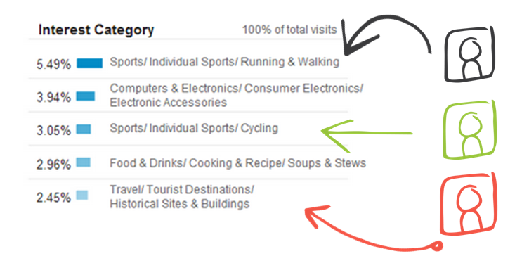
Look at their Interests: One option you have with Universal Analytics is to segment people by interests. It sounds crazy, but Google will show you how many of your visitors are movie lovers compared to news buffs. With more information about the people coming to your site, you can tailor your content further.
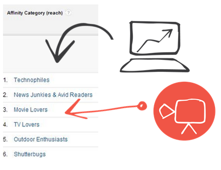
Affinity categories: There are also Affinity categories, which are meant to provide a broader look at users’ lifestyles rather than specific interests.
Now that you’ve segmented out your visitors and found that one group is converting at a higher rate, and which pages and they’re visiting, you can draw some solid conclusions. Product page A is doing better than Product page B, and the primary differences are that page A has custom infographic on it and a CTA above the fold. The solution seems easy – put a graphic on page B and move the CTA above the fold.
This is a strong interpretation of the data that Google provides, but there’s always room for human error and you should have additional data to backup your conclusions. It’s helpful to get a second opinion … or a lot of second opinions to see what customers actually want and care about. When data is coming directly out of the demographic’s mouth, you can’t argue with it.
Conduct qualitative analysis to find out what users think
The classic way to do a qualitative test is to shove some test subjects in a lab and extract the thoughts from their heads … You will probably never do this because it’s insanely expensive and you need a team to make sense of the data.
Here are some cost-effective alternatives:
Option 1: The 5-second test
Challenge your conclusions against your target demographics’ opinions (in this case, that select group of high converters) with a 5-second test. Did you know that when you visit a website, you’re making a number of snap judgments and building trust (or not) within the first five seconds? This will show you what kind of an impression your audience gets from your top-converting pages and what’s missing from your under-performing pages.
To run one of these tests, you upload a screenshot of the web page in question and create a prompt, such as: “Imagine you are shopping for shoes and you come across this page.” Then you enter questions for viewers after they’ve seen the site, like “Rate the quality of this page between 1 and 5,” or “Did the brand appear trustworthy?”
You can then select the necessary sample size and set demographic requirements and run the test*.
*The finer your demographic parameters, the more you’ll pay – so make the survey prompt and questions count!
Here’s how it works in action: This helped my client improve a top-converting page to drive even more sales. Through a 5-second test, we saw that visitors thought the page was busy and had too many choices. They were overwhelmed by the number of options and most said they wouldn’t buy something because there was too much information to process. This is relatively easy to fix: Pare down the content to direct customers to the most important parts – product information, price and the “Buy Now” button.
Option 2: Heat mapping
Another way to test your theory is to see what parts of the page are drawing the most attention. Heat mapping will never be able to show you where visitors are actually looking, but it gives you an idea about where they’re clicking the most to see if catering to users’ interests is paying off or costing clicks.
Here’s how it works in action: We used a heat map to see whether my client’s content pages were getting clicks where they counted – CTAs and links. The Audience Interest and Affinity categories in Analytics suggested these users liked celebrity news and the client wanted content with a pop-culture focus. Unfortunately, the test proved most visitors clicked pictures , but skipped over the calls to action and the brand’s logo, which means they’re paying attention to the most important parts of the page. With this feedback, we decided to make CTAs more prominent so visitors know where to click next and decrease the focus on celebrity pieces.
Option 3: Mouse hover, scroll map and click heat map
Want to go deeper than clicks? There are other studies that show where visitors’mouses hover on the page. You can use this information to gain a sense of what’s gaining interest on top-converting pages, and how you can carry those elements over onto pages that struggle to provide goal completions. Again, where are people looking on Page A that they aren’t going on Page B? Why not? What’s missing?
Here’s how it works in action: When considering how to improve a page’s conversion rate, we looked at places where people were hovering, scrolling and clicking. We found that most visitors were paying attention to a picture in the top right corner of the screen, which was bad because it took focus away from the content. We tested a mock-up of the same page redesigned with the CTA in the top right corner and the featured image aligned with the content saw much better results – 73 percent of viewers now dwelled on the call to action and 88 percent looked at the full article.
Stop relying on intuition – Get proof for smarter marketing & more ROI
We’re living at a time when there’s data everywhere, but that means you have to work harder and dig deeper to find the information that really matters for your web marketing strategy. At the end of the day, it doesn’t matter what you think customers want from your website, or what I think your customers want – it only matters what they truly do want from you and what they respond to. When you get metrics straight from your audience, you can deliver experiences that make people convert.