
I’ll admit it: I sometimes watch those movies that are so bad they’re good. You know, the ones that make you think, “How did this movie even get production approval?” while at the same time keeping you glued to your seat.
(I’ll refrain from listing some of my favorites here out of fear that I’ll be banned from ever writing for Brafton again.)
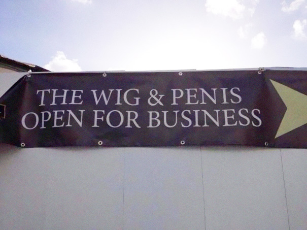
The concept of “It’s so bad it’s good” can be found everywhere – even in the world of content marketing, and especially when it comes to design. Whether it’s Photoshop fails, sloppily put together images or a website that looks like it’s straight out of the early ‘90s, there are tons of examples out there to tickle your fancy.
Below, the Brafton Graphics team weighs in on some of their favorite crazy design mistakes, and offers advice on how to avoid them so your brand doesn’t become a “so bad it’s good” staple.
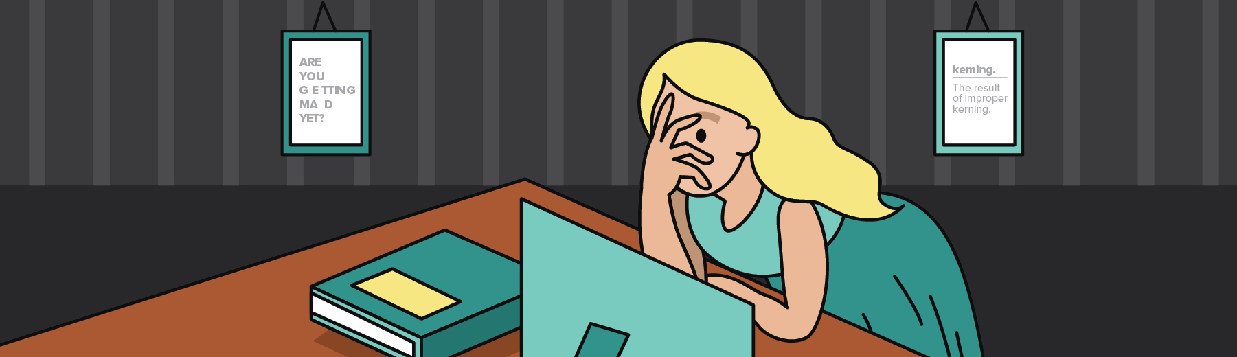
Learn when you kern
Kerning is the space between letters, and it’s one aspect that can turn a great graphic into an unintentionally funny – and unfortunate – one. Graphic Designer and Illustrator Ali Eagle said when letters are too close or too far away from each other, the reader can perceive a word or phrase in a much different way than it was intended. She added that it’s something she always keeps a close eye on when creating designs.
“Our department is always checking our letter spacing, especially when we use fonts that are blown up to larger sizes, or are decorative fonts that might not have the most intuitive spacing built into them,” she explained.
It’s always great to get an extra set of eyes on any design you create, so be sure to pass it by others to get their feedback – and perhaps spot those poor kerning mistakes.
Via BoredPanda
Via The Denver Egoist
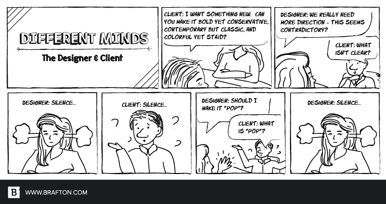
Making clients’ (unrealistic) dreams come true
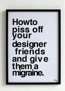
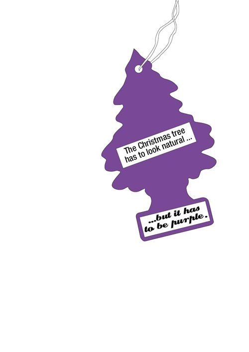
Brafton’s Design team loves working with clients and helping them realize their design dreams. However, that doesn’t mean there aren’t clients who come in with unrealistic expectations, and it’s up to our designers to talk them through everything and show how some ideas work better than others.
Senior Graphic Designer Jenna Campbell said that designers often put aside their own tools and strengths in order to please the client at any cost. But this isn’t always the right approach. She stated that while designers should aim to deliver beyond a client’s expectations, they should first take a step back and ask themselves, “Is this really where this graphic should be going?”
“Every now and then, a client may think they are a creative genius, and achieving the impossible is as easy as, ‘Can’t you just change this in Photoshop?’” she explained. “As professional designers, we need to know when to step in and stick to our design guns.”
Via Daily Dawdle
Via WebDesignDev
Senior Graphic Designer Maysoon Shafi explained that she often sees graphic design go the wrong way because of unrealistic expectations. She offered up this article from French design agency Graphéine, which showcased a few famous graphics along with what the agency imagines some typical client feedback would be.
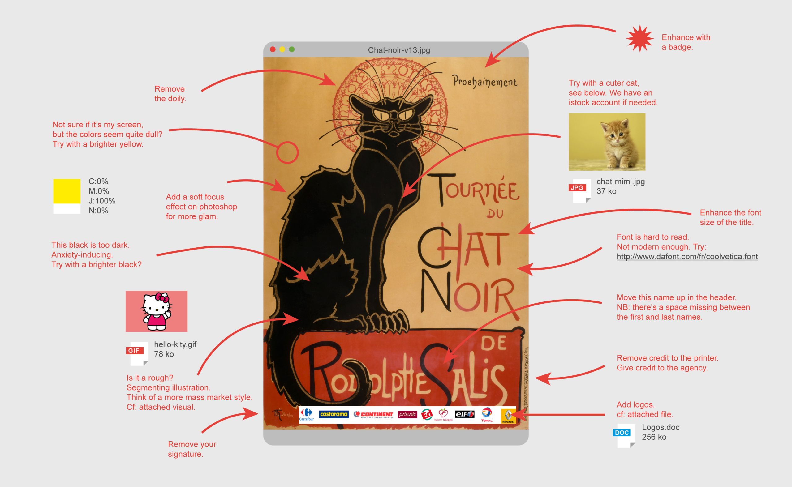
Via Graphéine
So how can designers and brands work together to develop amazing graphics that fit everyone’s needs? Design Director Ken Boostrom said it all comes down to how they communicate, and the best way is through designs.
“It’s not easy to speak design direction,” he explained. “When communicating design or visual direction, use visual examples. One search in Google images will give everyone a visual tool. Pull nearly any image from Google that visually demonstrates color, fonts and illustration style, and use it to show what works best for your brand.“
He added that many clients want designs turned around at a fast pace, but this significantly impacts any creativity in the graphic.
“One short response to why graphics or design doesn’t work is, ‘speed kills,'” he stated. “I might estimate that projects that have speed as a priority fail because ‘speed’ is not a communication – it’s an action. Images, design and illustrations are created to communicate and rushing through the process reduces creative thinking.”
Don’t forget your website
Design mistakes don’t only happen with images and graphics – they also happen with websites. Face it, if people are coming to your website, and they don’t like what they see, they’re going to leave. And you can say goodbye to your chance of converting them.
Senior Designer and Illustrator Julia Emiliani offered up the following examples of bad website design that she has come across:
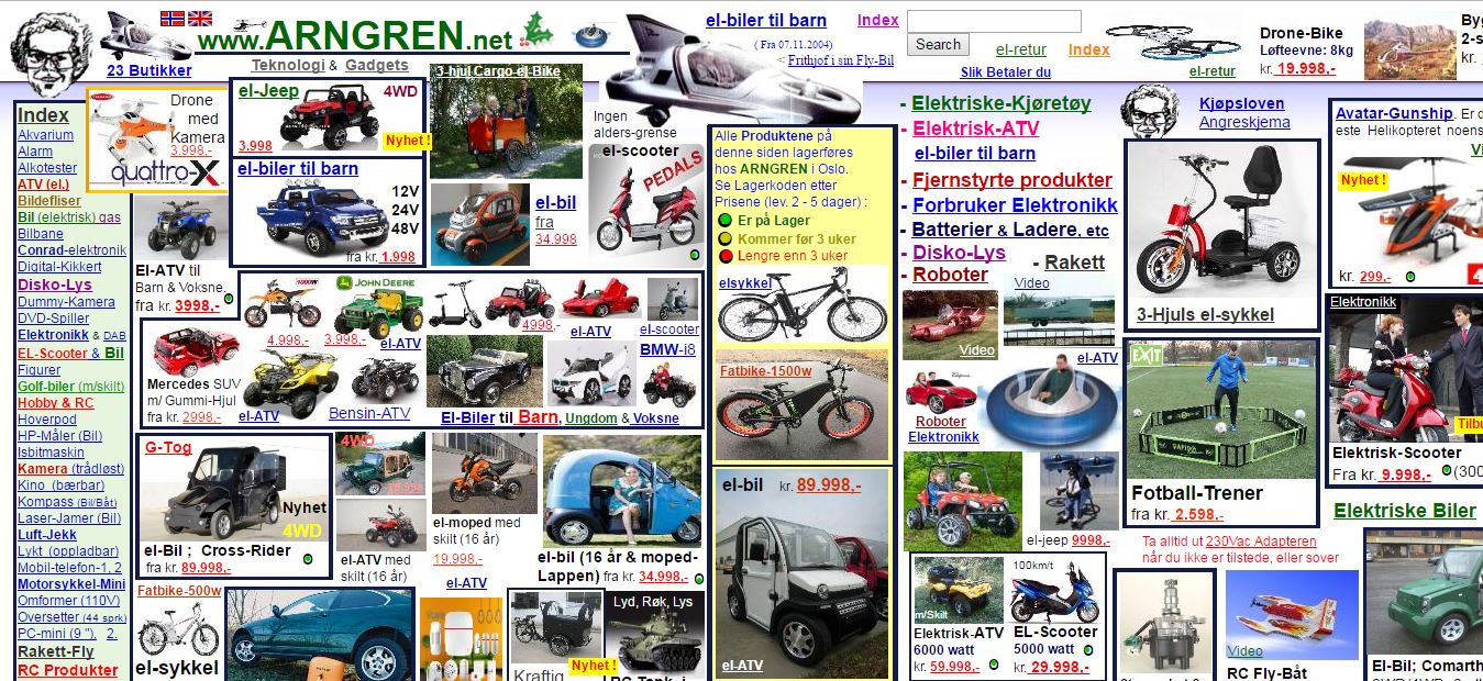
Via Argren.net

Via Pennyjuice.com
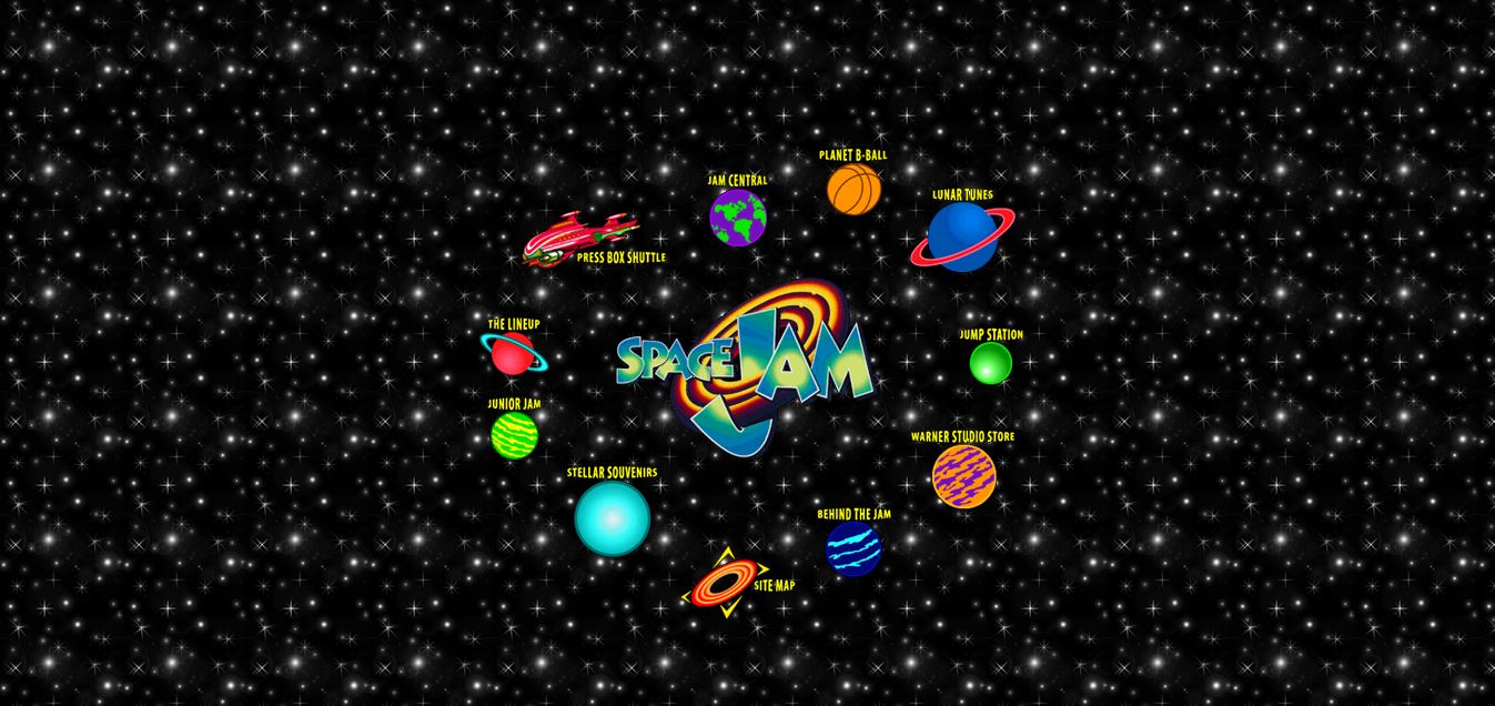
Via Warner Bros
When creating or revising your website design, always keep your prospects in mind. What are their initial opinions of your brand going to be when they come to your page? What design aspects can you use to get them to stay on the page longer? The user experience of your website is just as important as the content you’re providing, so don’t neglect this vital design factor.
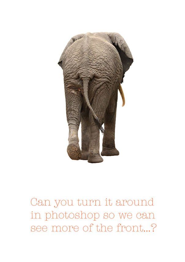
F is for Photoshop
You’ve probably come across a few Photoshop fails in online or print ads at some point, and while they’re funny to look at, they’re a nightmare from a design perspective.
Senior Designer Courtney Meyer provided some of her favorite Photoshop slip-ups that will make you do a double take:
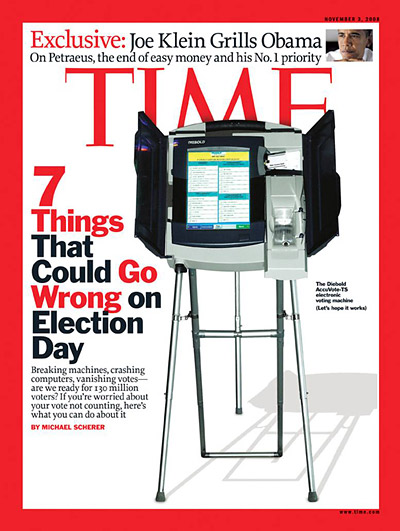
Via Time
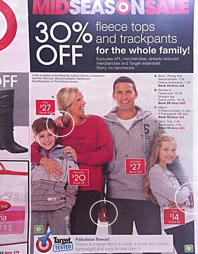
Via Daily Mail

Via Tourism Updates
To avoid these easily fixable types of design mistakes, Courtney advised you need to have another pair of eyes.
“It’s important to go through a graphic review and have more than one person looking at your work,” she said. “You never know when something might be construed differently than you intended.”
Effective and captivating designs are now a crucial component of content marketing strategies. So unless you want your brand’s visuals to be the next Sharknado, make sure you are catching mistakes before they happen.