
Imagine this: A visitor comes to your website and reads a piece of content that you put a lot of effort and time into. Great, right?
Well, sure, if your end goal is to just have that person look at your content and nothing else. But let’s be honest here: That’s not the end goal of any marketer (other than professional bloggers who make money off of ad space). You want that visitor to read your content, then move on to the next step, convert to a lead and become a customer.
Improving user experience is an aspect that many marketers work on – and sometimes struggle with.
Let’s go back to the example visitor I mentioned earlier: That individual comes to your site and reads your content. But then they get stuck. They don’t see anything on the page that directs them to a next step, and there’s no (or poor) navigation to lead them on.
What do you think that person is going to do? They’re going to leave, and your chance to convert them will leave along with them.
This is why website structure and user experience play an incredibly crucial role in encouraging your visitors to take action. And it’s why brands can’t afford to ignore UX – it should be an important factor in their marketing strategies. In fact, research revealed that within the next four years, the customer experience will become the main brand differentiator rather than a product or price. When people come to your site, they aren’t just expecting to get answers to their questions. They also want to find those answers easily, and having a next step helps.
Always a next step
Make sure your visitors always have a next step to move on to. This is the most vital aspect of user experience, according to Brafton SEO and Digital Marketing Consultant Casey Brusch.
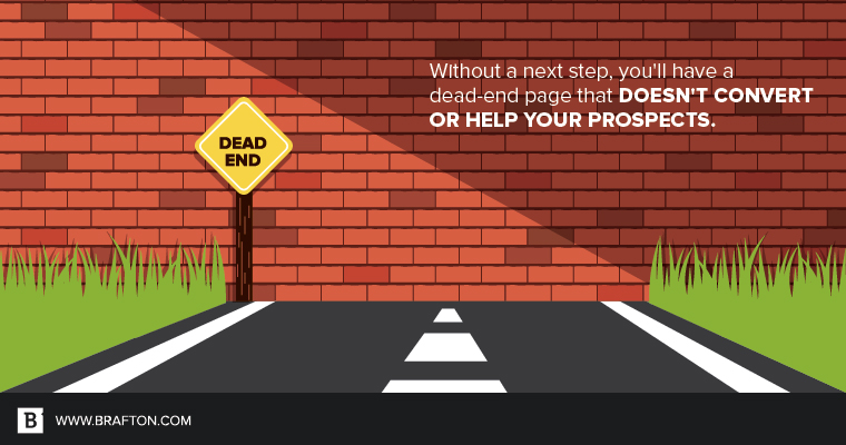
“Make sure prospects have a place to go to find more information, or make sure they’re able to navigate back to find something that’s better suited for their needs,” she explains. “Whatever it is, give them that next step. Otherwise, you’ll have a dead-end page that doesn’t help or convert them. In fact, it could make them go back to Google and try to find more guidance. What if that page is on your competitor’s site?”
Keep it simple and consistent
When it comes to UX, Casey is all about simplicity and consistency. This goes for every aspect on the page.
Simplicity
Many companies want to cram as much information as possible into one page, but visitors are going to be turned off by too many distractions. This will also make it unclear which next step they are supposed to take. It’s important to remember that you are creating content for your audience, not yourself. They are not as interested as you are in your 2,000-word landing page.
To keep content simple, make key takeaways easier to read by using bulleted or numbered lists as well as bold formatting. Also, think about using visuals such as videos or graphics to more effectively convey a message. If a user is on your site to find out how to use a certain product, post a video. Or if they need guidance through a step-by-step process, a graphic or an explainer video will work great for that purpose.
Consistency
Consistency ties your website together and helps with creating a unified branding message. Casey suggests making sure all of your pages look like they are part of one journey. She also says this consistency should extend to your site navigation.
“Keep your top navigation menu simple and consistent,” she explains. “Users should know exactly where they are in the architecture of your site and see from your navigation menu how to get back or where they can go next for additional information. I recommend no more than six primary items in your navigation menu, and these can drop down to more options categorically.”
Use no more than 6 primary items in your navigation menu – they can always drop down to more options categorically.
CTAs and colors
When you’re providing that next step for your visitors, you also have to keep your eye on how you are guiding them. This is why creating effective calls to action is crucial.
Just like the overall page design, you should keep your CTA strategy simple. Only have one CTA per page based on the most likely next step for the target audience. To make a CTA more noticeable to readers, place it above the fold and pay attention to the colors you use. While you want to create consistency with your CTA colors, make sure they stand out. Casey recommends using a tool like the Adobe Color CC to find complementary colors that still stand out against your site’s color scheme.
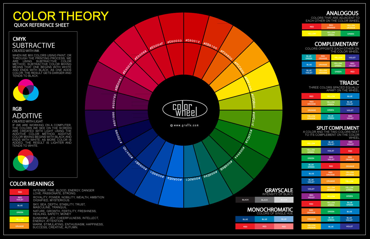
Via: Graf1x
While additional resources and navigational items can be helpful on a page, you want your CTA to be the most prevalent since it’s the one action you most want visitors to take.
Non-conversion steps
But what about prospects who just aren’t ready to convert yet? Casey suggests including next steps for those visitors further down the page. She uses Brafton’s example of pop-ups for newsletter catches to show how brands can provide a clear path for top-of-funnel prospects.
“Newsletter catches are a great way to gather information from people who aren’t ready to become customers,” she says. “This keeps them updated on your brand and encourages them to visit your site again when they finally are prepared for that next step.”
UX for the buyer’s journey
Just like you create content for each stage of the buyer’s journey, you should also create a user experience for it. This is incredibly important because prospects need to know what they’re getting on each page, and it should correspond to where they are in the funnel.
Casey says that while some marketers may think the buyer’s journey is too fragmented or unique to track, it doesn’t mean you can toss out the playbook.
“The buyer’s journey may not be as fluid as it once was, but even if this is true, don’t assume prospects don’t need information,” she argues.
For visitors in the top of the funnel, providing them with the content they need and a direct next step (most likely a CTA) is the ideal user experience. For people deeper down in the funnel, you’ll have gated assets that require more information. Wherever the user may be in their journey, make it clear on that page what exactly they’re getting.
And this approach will help your site when it comes to SEO as well. Search engines have begun to favor pages that take into account user intent.
The nurturing process doesn’t start once someone has filled out a form or downloaded an asset – it starts with UX.
“Each page of your site should address a specific need, and make that clear right from the headline of the page,” Casey explains. “That leaves little confusion as to what the user will get out of the content and then make it easy to transition to more information, like a demo.”
As you can see, the user experience on your website is one of the main factors when it comes to increasing your conversions. And while getting those conversions is a great goal, Casey states that it’s not all about design, structure and UX – you’ve got to make sure you’re also nurturing those leads once you’ve got them.
But that nurturing process doesn’t start once someone has filled out a form or downloaded an asset – it starts during that initial user experience. So make sure you’re providing the best possible website UX for your prospects to lead them down the conversion path.