
Your blog may not be the belle of the sales ball, but that doesn’t mean it should scare away potential suitors.
Blogs are the first line of defense in establishing your brand, building trust among visitors and enhancing search engine optimization.
Oftentimes, your blog is the first interaction prospective clients have with your brand. These top-of-funnel website visitors can either be greeted by a seductive mix of visual marketing and user experience best practices (cue sultry saxophone music) or a mess of text and missed opportunities (cue record scratch sound effect).
Put simply, ugly blog content won’t win you any hot sales dates.
Understand and avoid the six cardinal sins of blog design to keep your readers coming back for more:
1. Tiny text
If you’re asking someone to read your blog, the least you can do is take it easy on their eyes.
“With all the screens and displays we view each day, eye fatigue is a very real thing,” said Lauren Fox, Creative Manager of Brafton.com. “If the text on a blog is too small, and I have to squint to read it, I’m much less likely to read a whole post.”
Beyond fonts and character sizes, consider how line spacing and line height may impact your blog’s readability.
2. Wide loads
Most of us may read from left to right, but regardless of direction, everyone’s eyes grow tired of scanning long distances before moving on to the next line. Reader comfort is key.
“We’re better at reading through text that’s grouped together – where we can see more at a glance with less horizontal scrolling,” Lauren said. “Article pages that are single columns without a sidebar are fine, just make sure you restrict the width.”
3. Gargantuan graphs
Walls of text are the death knell of any blog. Entire digital battlefields are littered with the corpses of authors who didn’t implement bite-sized paragraphs. When in doubt, hit the “enter” key and break up bulky paragraphs to make blog posts easier to scan.
That said, don’t go overboard. A blog post that’s nothing but standalone sentences can be just as bad as a never-ending paragraph.
4. Faulty formatting
In a perfect world, blog readers would hang on your every syllable. In the real world, they crave posts they can jump around on a whim.
“If an article is just a long-form block of text on a page, it makes it very hard for the reader to determine the ‘outline’ of the post at a glance,” Lauren said. “Sometimes we don’t have time to read through an entire post to pluck out the most important points and we need formatting elements to help.”
Those elements include numbered lists, bullet points and bolded subheads.
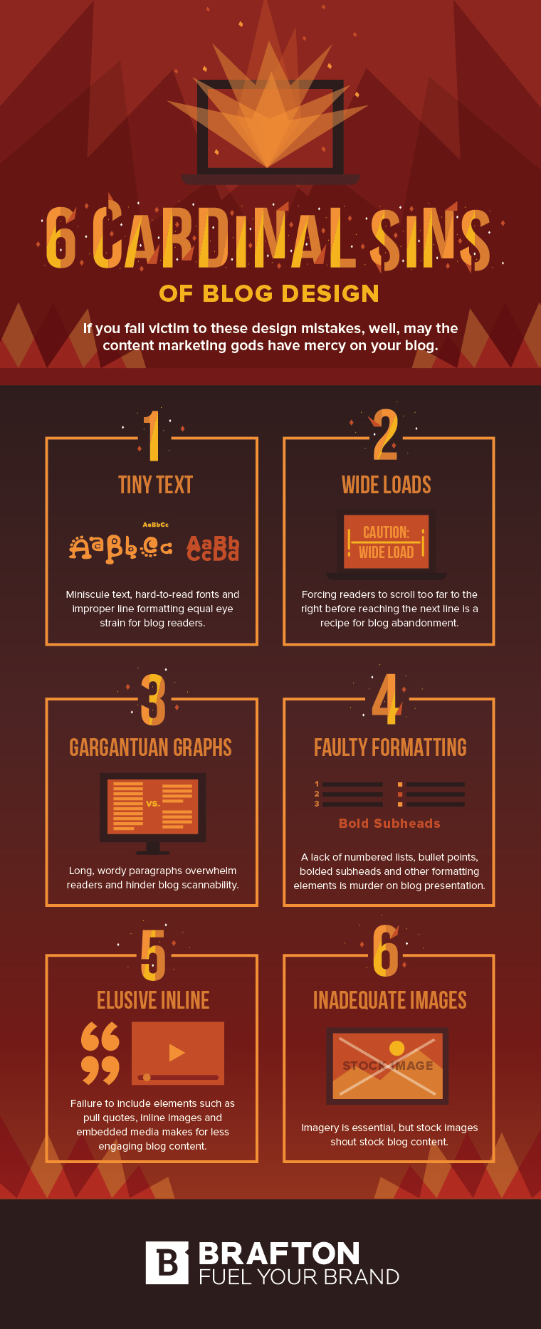
5. Elusive inline
In the modern blogosphere, inline elements are par for the course. If you’re not making use of pull quotes, inline images and embedded media, you’re missing out.
They break up text, add visual flair to blog posts and can be used to enhance, expand and spotlight different parts of your blog.
6. Inadequate images
Using images is a no-brainer. Blog posts without eye-catching imagery are more cringe-inducing than parents chaperoning a school dance.
The real problem is stock imagery. News flash: It’s dead. If you don’t want readers to associate your brand with stock content, invest in custom graphics.
Combine high-quality content with vivacious visuals. Slap on a relevant, attention-grabbing call-to-action button and place it in a logical location. Wash, rinse, repeat.
Visual marketing and UX techniques may not transform your blog into a money-making bonanza, but they’ll sure as hell make it easier to move prospects down the sales funnel.