

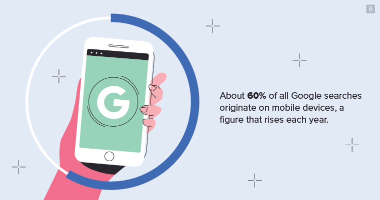
About 60% of all Google searches originate on mobile devices, a figure that rises each year. For me, it’s probably closer to 90%. I suspect that’s true for many of you as well.
This reality has created increased pressure on brands to optimize their media properties for the ever-important mobile user. That goes for websites, email and social media.
While social media platforms and email clients have existing tools and apps that make mobile optimization the norm, plenty of companies still operate on legacy or custom sites and content management systems. In other words, optimizing the user experience for outdated or siloed platforms is its own kind of headache. That’s why we marketers love plugins, templates and open-source architectures: They’re regularly upgraded, improved and customizable.
Whether your company is still in its marketing infancy or is already running enterprise-scale campaigns, mobile experience is a proxy for human experience. And any delay in integrating mobile search best practices into your content marketing is a day lost – and, potentially, a SERP ranking lost.
Here are several tactics you can use right now.
1. Disable, compress and minimize what you can
We all love plugins, toolbars and other helpful coding elements – they make our lives easier. But they can also slow down your site. While best practice is to keep page speed under three seconds, you should be aiming for two.
Google’s PageSpeed Insights tool shows you whether you’re hitting the mark and, if not, what you need to do to improve load time.
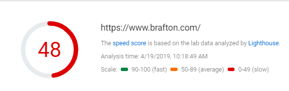
We’ve got some work to do. However, everything is a tradeoff. We’re fine having a slightly lower page speed if it means we’re able to keep certain components of our site as is.
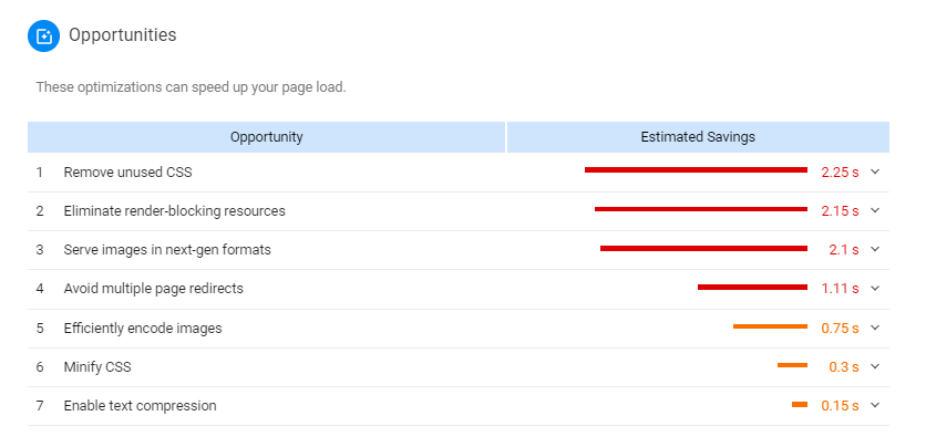
PageSpeed Insights clearly lays out opportunities for you to target, as well as how many seconds you can shave off your loading time by doing so:
The key to making your mobile site as usable and seamless as possible is to balance what works from a conversion standpoint with what conflicts with user experience. If your page speed is four seconds, for instance, but the JavaScript causing that wait has proved to convert users, then you can decide what to keep and what to cut for the sake of your business success.
Generally speaking, the following best practices apply to most sites:
- Reduce the number of interstitials (intrusive pop-ups) you use.
- Compress images (make display sizes the same as natural sizes).
- Compress text (Use GZIP to make downloading text-based content, font, data and HTML faster for servers).
- Remove unnecessary JavaScript and redirects.
- Prune zombie pages that are no longer relevant to your business.
- Limit auto-play animations and Flash Video.
- Curb the number of nonvital plugins to your site.
While the above tactics are hallmarks of responsive design, you can go a step further. Rethink your site’s overall visual impression. What jumps out? What adds little? What grabs attention immediately. Consider the following tactics to ingrain mobile-responsiveness into your larger branding:
- Use smaller hero images so users aren’t hit with a single block of design before they see any text.
- Leverage negative space to create contrasts on the screen. Users can only focus on so much at once, and you need their attention to be concentrated on the core message you’re conveying, not on cluttered or disruptive sidebars and design elements.
- Make phone numbers and addresses clickable. That way you allow users to contact your company with one click, rather than forcing them to jump back and forth between your site and their keypads.
2. Simplify form fills with page takeovers
Generating organic search traffic is the first step of the content marketing supply chain. But you also need to be converting organic search traffic. That’s what makes user-friendly web forms a vital cog in the customer journey.
If a mobile searcher lands on your page, finds it helpful and wants to take additional steps to learn more, how do they go about that process?
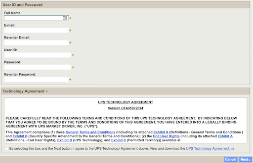
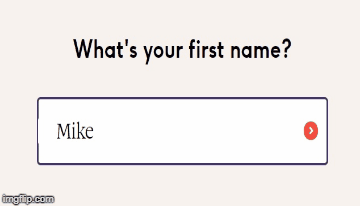
The answer is usually a quick form fill, so that your company can collect the user’s contact information and send them a downloadable asset like an eBook or white paper. But on a mobile screen, a form fill that requires a user to fill out too many boxes creates a tedious and disruptive user experience. Doesn’t the example below from UPS make you cringe?
Clicking back and forth, manually entering data and scrolling through the form may be conceivable on desktop – not so much on mobile. That’s why all of your mobile form fills need to be as concise and simplistic as possible.
One popular and effective way to do this is to scrap your long, multi-entry form for a series of page takeovers. Here’s what that looks like from personalized vitamin company Care/of:
A full-page takeover is when you enter your name, and a new page supplants the one you’re currently on – but you still remain on the same domain. You then enter an email address, for example, then the same thing occurs. So rather than forcing the user to scroll vertically and input data, you only require them to click buttons: almost gamification. This sequence continues for as long as you need it to. Best practice is to keep it limited to as few pages as possible, however. Three pages should be enough.
3. Make creation and publication a single process
Often, marketers rush to create content without a formalized process for how, when or why to publish it – which snowballs into misguided distribution and promotion tactics as well.
In other words, how your content is published and displayed on your site will ultimately impact who sees it and whether it’s a satisfying mobile experience.
Before you churn out content, map how each asset will be published and presented to the world. Is the goal higher click-throughs in SERPs? Is the goal better conversion rates on your product pages? Is the goal increased open rates via email, or engagement rates on social media?
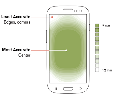
Your goals will impact how your content is formatted. They will dictate the UX design of the page on which it lives. They will affect navigation throughout your site. In the image below, you can see how and where users touch their screens. On the average smartphone, it’s clear that the meat of your content should be centered at all times. You should also embed native CTAs so that they appear in the middle of the screen, rather than way at the top or hidden beneath content.
For e-commerce brands, where users click is directly tied to profit potential. Mobile usability is a deciding factor of whether users purchase from your company.
An e-commerce site is likelier to require advanced features like additional input fields, a native site search engine, a more complex sitemap, conversion-optimized product pages, detailed FAQs and guides, video demos and virtual tours, more CTAs and integrations with other platforms.
All of these factors make content creation more difficult, meaning marketers must be even more strategic with their investments on the front and back end. When a site contains more functions – or more bells and whistles – the likelihood of something breaking or working incorrectly is higher, leading to a poor mobile experience.
An end-to-end creation-publication process tries to avert these potential issues before they occur.
4. Google is your homepage: Think like a SERP
Because Google defaults to indexing the mobile version of your site in SERPs, you should consider your total web presence through the prism of a mobile user. How do they engage with SERPs? How do they search? How do they click? How do they scroll? What do they view? What do they consume?
The numerous search functions within SERPs give you a good idea as to what types of content you should be creating and how it will be displayed to a mobile user.
Take the search bar. Google will use autocomplete suggestions to provide query matches before a user is even done typing. Build content around those suggestions. These are search terms that actual searchers have queried before, so there is intent and traffic behind Google’s decision to suggest them to you (and users).
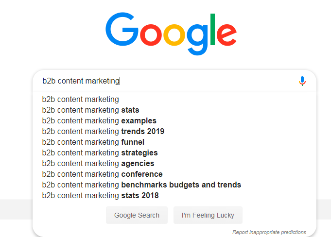
As seen above, you have nine ready-for-creation content ideas for free, directly from Google. Mobile users are unlikely to query an entire long-tail search term or phrase through their devices, so they will be relying on autosuggestions to finish their thoughts. And once they land on a SERP, your content should be perfectly optimized around that target keyword. It’s basically the premise of showing up is half the battle.
5. Optimize for no-click SERPs
The other part of a strong on-SERP presence is how mobile users interact with the organic landscape. The rise of voice assistants and voice-activated devices has generated an entirely new niche of content marketing: voice search.
Voice search queries are much more likely to:
- Use long-tail keywords and keyphrases.
- Be in the form of complete sentences or questions.
- Be informational or command-driven in intent.
- Return answers directly from Featured Snippets.
Also consider that by 2020, 30 percent of all web browsing will be screenless: no physical interface, just a voice into a speaker. At present, about 20 percent of mobile queries are voice search.

What this means is that marketers must dive into new media that’s less about eyes and more about ears. To be fair, it’s still mostly about eyes, though 🙂 To optimize your content and your site for such a reality means rethinking how you structure and markup your pages. Here are a few pointers:
- Individual sentences need to be concise.
- Paragraphs should completely answer a question, especially in reference to the subhead.
- Copy should be formatted to match the Google’s preferred SERP feature for that search term.
- Google often serves users a table (7%), list (11%) or succinct paragraph (82%) as a Featured Snippet, provided there is content available on the web that best matches a user’s query. Write your copy with these formats in mind.
- Use proper schema markup to help search engines best understand and display your pages.
- Adjust content around keywords for which you already rank, preferably those in positions 1-3 in SERPs.
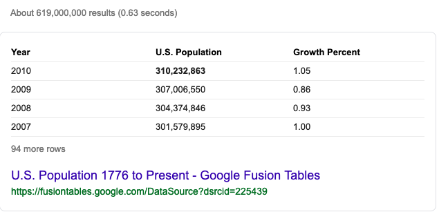
Common Featured Snippet formats displayed below:


If a mobile user gets all the information they need directly from a SERP – with no need to click on anything – then they have won. Their search is complete, and they’re happy. But for you, you’re only winning if your site is the one displayed in the Featured Snippet. Content marketing has effectively become Featured Snippet or bust.
Other listings on Page 1 will see dramatically reduced click-through rates when a Featured Snippet is crowding out everything beneath it. That’s a problem for everyone but frontrunners. But it also means marketers should be placing greater emphasis on conversion rates, aka making the best out of those who actually do click through and land on their site. If the on-page experience on your site is terrible, then you probably never deserved that click in the first place.
Mobile first, rank first
The pace of technological change in the online marketing space is no joke. A much-hyped, heavily funded content marketing program that took six months to ideate can be instantly rendered moot by an algorithm update or automated tool.
That’s why planning both short- and long-term content marketing programs should be fluid. It should leave room for tweaks on the fly, for optimization opportunities at every turn. That’s the only way to stay in tune with organic search trends and user expectations.
In the mobile-first era, the mobile user should be the foundational center point from which everything else is built. It’s how you stay in front of customers and stay ahead of competitors.
What mobile search best practices will you be tackling this year?