
You wouldn’t buy The General Auto Insurance for a BMW 9 Series.
You wouldn’t pair Kraft cheese slices with a $100 bottle of Pinot Noir.
You wouldn’t use eBay to sell your cloud software.
So why are you using a boring ass CTA for the eBook you spent three months developing and hoping to get $100k worth of new business?
I’ll wait for your explanation.
Now that you’ve admitted your fault, let’s talk more about this. I am not angry per se about this; I’m disappointed.
Why?
Because content marketing is all about providing deeper value to prospects, leads and customers. You, as the marketer, work across departments to ensure your organization’s value propositions and products have strong messaging and demonstrate your expertise in your industry, which drives sales for your sales team.
It’s on you to bridge the divide. You are selling your hard work short by not matching your CTA to the visual style of the content inside that eBook.
“But, Caroline, can’t you see the title of that eBook says it all? Every site visitor or social media user who sees that title is going to come running to throw their budget at us! It’s so obvious that it’s an engaging and interesting piece of content.”
No, it’s really not obvious. How often do you download something that has a bland CTA?
The truth is, we are inundated every day by offers, insights and unique value propositions, and you’re going to get lost in the clutter if you don’t stand out.
- “Why X Solution Will Save & Make You Money!”
- “The Only Metrics that Matter for Your Org,”
- “Use the Power of the Cloud to Fuel Your Growth”
As they said in the movie Heathers, gag me with a spoon. The good news: You have the power to change direction and crush the CTA game.
Okay. I am done criticizing.
If you want to learn more about the language behind a strong CTA, Crazy Egg has a great article on that. But we’re diving into graphic examples of fantastic (and mismatched) CTAs. Let’s do this:
The Good:
If you can be humorous with the header image around your CTA for an asset, do it! Take a look at this one by The Industrial Marketer:
First, I burst out into laughter when I saw this image – it caught me off guard to find something so humorous and cheeky on a site aiming to help industrial marketers spice up their campaigns. I immediately wanted to download this asset, because if that’s the image associated with the guide, it’s certainly going to be an enjoyable read.
I was not disappointed. As you see below, the asset matches what drew me in: humor.
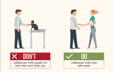
Collaborating with cats rather than your sales team is bound to fail. (Also this is great advice for any marketer: Work with your sales team to maximize your efforts).
The Bad:
My inbox is filled with sales pitches and invitations to download a guide to encourage Brafton to purchase a product (as if I make those decisions). Occasionally these emails are compelling and sometimes, not so much:
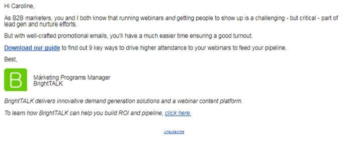
Is there anything compelling about that link or email?
My eye goes to the company’s logo before I notice the content of the email and the CTA. In the spirit of my investigation for this piece, I followed the link and downloaded the guide. Guess what? It was an interesting, informative and colorful piece that had actionable takeaways.
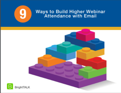
The Lego block theme carries throughout the eBook – they build upon each process that is needed to increase webinar attendance. The email should’ve been in an HMTL format with color and contained a fun CTA. The eBook lends itself to a theme to easily promote it – BrightTALK missed out on tying those in.
As another example for you, take a look at this promoted eBook for LinkedIn Marketing Solutions. LinkedIn publishes a significant amount of content for all parts of the funnel, and I rarely download it.
As a content marketer, I was curious about this asset:
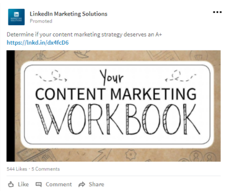
The ad copy itself is lackluster, the image is a C. LinkedIn’s brand authority probably has their marketing team thinking they don’t need to try too hard to make engaging ads for their downloadable assets.
That is silly.
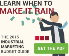
If you search “content marketing guide” on Google, 29 million results come up. That’s roughly the population of Afghanistan. I wasn’t expecting much from this eBook, as I often find their content to be mediocre and too simplified for my marketing knowledge.
But, this eBook is a whole lot of fun:
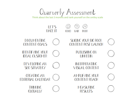
LinkedIn should’ve incorporated the “WorkBook” theme in a more playful way in the CTA. There is a lot in this asset that could’ve been used to encourage me to download this, but the ad failed to show the value of it. The last thing you want is hesitance to provide reader information because it’s unclear if your asset is going to be worth the time to read. Each reader may be thinking, “Do I really want to download this and opt into a drip campaign?”
For bland assets, the answer is usually no.
As I mentioned earlier, it’s on you to bridge the divide between how the world sees your brand and how to put forth the best version of it.
When you produce larger assets, work with your agency or internal designer to create CTAs with images that correspond with the asset. Format them to to be used across distribution channels and on the site. If you don’t have the bandwidth for in-house or agency-led graphic design, use Canva – a great platform to help develop visual content.
You’ve got the power to drive your organization to the next level – don’t you want to make it rain for your sales team?