
Graphic design is intimidating for brands with limited resources. This is especially true when the stakes are high, and the goals are conversions and engagement through actionable, eye-catching graphical assets.
Businesses without dedicated graphic design teams or agencies to create their calls-to-action often turn to free online graphic services like Canva, which serves 200,000 companies and 2 million users.
When it comes to graphics for CTAs, marketers often get hung up on the visual design (color, font and shapes) and the specific images and what they mean (pictures of people and objects, buttons, and eye-flow). Let’s take a closer look at these elements – we’ll save copy, phrasing and word choice for part three.
Visual design
It takes one-tenth of a second for a new user to make a first impression when they land on a site. Effective, eye-catching CTAs are the difference between capturing a lead and bouncing them. Great content and SEO can go to waste if the aesthetics of a CTA turn audiences off.
Color
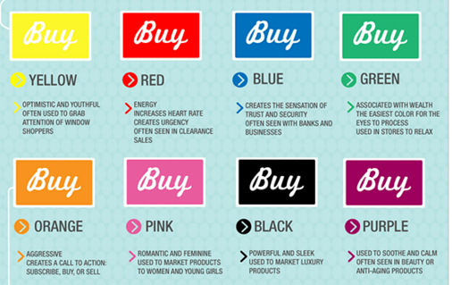
One of the first things visitors will notice in your CTA is color – and color will help your viewers see what you want them to see first. According to Kissmetrics, keeping a solid color scheme increases brand recognition by 80 percent.
There is no “best” color for conversions, but certain colors communicate hierarchy better than others, depending on the category.
For example, red can mean “Stop! Look at this button,” or “Attention!” or “Hot!” While this is helpful for gettin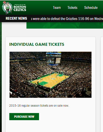 g a user’s attention and driving clicks, red also has negative associations: harshness, anger, alerts and even incorrectness (think about grading marks for math tests).
Green or orange are also popular CTA colors and communicate importance, movement, wealth and positivity.
Perhaps more important than a color’s subconscious meaning is how well your users can actually find it. The right colo r will call attention to the most important parts of the CTA – the actionable button.
Matching the CTA button to the header or logo will help it stand out as long as the branding of the company is well-established and the CTA’s design is minimal enough. For example, seeing a green CTA for purchasing Celtics tickets both visually matches the branding and logo at the top of the page, and takes advantage of its audience’s awareness of the team’s widely-known brand color.
Similarly, Dropbox uses blue buttons to connect with the blue logo, and keeps a minimalist, open design with mostly white space to make the recognizable color stand out even more.
Shapes
Acco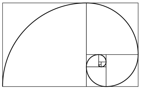 rding to Brafton’s Client Strategy Director, Wilfred Hirst, “when in doubt, use the Fibonacci sequence. The Golden Ratio usually provides the most appealing dimensions for making simple rectangular CTA boxes and buttons.”
That’s not to say that circles, and rounded buttons don’t work well also. In fact, Steve Jobs was an early proponent of the rounded rectangle and square (which towards the end of his life, he factored into app shapes, and even the shape of the actual iPhone handset.
“Bill Atkinson, who worked together with Steve Jobs … added new code to QuickDraw to draw circles and ovals. Steve Jobs wanted more and Bill came with a mathematical solution to draw rectangles with rounded corners.”
– PaulOlsyslager.com
These shapes are useful for generating user engagement because they:
- Subtly point inward and draw attention to their content, while rectangle corners point outward.
- Suggest softness as opposed to sharpness, which many readers subconsciously react more positively to.
- Actually require less imaging power from your eyes and brain, and viewers can react quicker to seeing them.
Text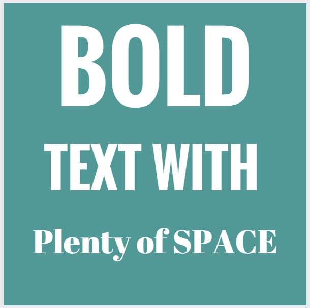
The next part in our CTA-optimization series will cover strategies for writing in a future installment of our CTA optimization series, but for now, we’ll discuss CTA text from a graphical perspective. Large, legible, bold writing is most effective in your graphics, and programs like Canva make this easy.
It’s generally best to leave out fine print, unless it’s calming, anxiety-reducing text like “don’t worry – no credit card required” or “cancel any time.”
Keep it simple
The fewer buttons on a CTA, the better, but If you do include multiple options, emphasize the design on one of them to suggest hierarchy and catch the reader’s’ eyes the most, or command the most of their time.
White or empty space can be helpful. It makes the option in your CTA stand out. The example below makes use of good empty – the picture is scalable, visually clean and appealing, and helps users move more quickly through the process.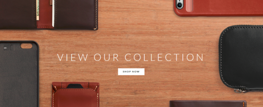
Objects and graphical content on CTAs
Now that we have colors, shapes and graphic design under control, the next challenge is creating the larger graphical objects, as well as engineering how people interact with the CTA.
Use natural flow
English speakers read from left to right, and from up to down. The same directions they follow for reading text also applies to pictures, which happens to often represent the passage of time. That’s why this picture illustrates weight loss, rather than weight gain.
When users land on a website, the first spots they generally study are represented here: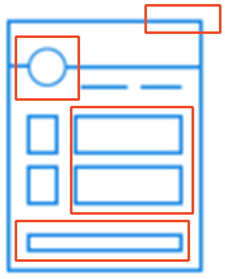
English-reading audiences quickly scan pages, and use a hybrid approach that resembles a Z:
Where’s the best spot to place a CTA on the page? Just above the middle of the fold, and slightly right is a good spot to catch readers’ attention.
For designing the inside of a CTA, a similar approach as above helps guide readers’ eyes toward the most important sections; the basic information along the top, from left to right, the button near the center, and any secondary actions or additional pieces on the bottom, from left to right. Never require your audience to backtrack on this path.
People
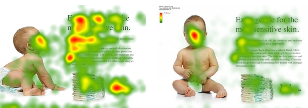
When you include objects or people on your CTAs, you can optimize their positioning and design to be more effective to viewers, and even control how they interact with your asset. If your CTA makes use of photos of people, their eyes can guide readers’ eyes in a specific direction because we tend to look at where other people are looking.
Object angles, and positioning also influence viewers subconsciously. Which mug would you rather take a sip out of?

If you’re right-handed, chances are you’ll say the one on the right (and vice-versa if you’re left-handed) because your brain has a slightly easier time imagining grabbing the handle with your dominant hand.
Between choosing the right color, shapes, pictures, photos and fonts, there are many factors that facilitate users converting through your CTA. For brands without internal graphics teams or agencies to support their graphics needs, the recent surge in free online software can help to ease many of these CTA graphics needs.
Stay tuned for the next piece of our CTA optimization mini-series, and take a look at our first installment, CTA Optimization Part 1: UX principles you can’t afford to forget. For info on the top graphic design trends for 2016 marketing,