Imagine you visit a library. No, don’t imagine the musty smell, just the books.
You’re in need of some specific information, and you find a whole section of books devoted to the topic. You choose the first book that catches your eye – a big, bright volume that seems authoritative and trustworthy.
You open it up to find … a mush of text. Your eyes can barely focus on the words, and scanning the page reveals a layout that would make Rube Goldberg proud.
Question: Do you continue reading the book, or do you put it back on the shelf and reach for one of the many other options available?
Answer: Duh.
The internet is that library. Your website is one of those books. And no matter how search engine optimized your site is, it won’t count for much if people click away as soon as they land on it.
Unfortunately, your competition isn’t dozens of books, it’s hundreds of websites, all aiming to steal away your customers. People judge books by their covers, but you better believe they judge what’s inside just as much.
Tracking text
Imagery is essential, but text remains the foundation of content marketing. Of course, that foundation might as well be made of quicksand if your typeface is terrible.
“All your typography impacts readability and how fast you can communicate,” said Brafton Design Director Ken Boostrom. “Marketers aren’t hired to slow down communication with an audience. Clean and concise use of white space, font-weight, line-height and the color of the text all contribute to overall readability and the website visitor’s enjoyment.”
Yet, even if your type game is on point, how you structure text is equally important.
“People search by skimming information,” Ken continued. “We skim headlines first, top to bottom, and make judgements. If we find a topic we want, we read the subhead to further define it.”
If a website visitor clicks on your article, they should be greeted by images, pull quotes and calls to action that break up the text every three to five paragraphs.
Visual views
Human beings are wired to respond to visuals. How you use them determines how people read your web page.
“In eye-tracking research, it was confirmed your eye goes to the largest image on a page, so placing a large image in the primary type column in a blog is a good practice,” Ken said. “For example, a large image to start the article, followed by a side bar call to action that is 50 percent smaller than your largest image and a small photo to wrap in the copy – that’s a good visual hierarchy.”
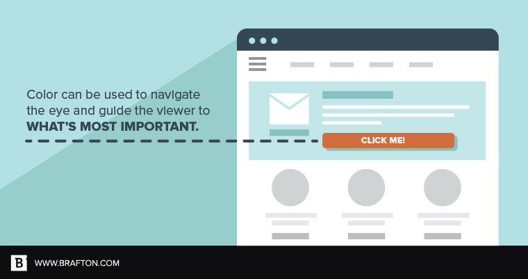
Don’t forget the role color plays, as well.
“Color can be used to navigate the eye and guide the viewer to what’s most important,” Ken said. “Think of color like a spice for cooking – it should generally be used sparingly. For instance, red is the most powerful color. If you have a beautifully designed web page – a single red button will get noticed. Your eye will be pulled in by the color.”
With that in mind, avoid using bright primary colors like red, blue and yellow in your blog’s overall design. Soften them to tone down their effect and avoid overwhelming viewers.
Leading the lazy
Your user experience design should always translate to ease of use. The simpler it is for someone to navigate your website and find the information they want, the more likely it is they’ll stick around and return.
“Humans are lazy,” Ken said. “We don’t seek the toughest route. If a web page looks dense and spotty and uses misguided colors – if it looks hard to read – I’m going to say, ‘No thanks!’”
Fortunately, the formula for maximum blog readability is easy to follow.
Ken recommended using the 50-percent reduction guide, meaning large headlines, medium-sized subheads and small copy for the body of articles.
“If you create a 48-point headline, make the subhead 24-point and the body copy 12-point,” he said. “This creates the perfect information hierarchy. They all work together to increase reading and comprehension speed.”
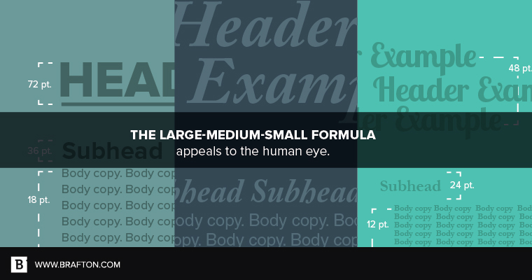
Combine with imagery that follows the large-medium-small rule, as well as legible typography and appropriate use of color, and you’ve got a recipe for excellent blog readability.
Now all you have to worry about is making sure the content you produce is worth reading. But hey, that’s a topic for another day.